Vasette logo refreshThe Brief
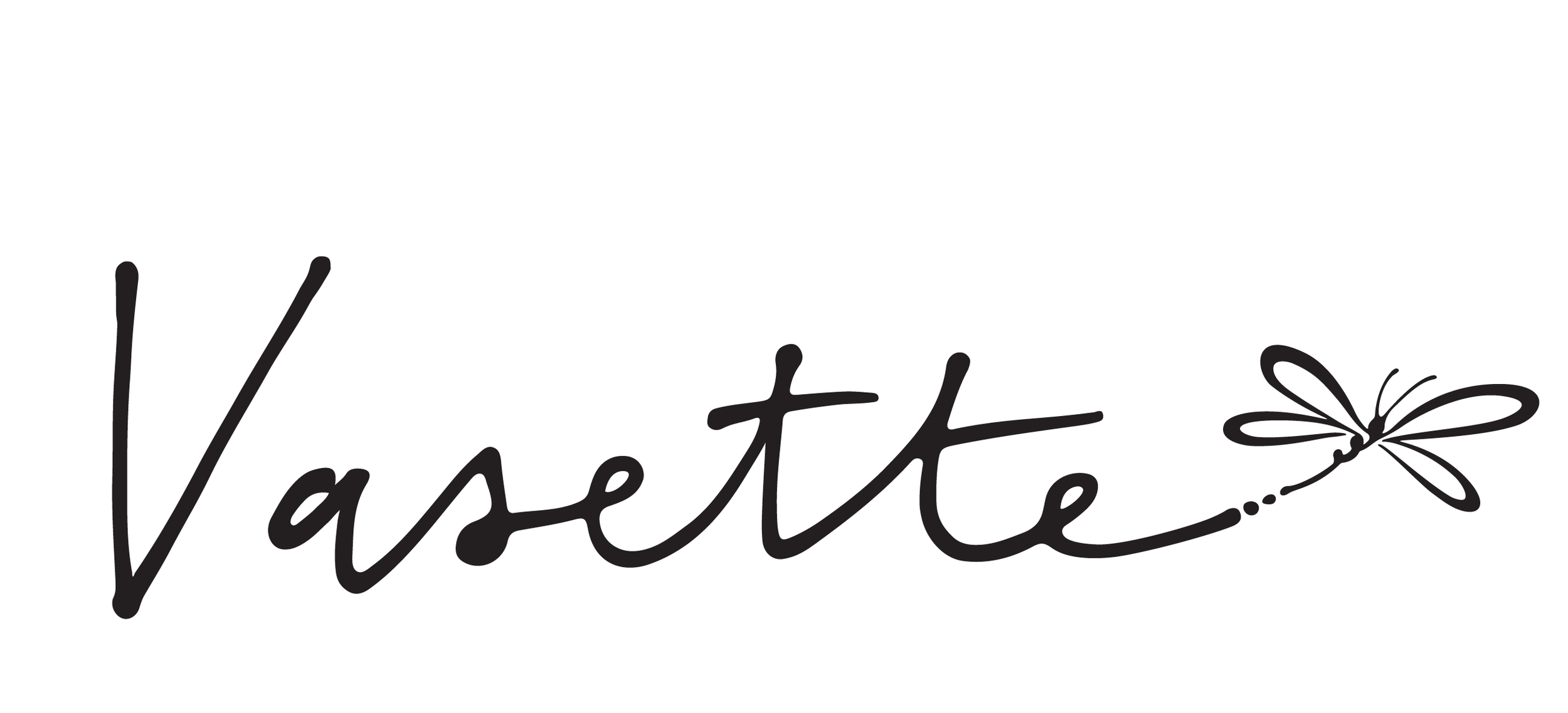
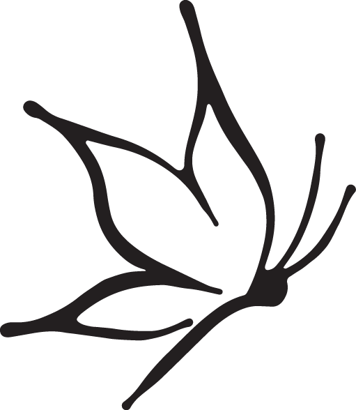
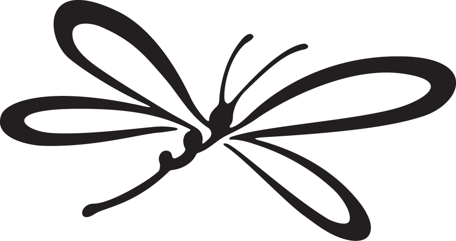
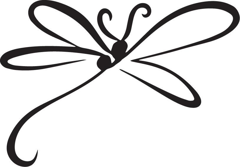
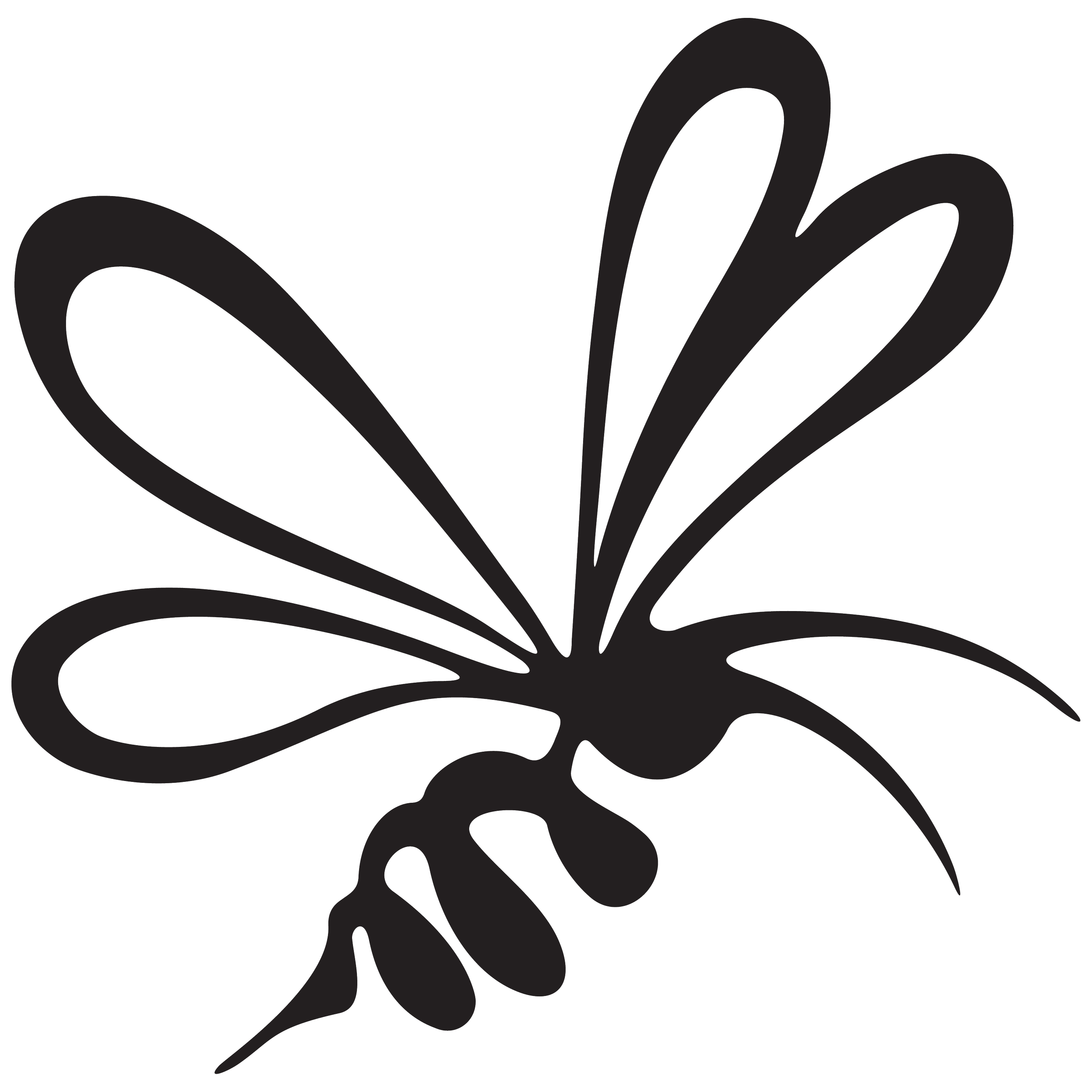
Flowers Vasette engaged me to evolve their existing handwritten identity by introducing a family of bespoke brand marks. The project centred on creating three hand-drawn symbols, a bee, butterfly and dragonfly, that felt like a natural extension of the recognisable wordmark. Designed as a flexible identity system, the marks could be used interchangeably across the brand while maintaining a cohesive visual language. The refreshed identity was later applied to in-store signage at their Chadstone boutique.
CLIENT
Flowers Vasette
Event Brand Identity • Logo Design • Illustration • Print Design • Signage Design • Production Artwork
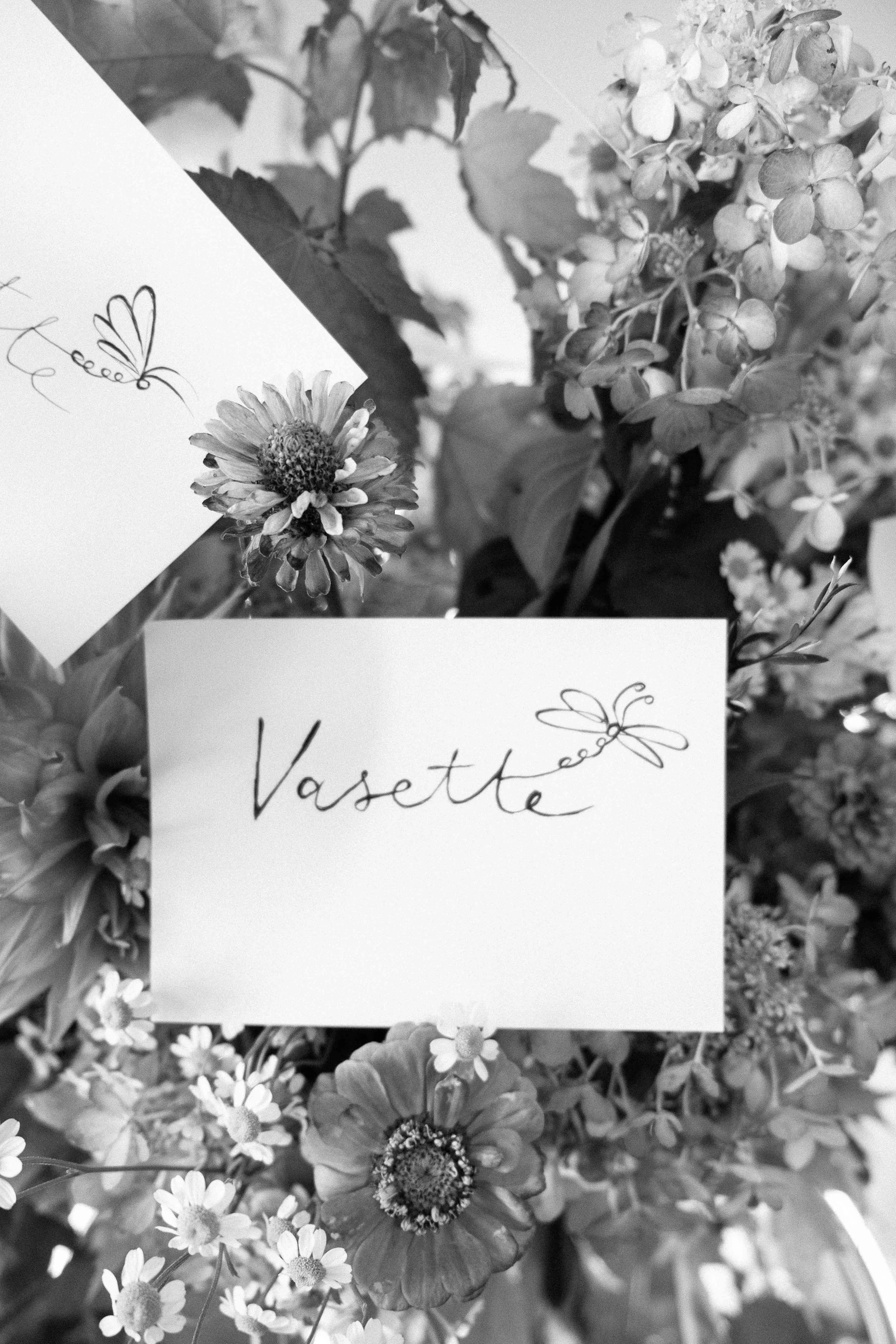
The Idea
While the initial direction leaned towards a detailed, old-world botanical illustration, I felt the strength of the existing identity was its simplicity. A highly rendered symbol risked competing with the handwritten logo rather than complementing it.
Instead, I explored free-flowing insect forms that could become a natural extension of the signature itself. They needed to feel distinctive, effortless and organic, preserving the recognisable identity while giving it a subtle point of difference.
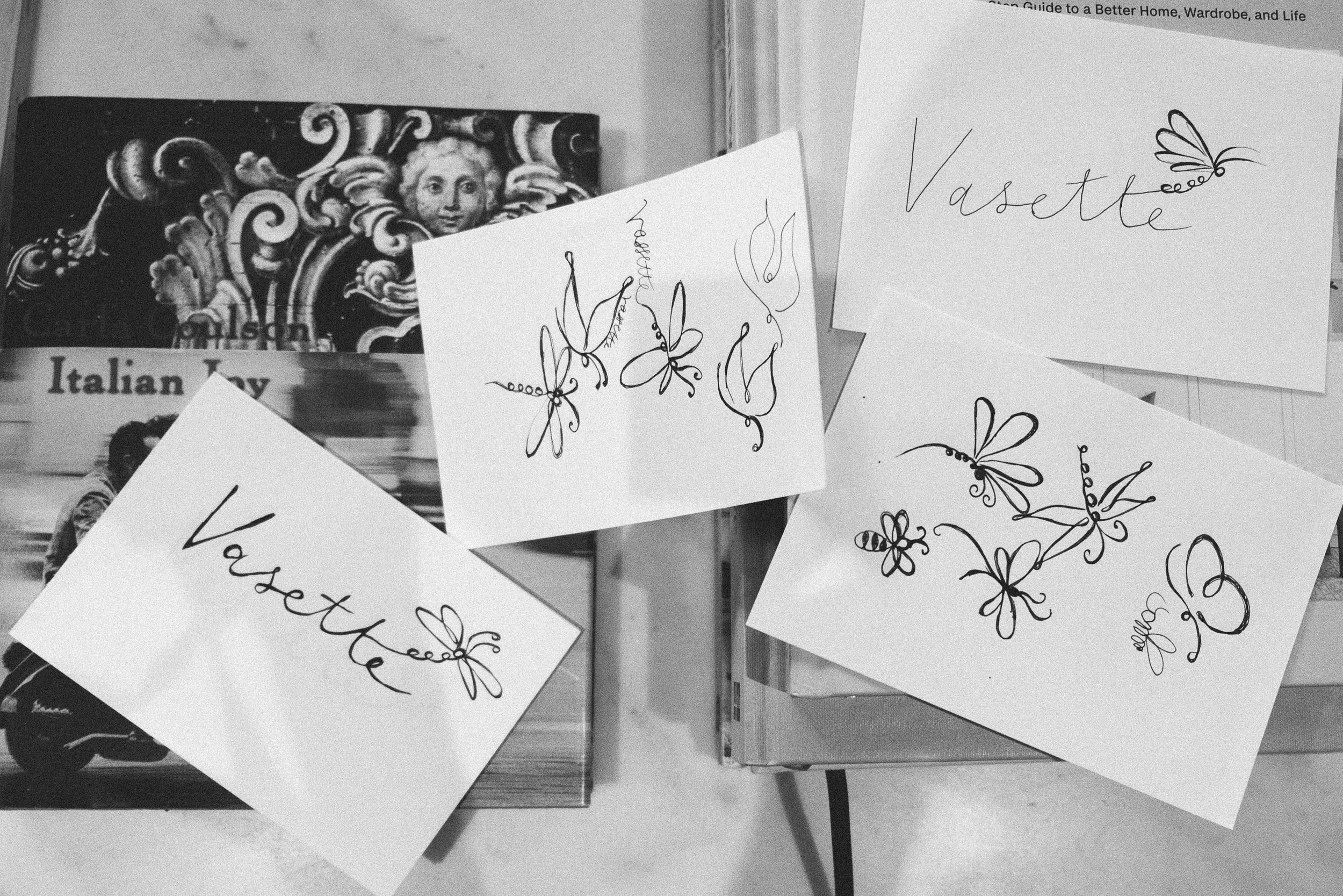
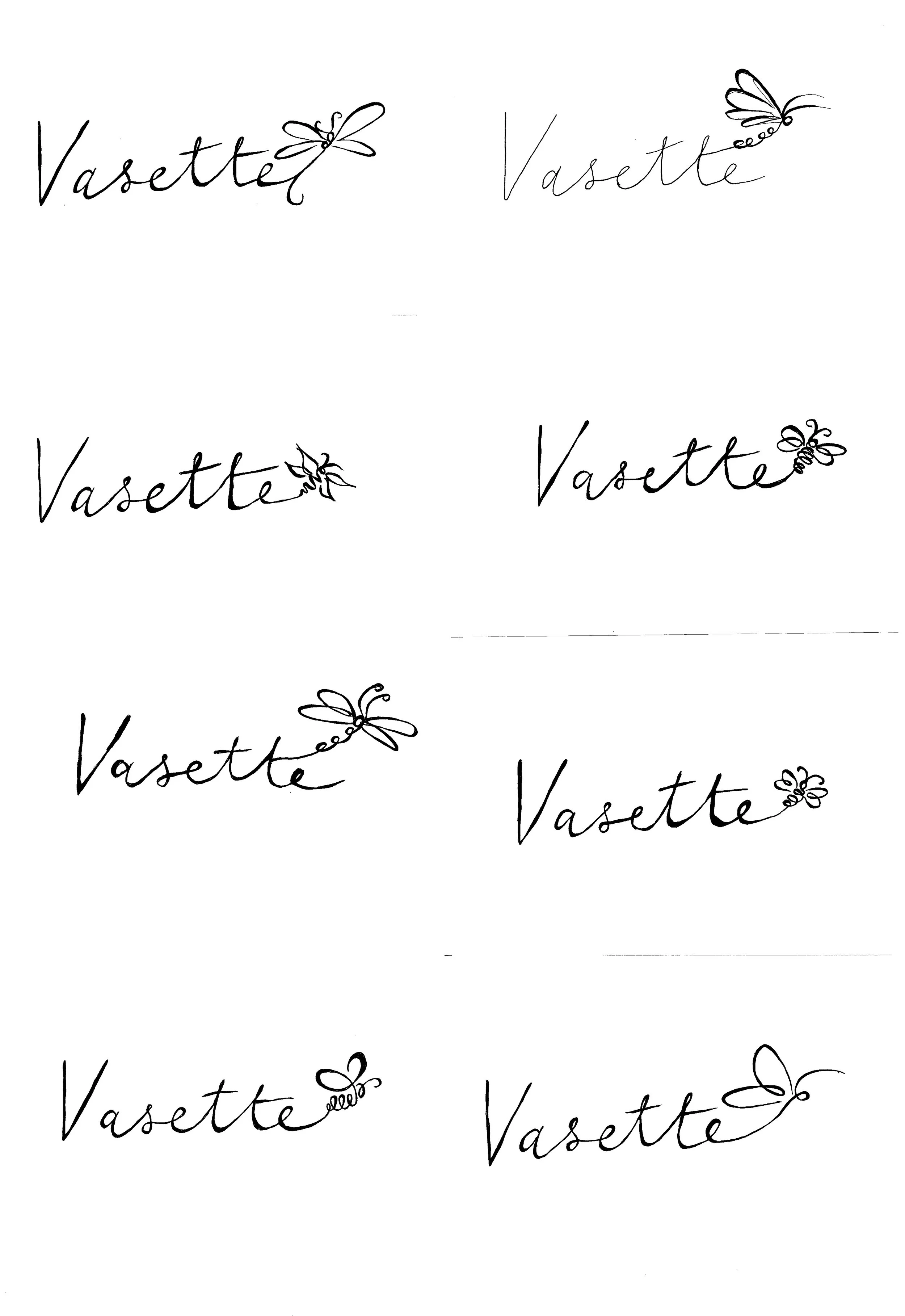
My process always begins with pen and paper. Working in ink encourages instinctive thinking, so instead of researching insect forms, I sketched them from memory, capturing movement and feeling rather than perfect detail.
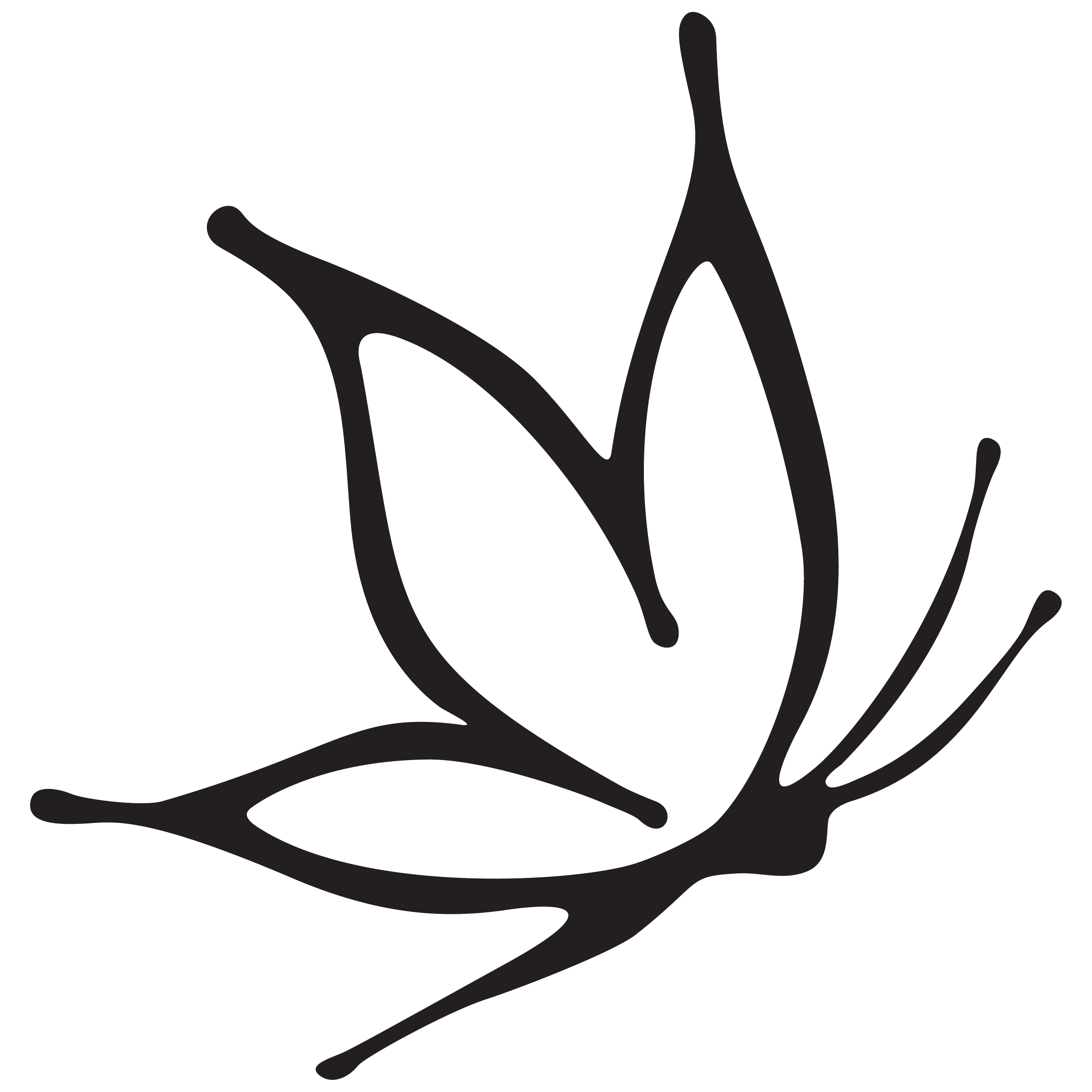
The Butterfly
Concept Developement
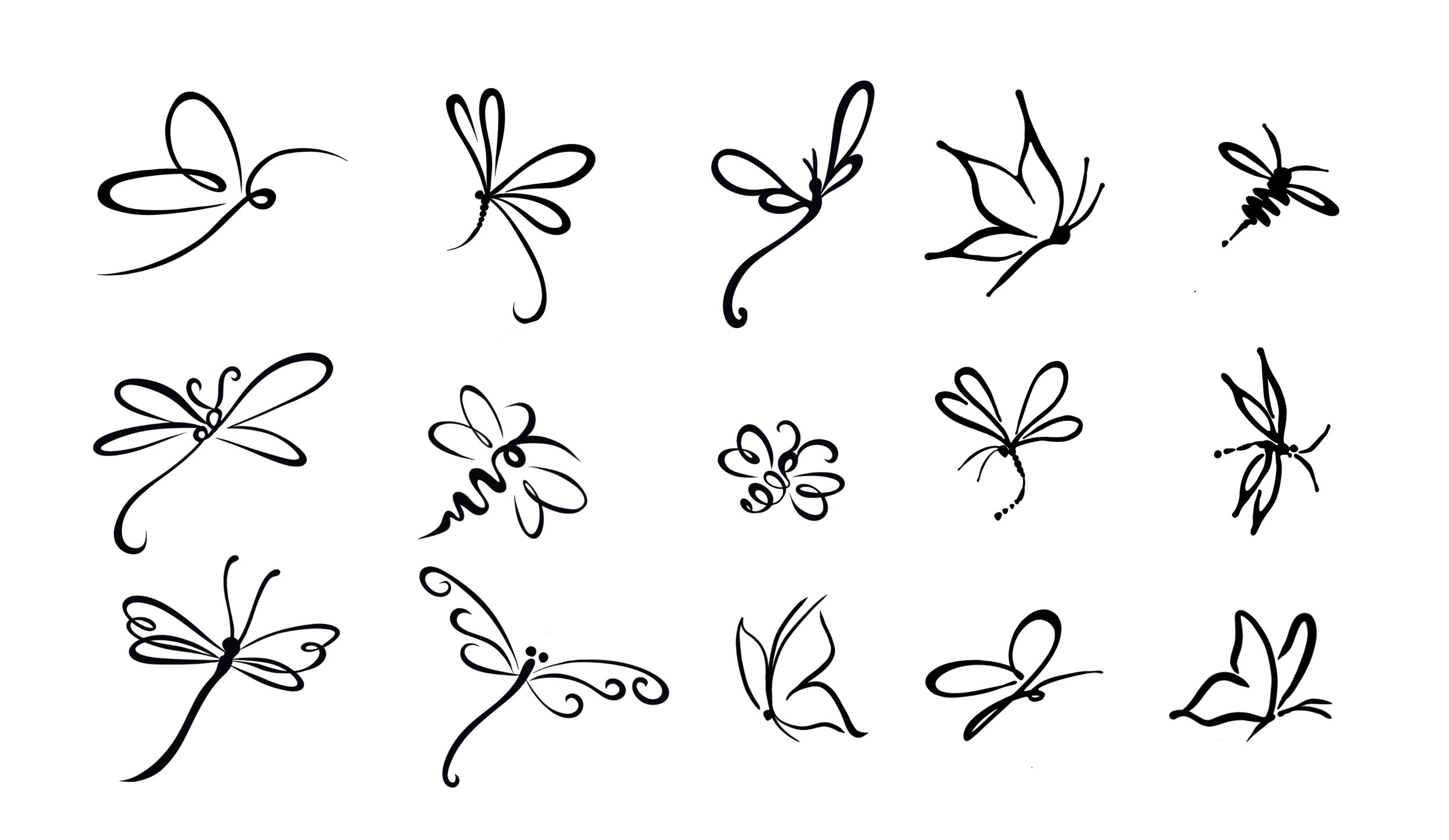
Once the strongest concepts emerged, the focus shifted to refinement. Each illustration was simplified, redrawn and tested alongside the existing wordmark to ensure it felt like a natural extension of the identity.
Refinement
The strongest concepts were refined digitally, with every curve, proportion and stroke weight carefully considered. Each illustration was simplified to echo the rhythm, weight and character of the handwritten wordmark, ensuring every mark felt like a natural extension of the identity rather than an independent illustration.
The Bee

SKETCH
REFINED
The Dragon FLy
SKETCH
REFINED
SKECTH
REFINED
Identity System
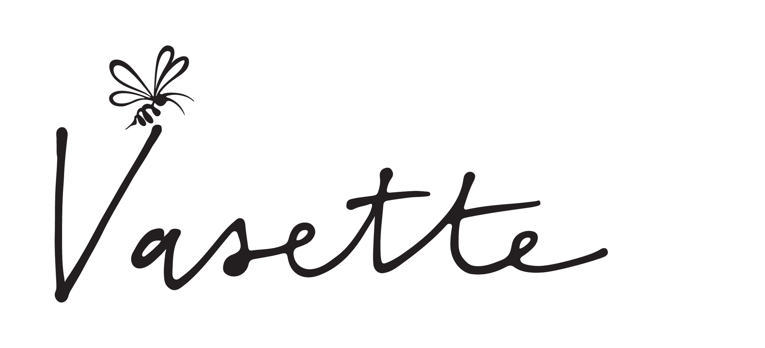
The final identity consists of three interchangeable brand marks, each designed to integrate seamlessly with the existing handwritten wordmark while introducing a distinct personality across applications.
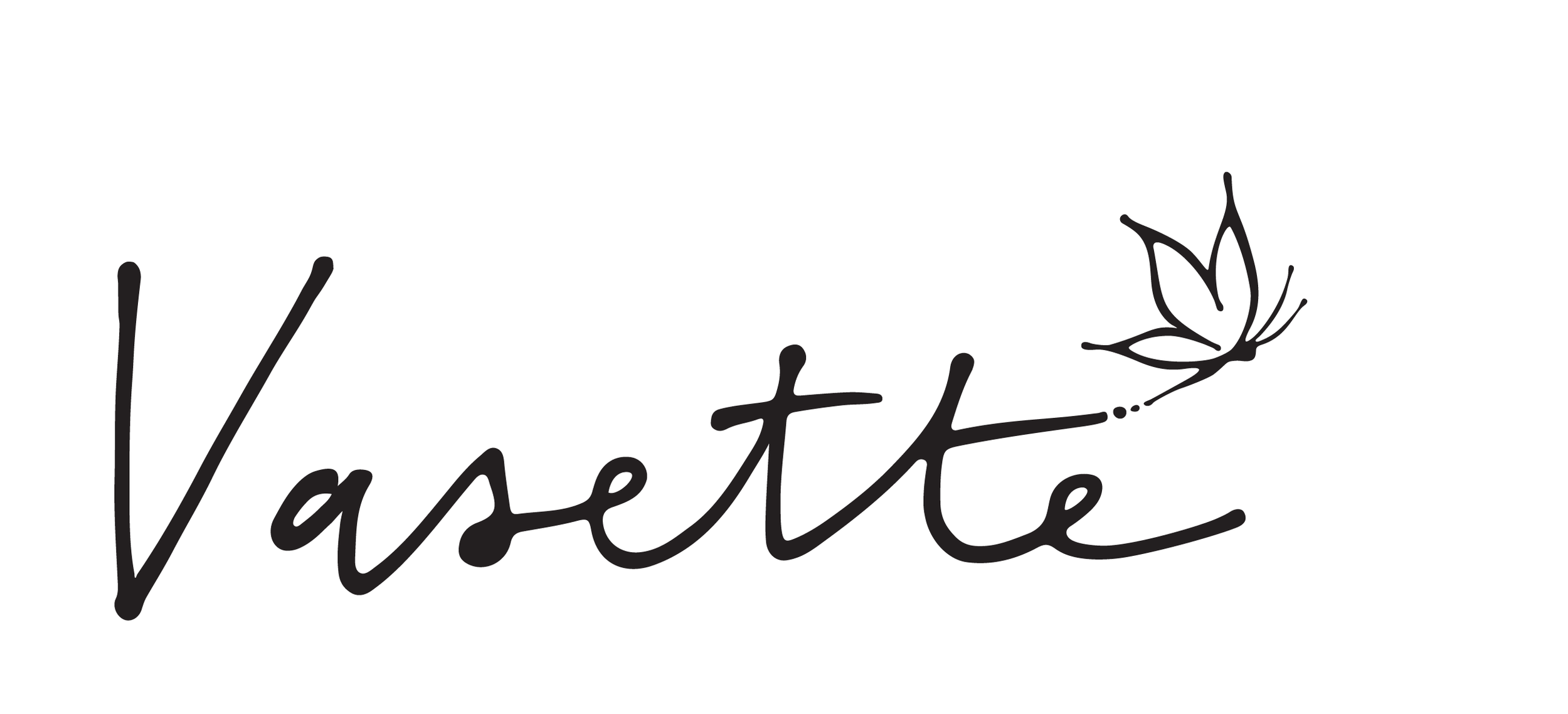
THE BUTTERFLY
THE DRAGONFLY