A Sense of Place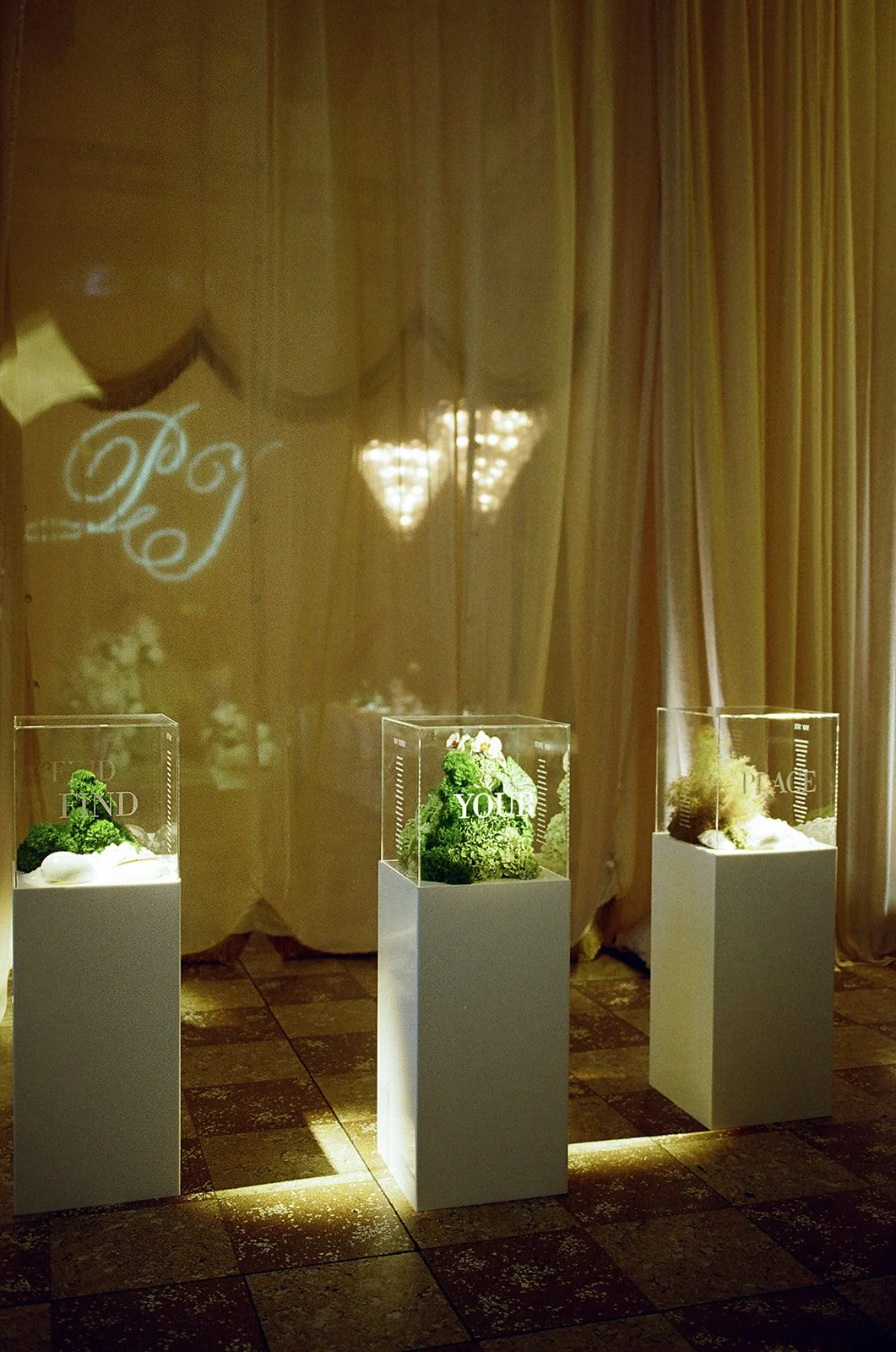
The Brief
Create a wedding identity that reflected both the couple's story and the venue it inhabited. The bride's Sydney roots and the couple's life in Bermuda informed a contemporary coastal visual language that felt completely at home within the architecture of Sydney's Museum of Contemporary Art (MCA). The result was an identity that felt intrinsically connected to both the couple and its setting.
CLIENT
Paloma Events
Event Identity • Logo Design • Print Design • Installation Design • Wayfinding • Production Artwork
Planner and stylist: Paloma Events
Photography: Kyle Ingram
Content: Madeline Anne
Design Concept
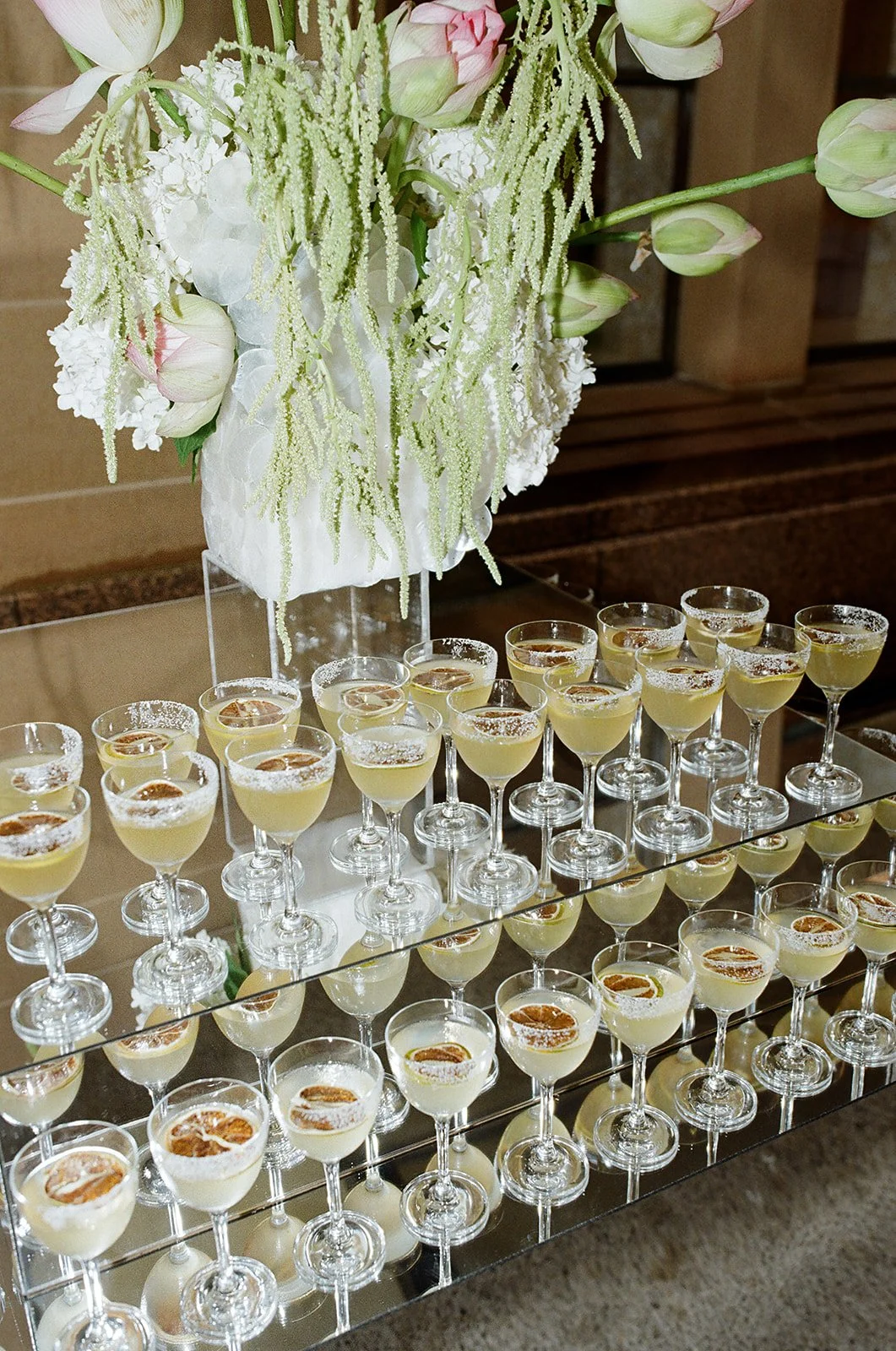
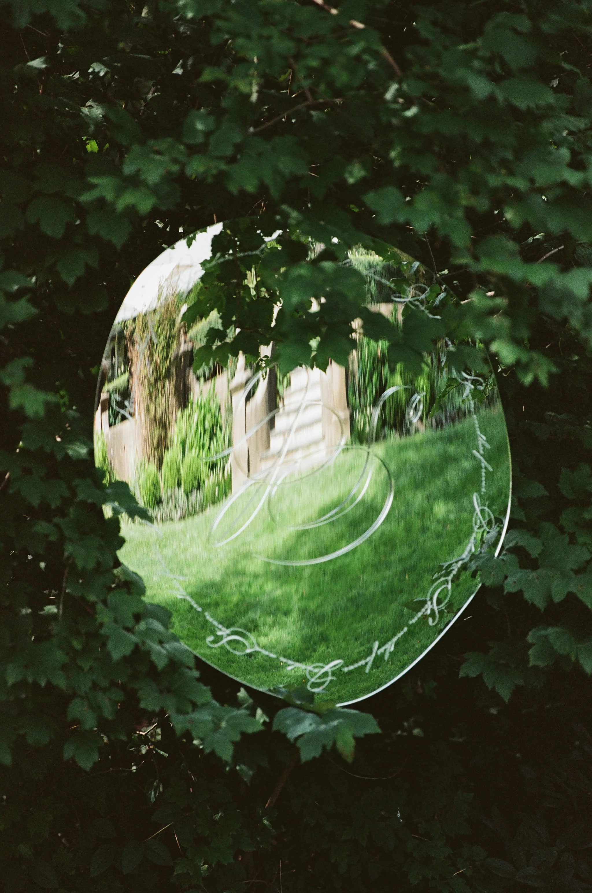
The identity drew inspiration from coastal landscapes, contemporary art and gallery architecture. Guided by reflections, transparency, texture and natural light, the material palette centred on vellum, chrome, acrylic and silver foil, reinforcing the concept across every touchpoint.
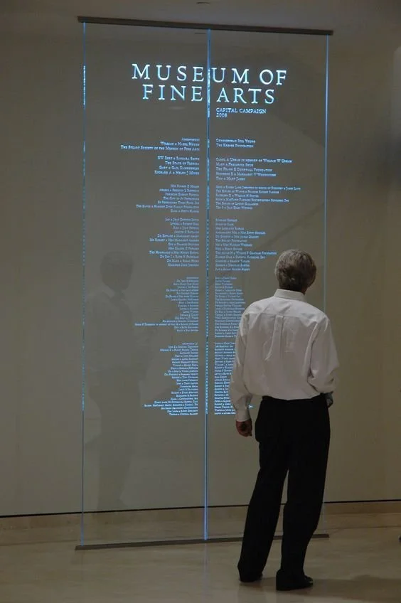
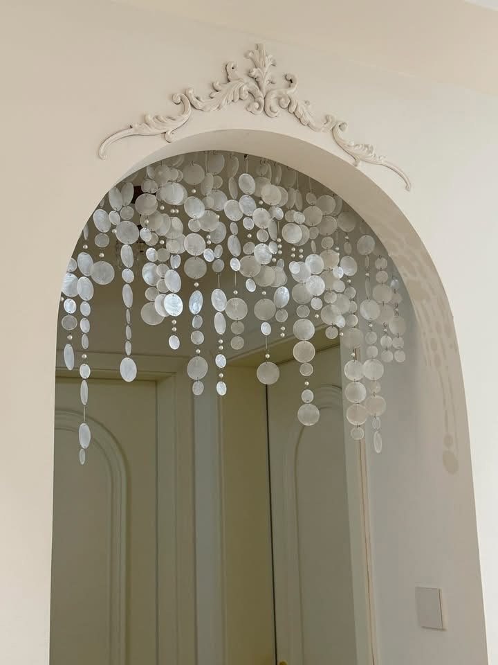
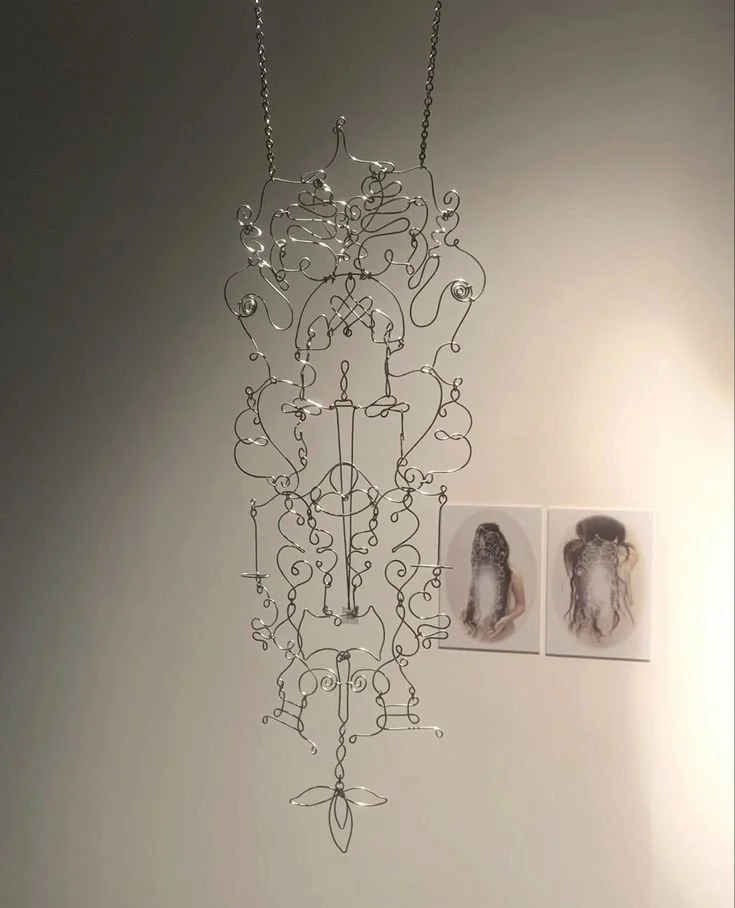
CONTEMPORARY ART — MINIMAL FORMS, CURATION AND QUIET RESTRAINT.
COAST — SOFT TEXTURES, NATURAL LIGHT AND A SENSE OF CALM.
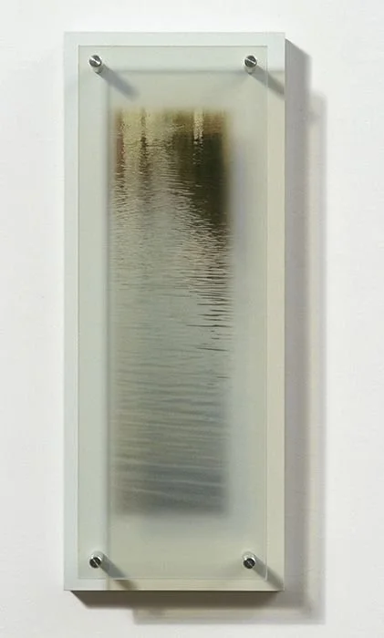
SCULPTURE — OBJECTS DESIGNED TO FEEL TIMELESS AND CONSIDERED.
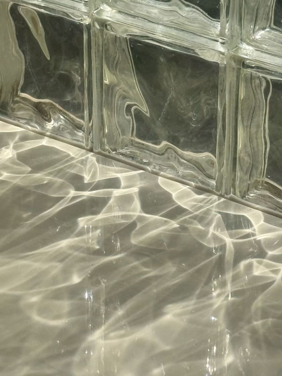
REFLECTION — TRANSPARENCY, MOVEMENT AND LIGHT ACROSS WATER.
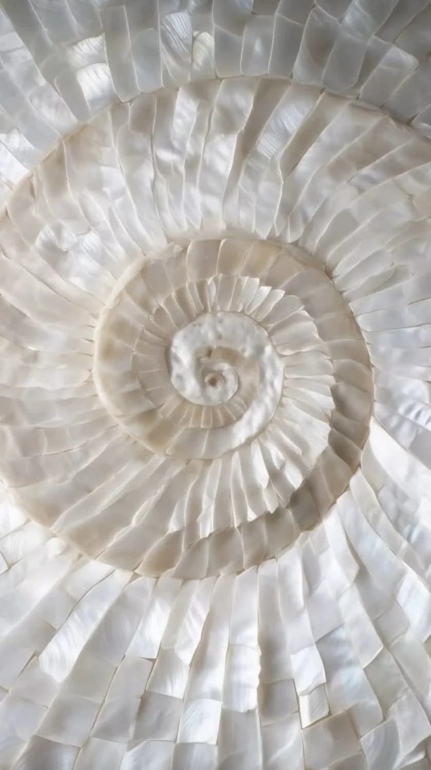
SHELLS — SOFT SPIRALS, SUBTLE TEXTURE AND TIMELESS BEAUTY.
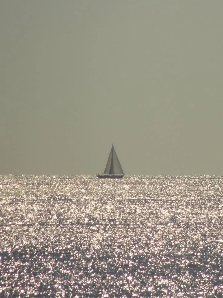
SEA — MOVEMENT, FLUIDITY AND THE MEETING OF TWO COASTLINES.
The First Impression
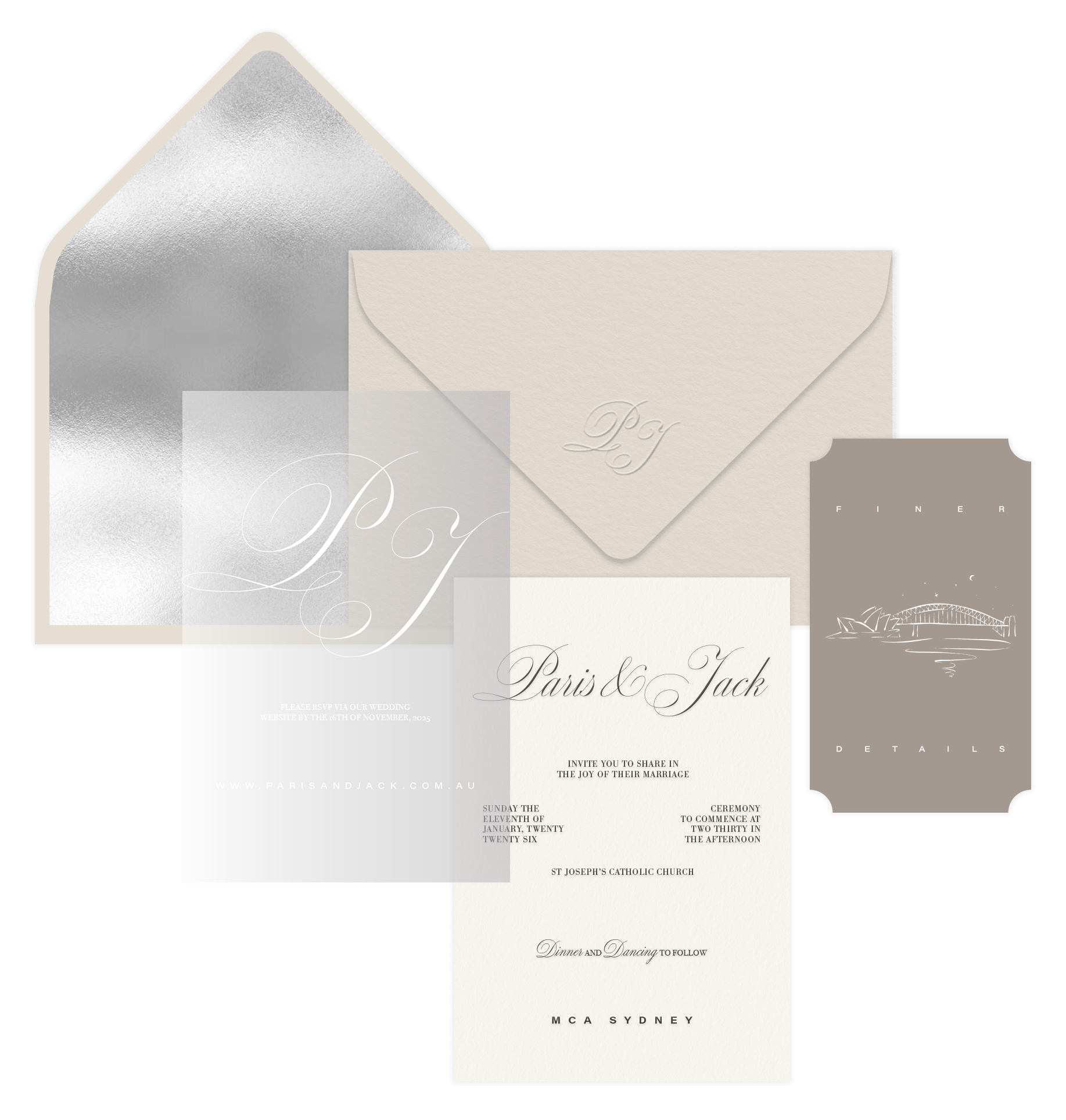
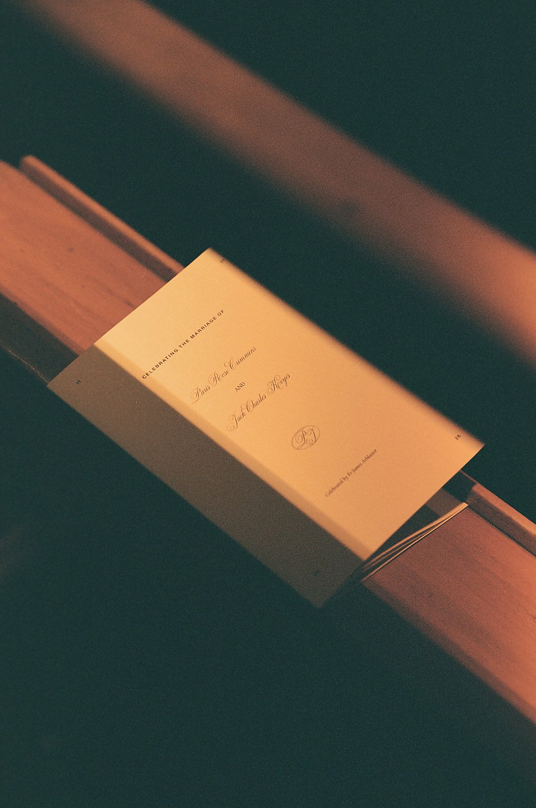
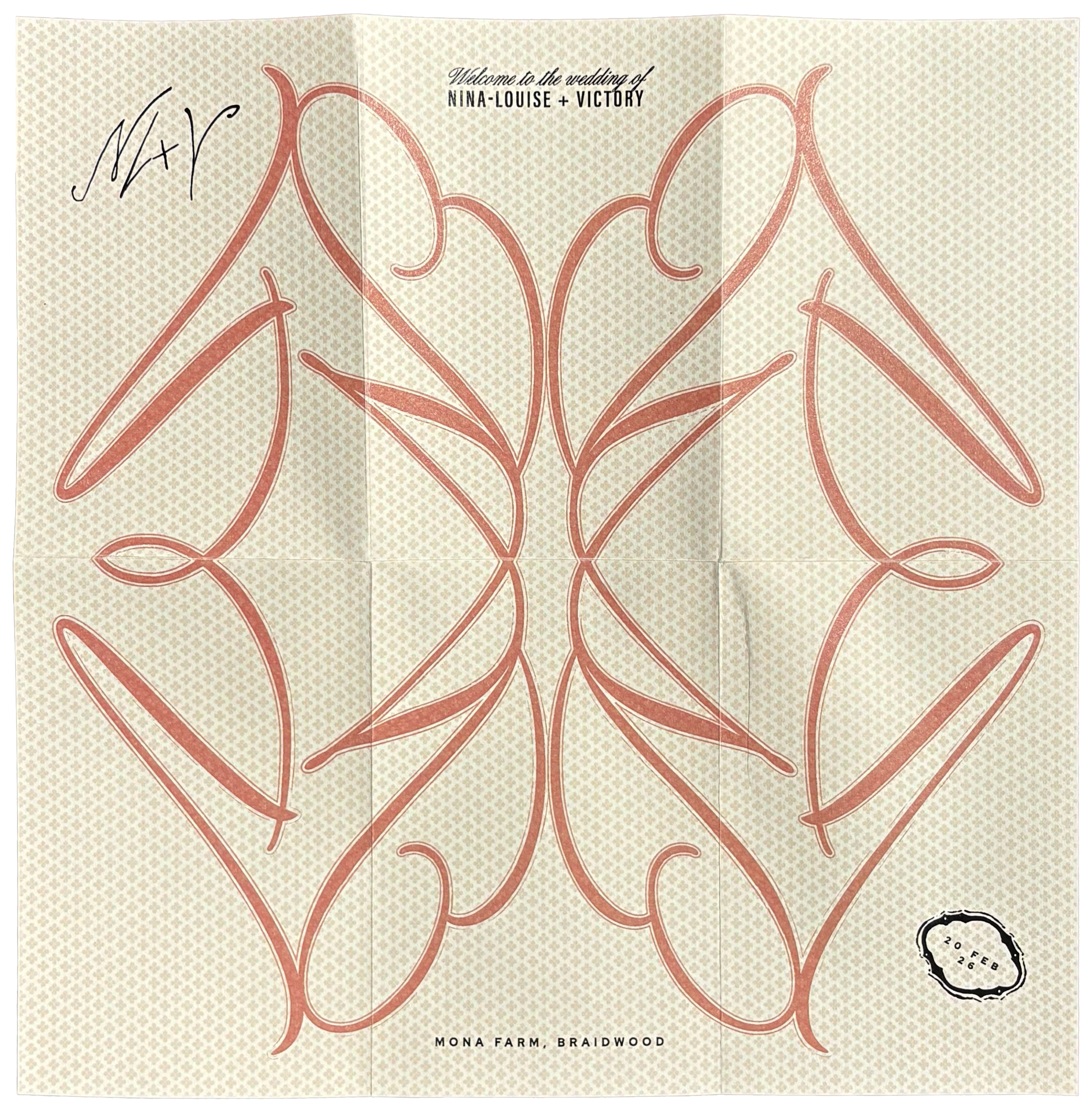
The invitation became the first expression of the identity, using layers of vellum, silver foil and tactile finishes to introduce the project's material language. Reflections, transparency and texture echoed the surrounding architecture and coastal landscape, establishing a visual experience that carried throughout the celebration.

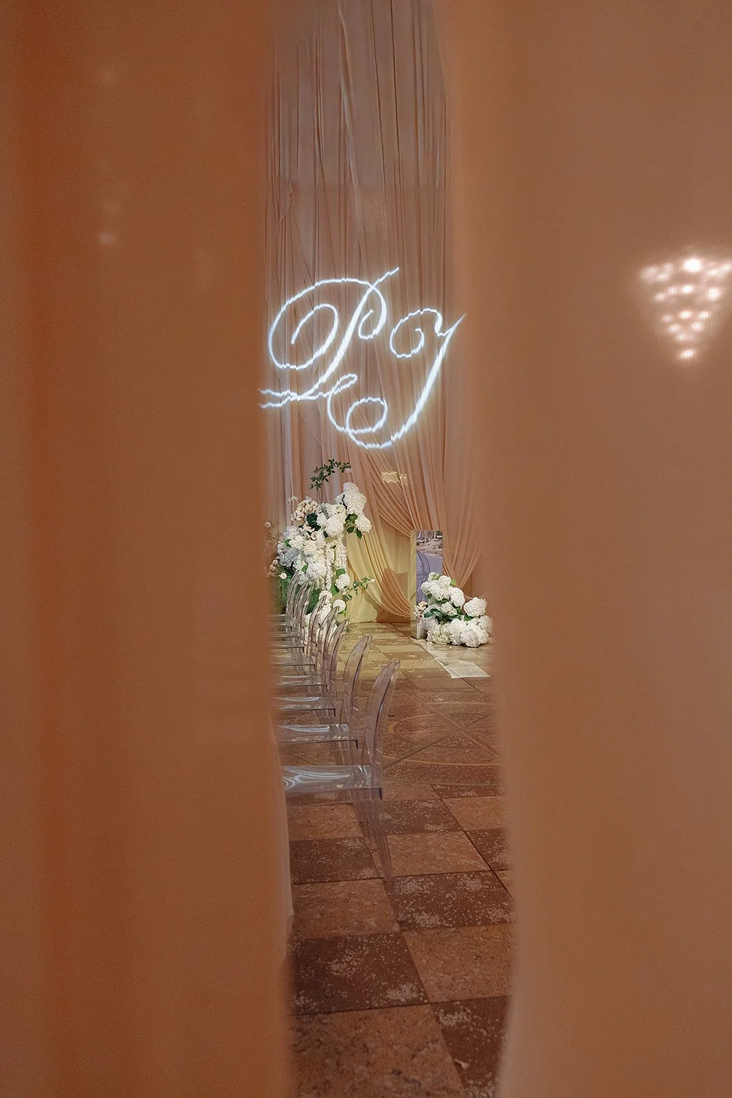
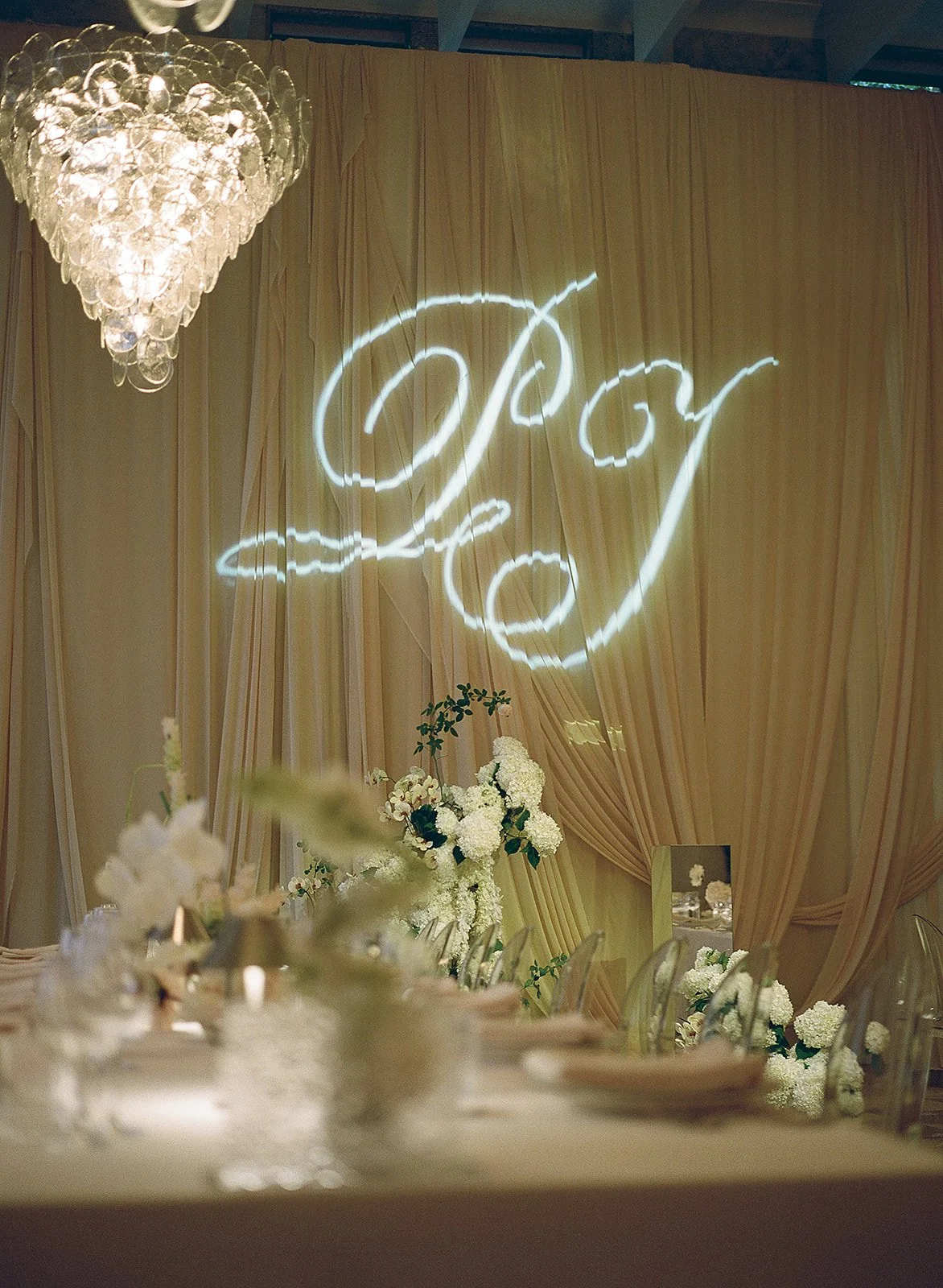
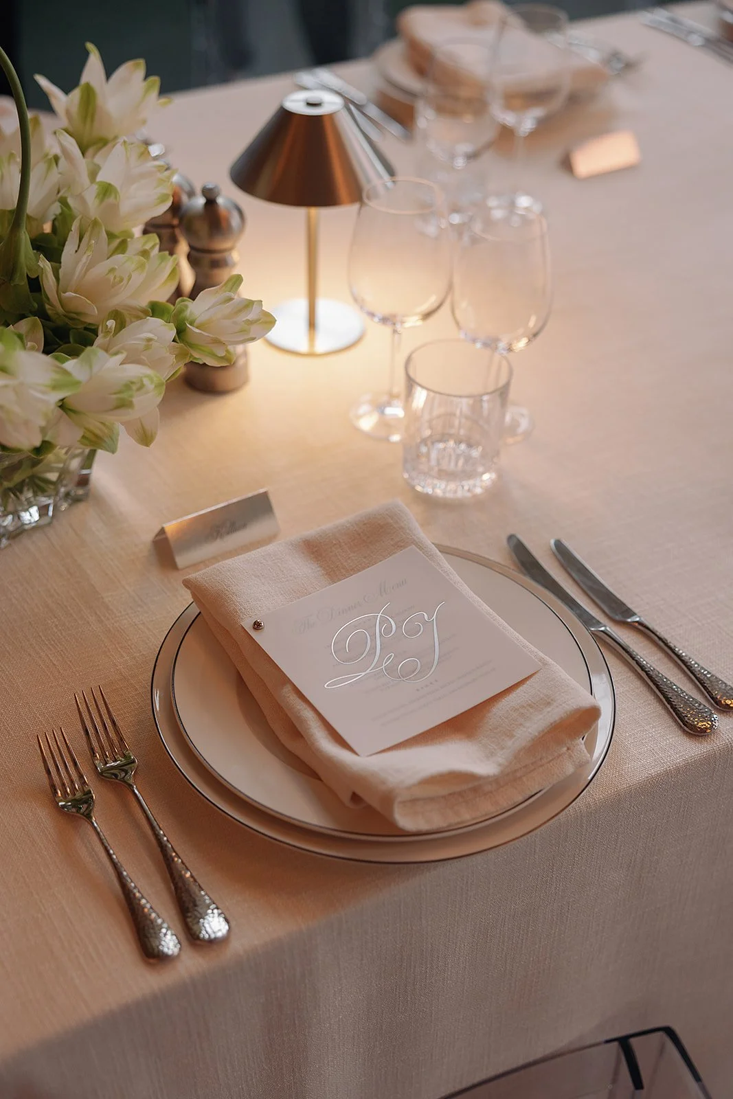
A bespoke monogram combined the couple's initials into one elegant, flowing form, creating a recognisable motif across the identity.
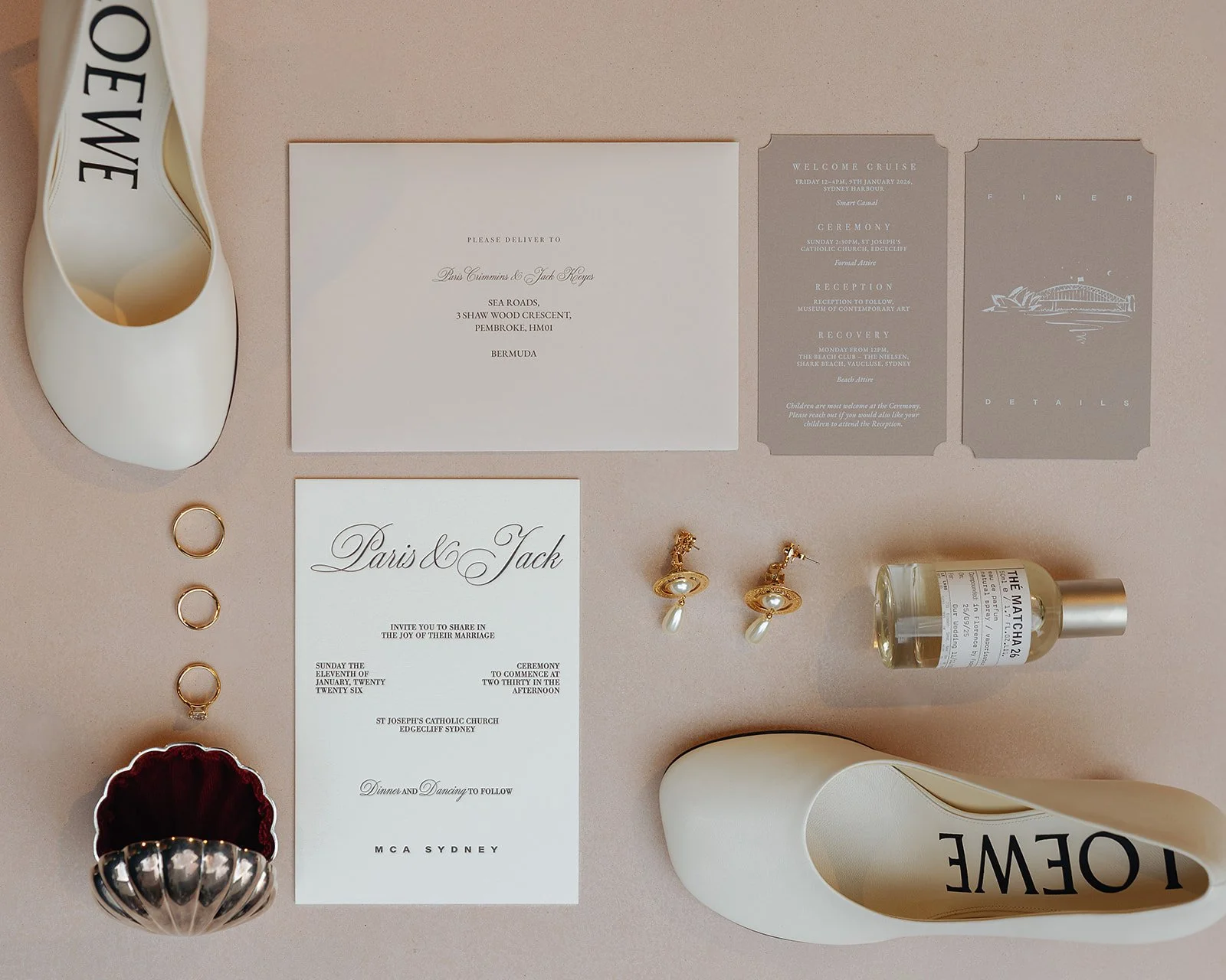
Objects of Experience
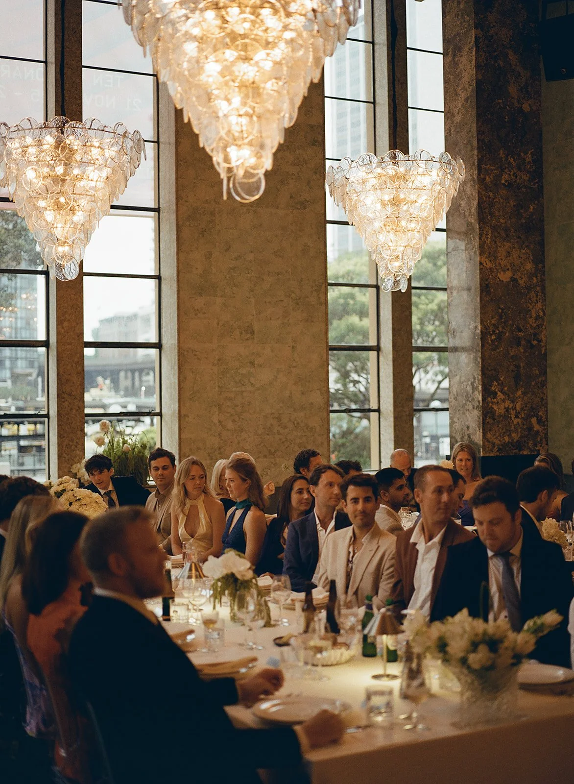
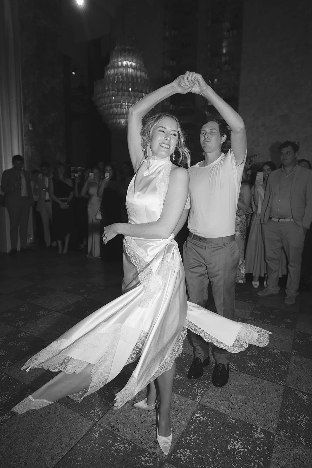
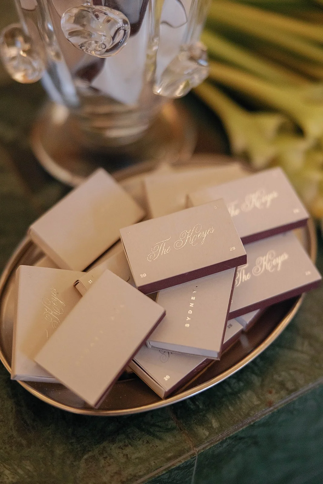
The identity reached its fullest expression on the day itself. Every detail—from menus and signage to seating displays and guest stationery—was designed as part of a single immersive narrative, blurring the line between branding and experience.
The Arrival
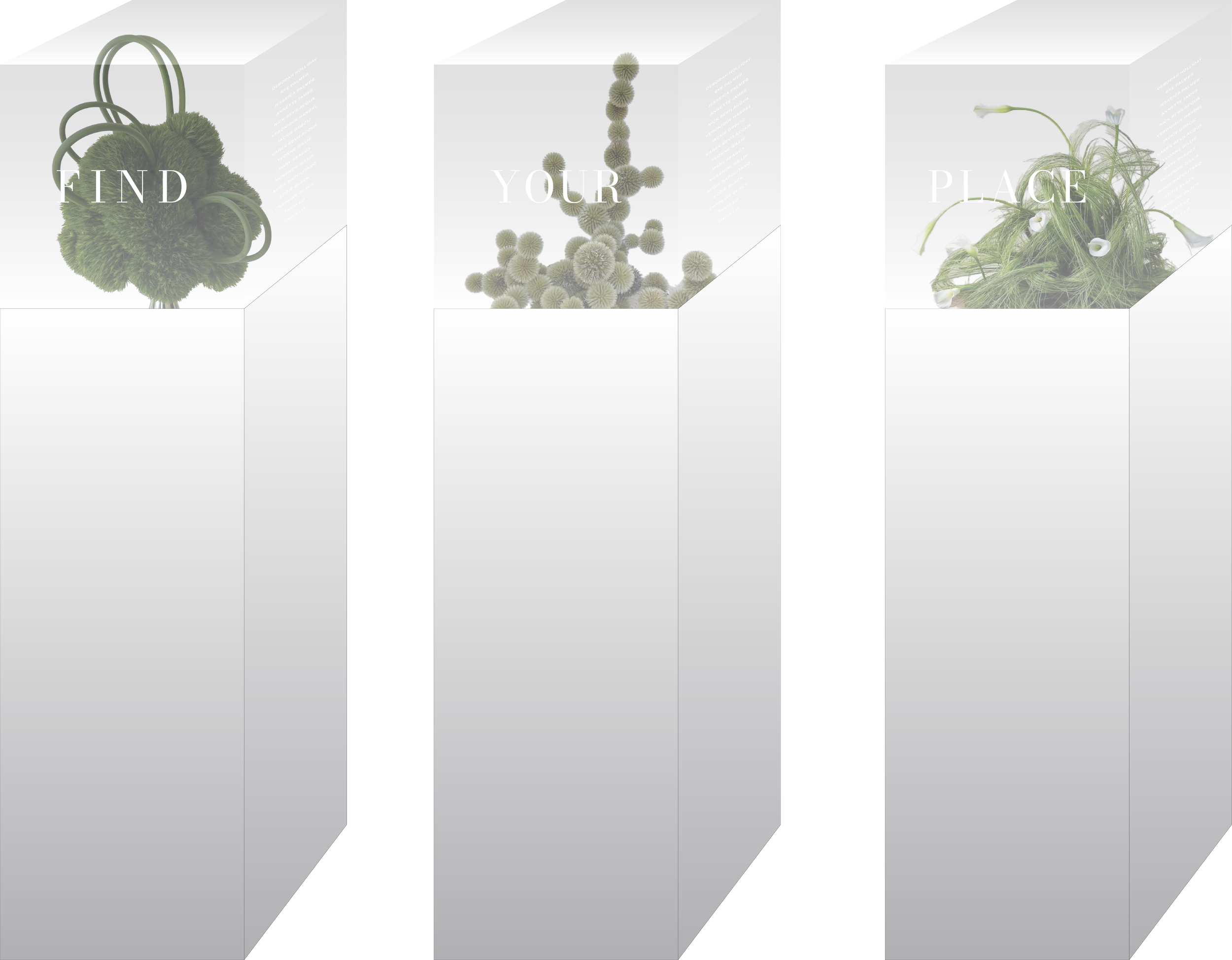
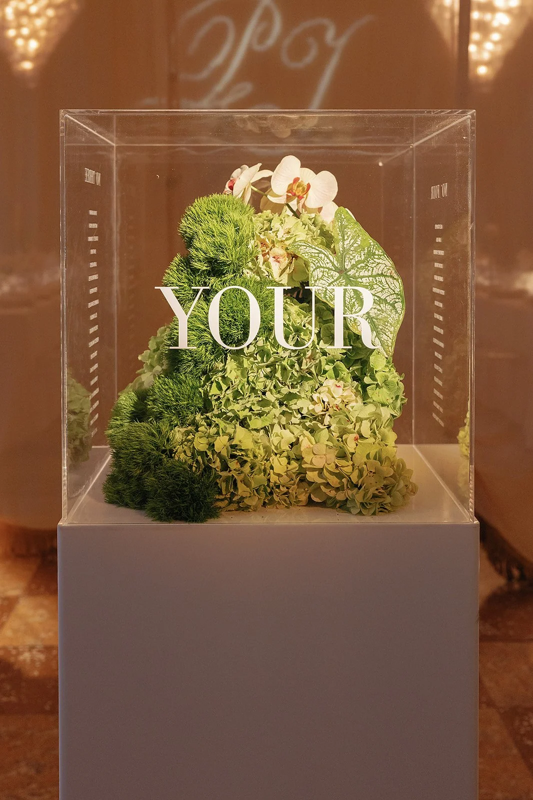
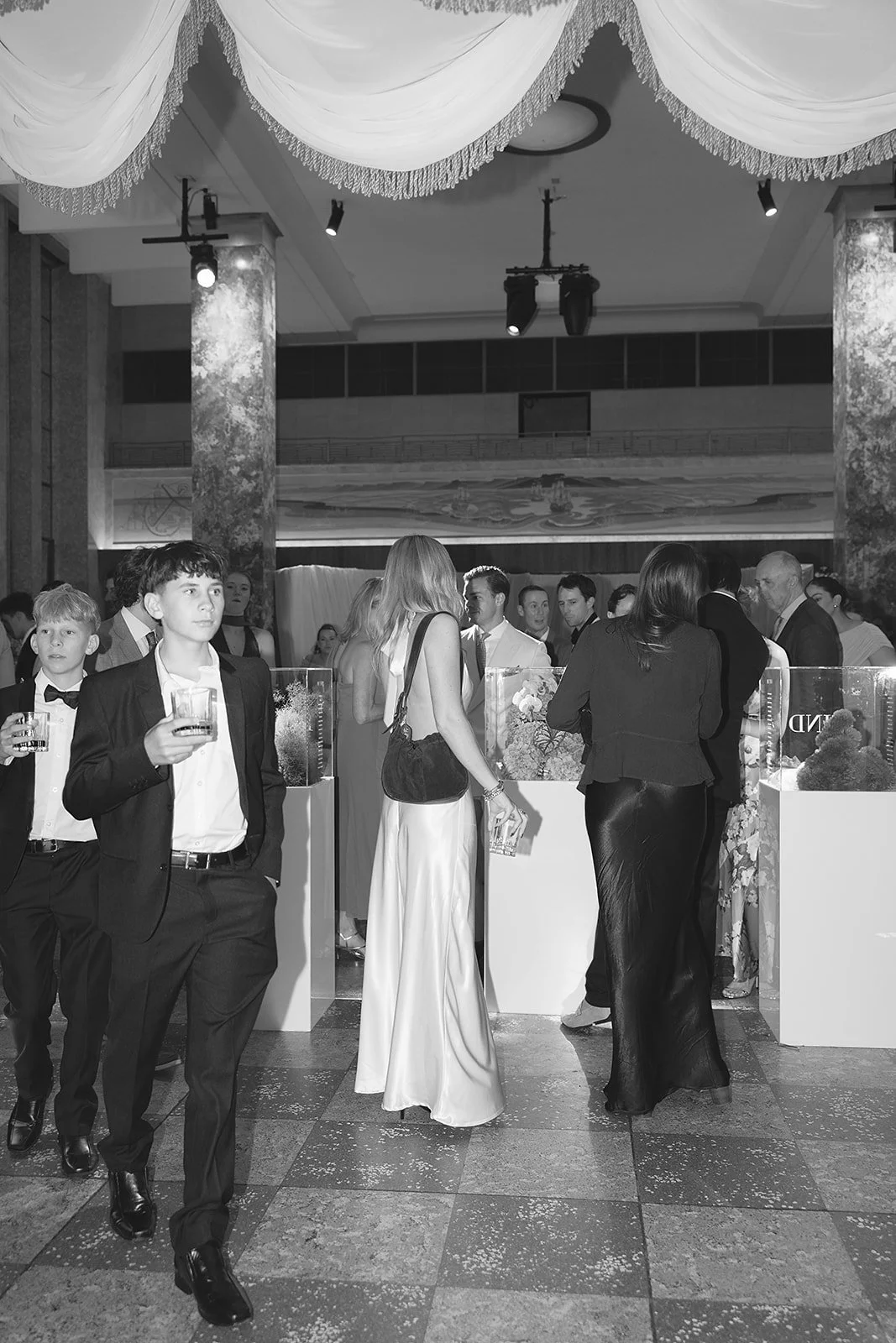
Inspired by museum display cases, the seating chart became an installation rather than a printed board. Three acrylic plinths displayed sculptural floral arrangements, inviting guests to explore each piece in search of their name. Blurring the line between wayfinding and exhibition, the installation transformed arrival into an immersive experience.
Sculptural Bar Menu
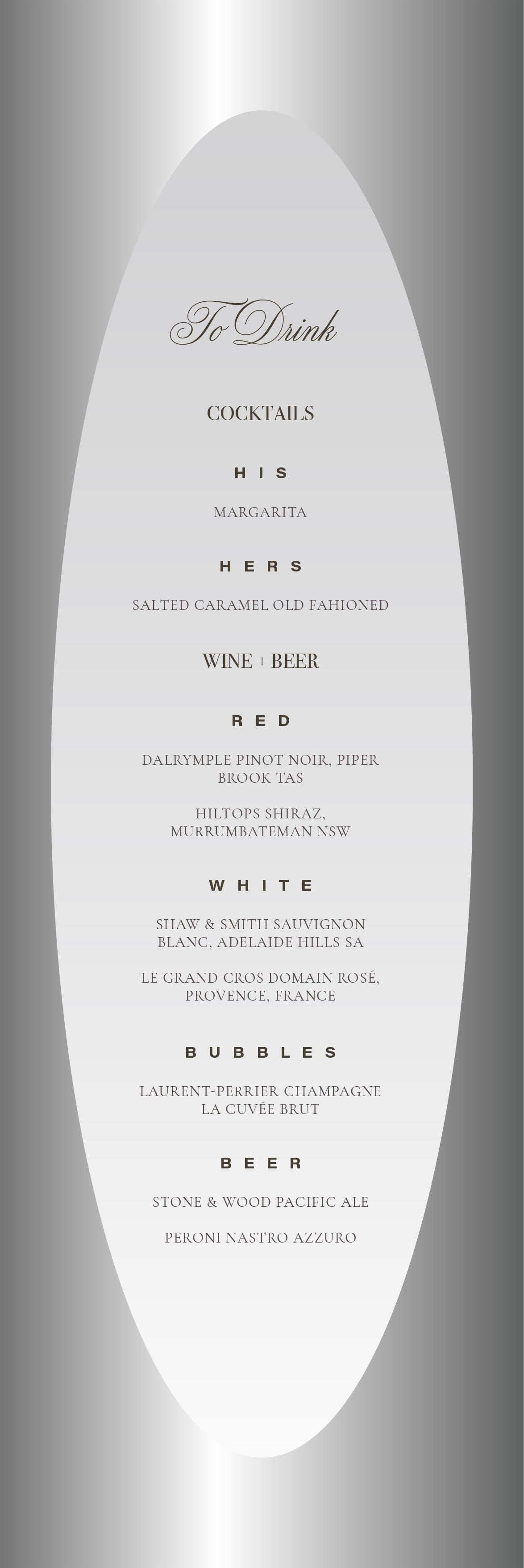
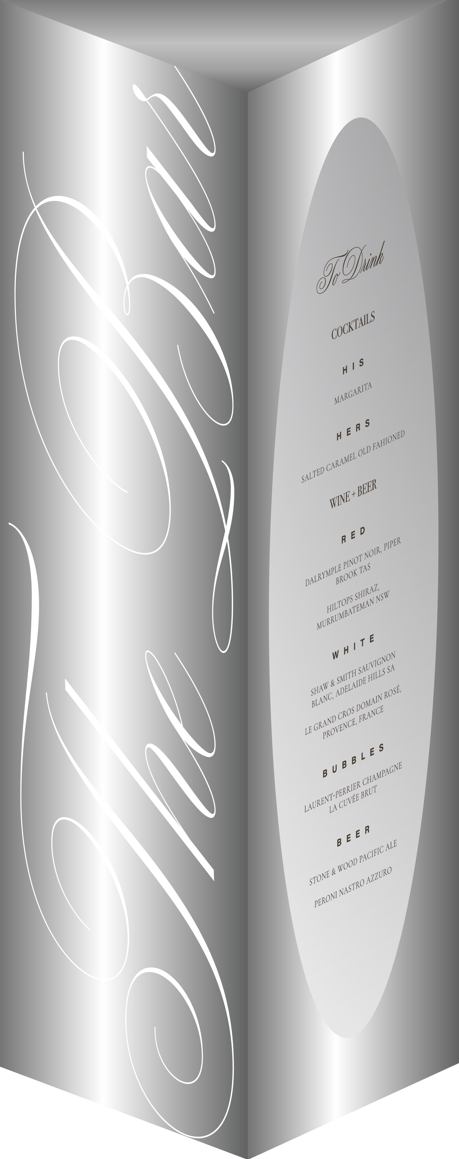
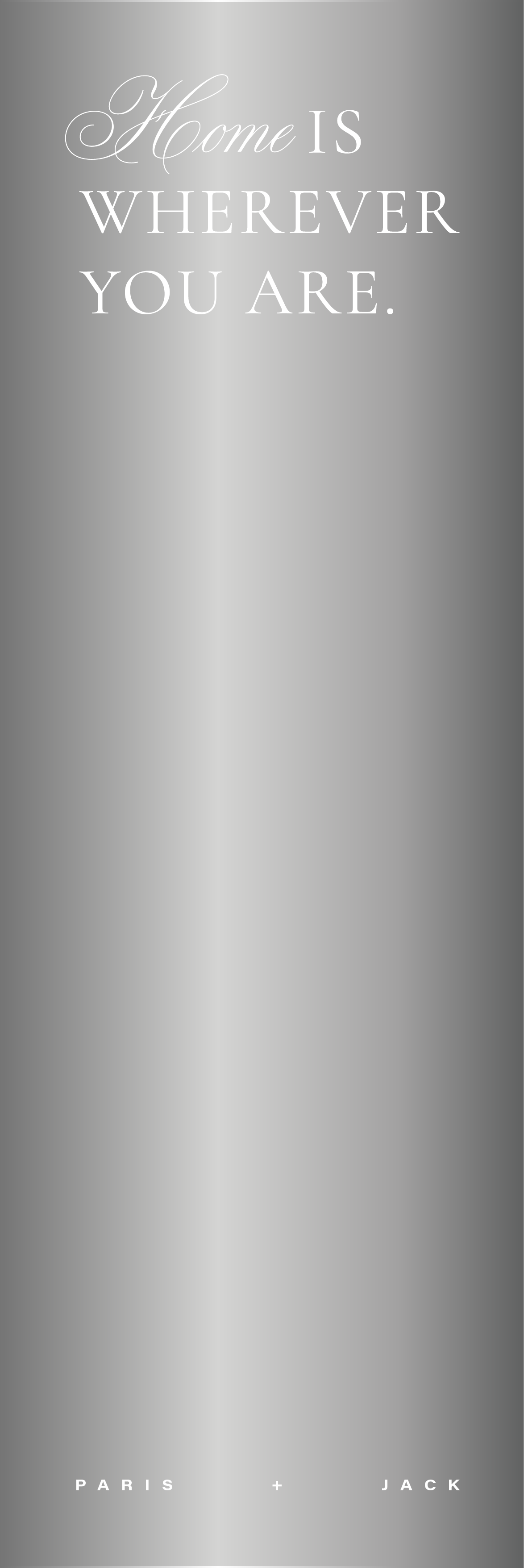
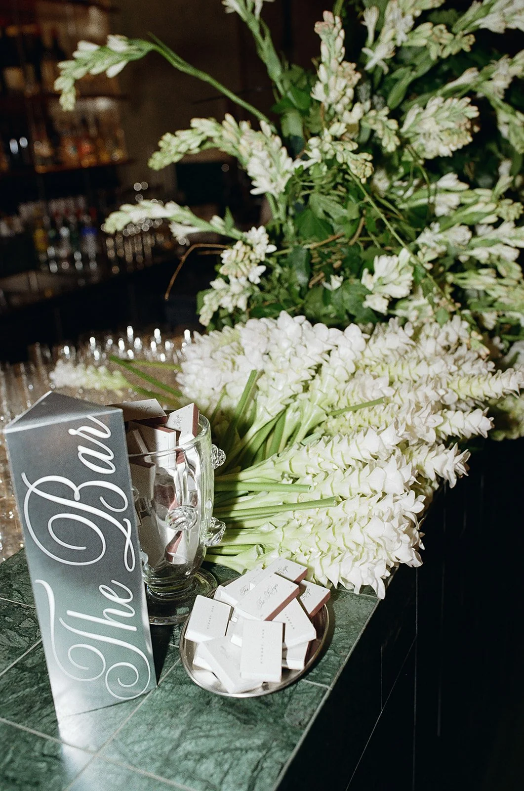
Designed as a sculptural object rather than a traditional bar menu, the folded chrome prism invited guests to pick it up and engage with it from every angle. Reflective stock and oversized typography echoed the gallery setting, transforming a functional menu into a tactile extension of the identity.
Layered Details
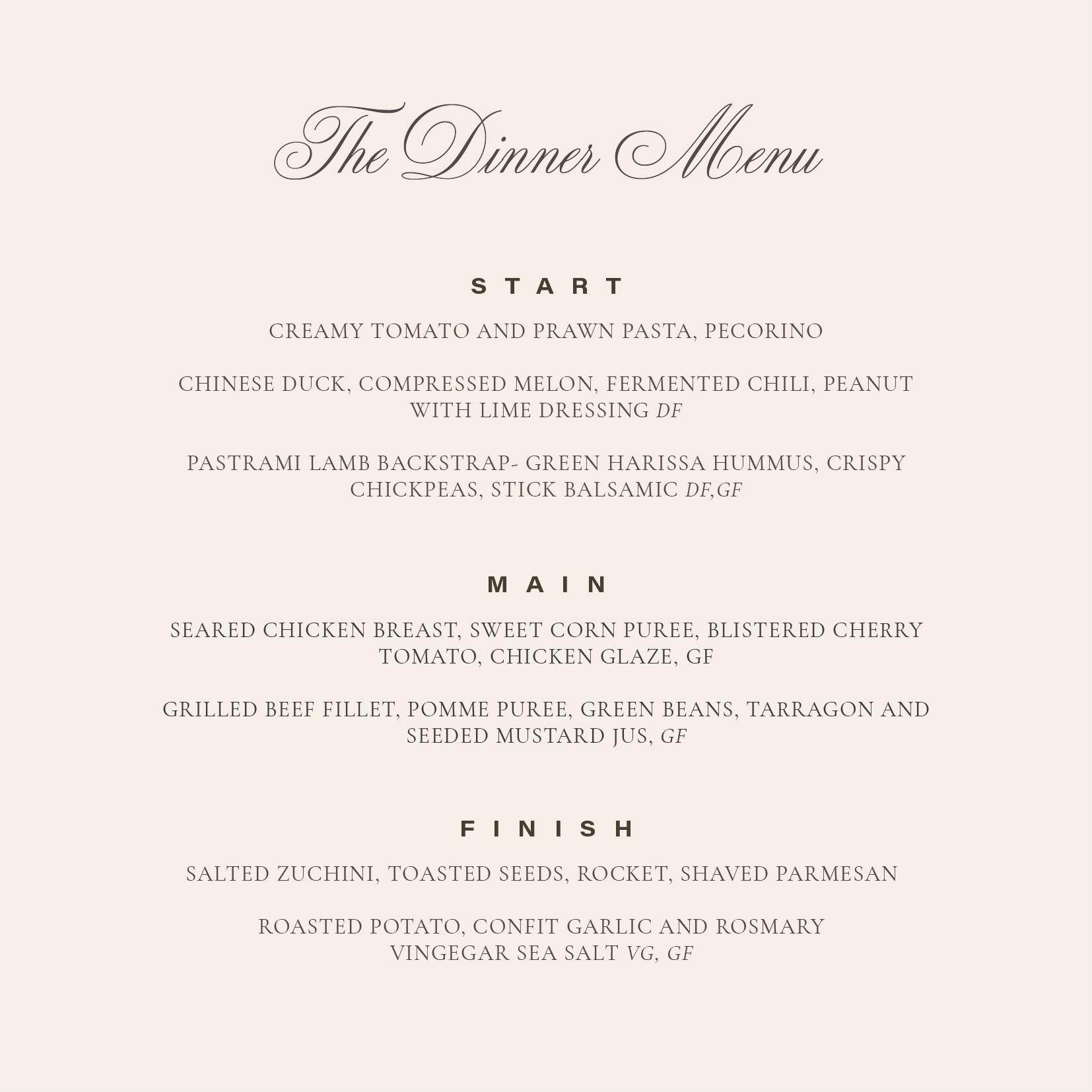

The menu extended the identity's material language through layers of translucent vellum, silver foil and tactile finishes. Secured with a silver stud, it invited guests to uncover the menu beneath, turning an everyday object into a considered moment of interaction.
The Experience