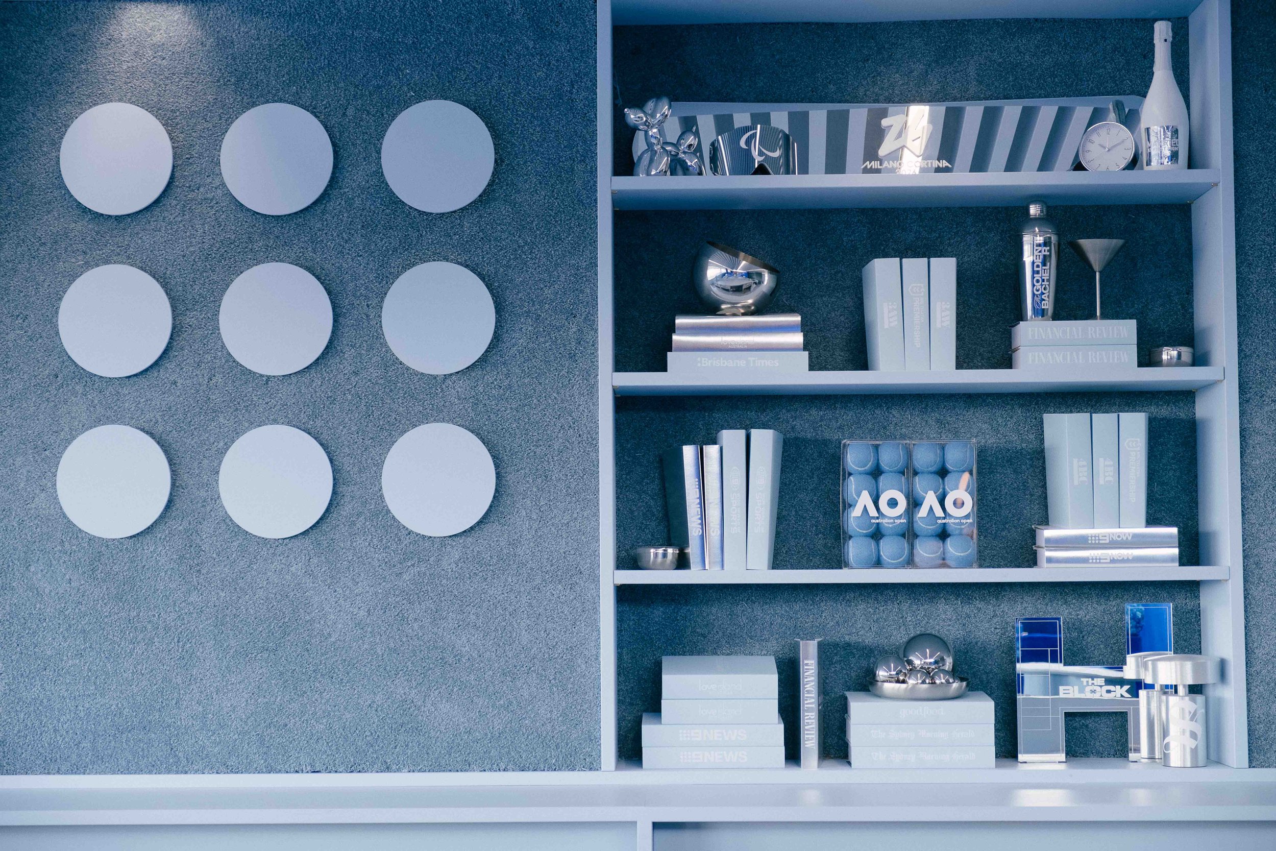
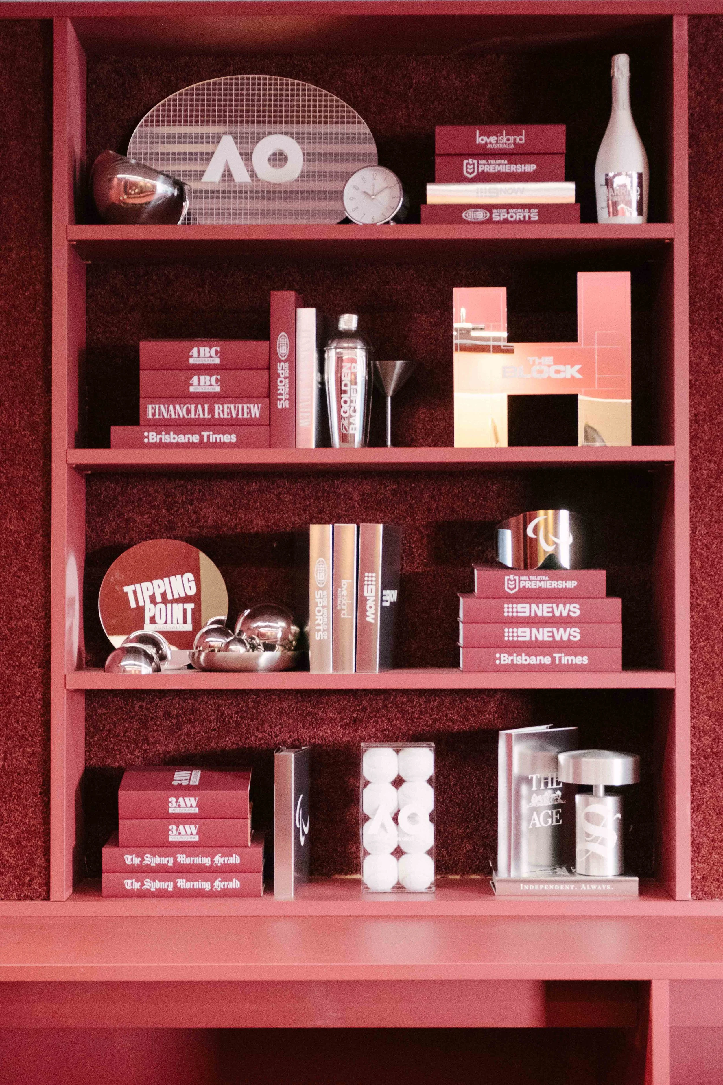
objects of nine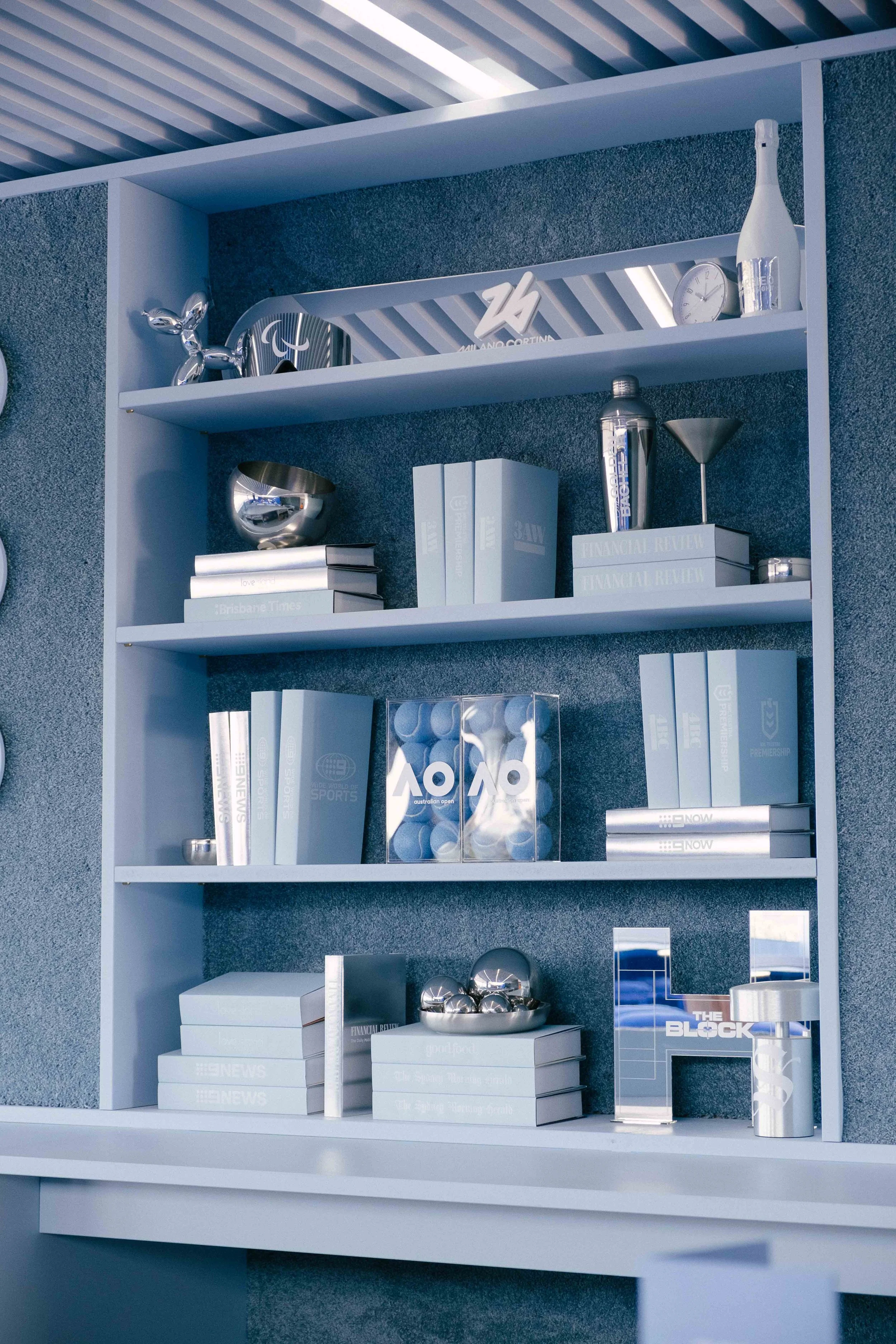
The Brief
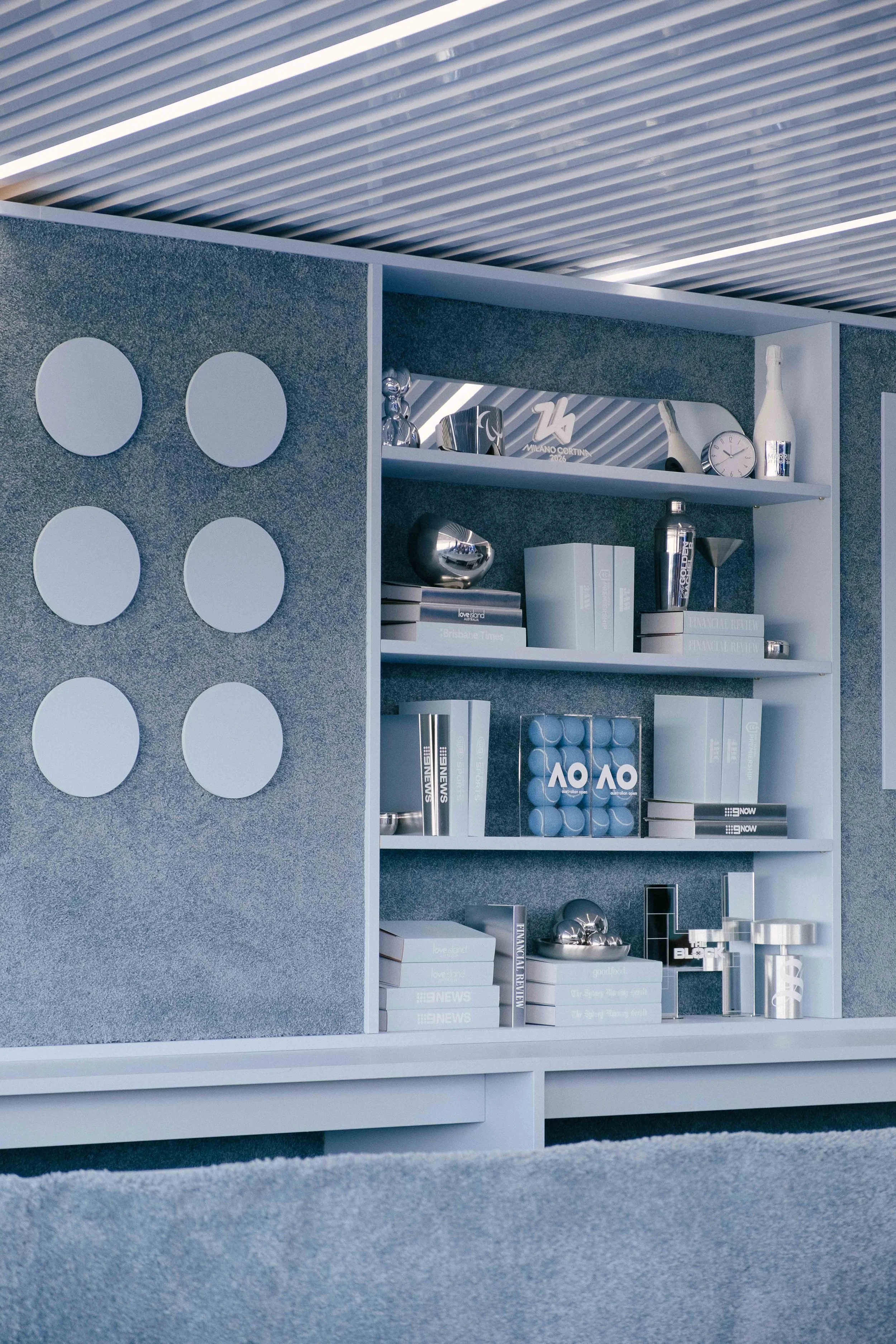
Develop a hero installation that represented more than 20 of Nine's brands within a single visual language. The challenge was to balance recognisable brand references with a cohesive aesthetic, creating an installation where every object felt distinct while sitting seamlessly within the wider Nine VRC marquee experience.
CLIENT
Nine
Installation Design • Bespoke Object Design • Graphic Design • Prop Styling • Production Artwork
Event Planner & Stylist: Ed & Ed Studio
Design Concept
The initial concept explored how brands could be experienced through objects rather than logos. Inspired by collectible design, architectural interiors and carefully curated retail environments, I established a visual language built around materiality, symbolism and sculptural form before translating each identity into a bespoke object.
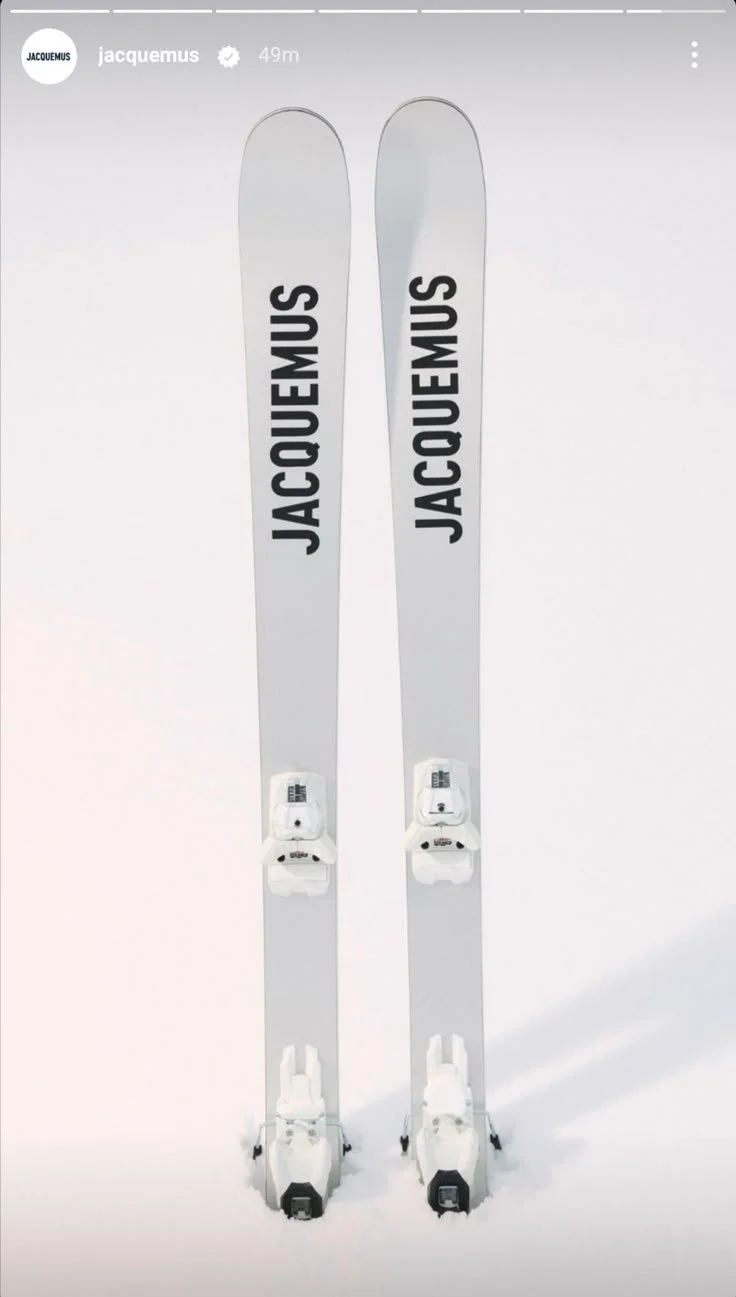
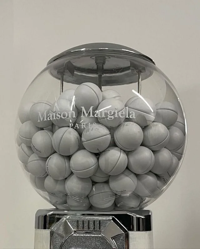
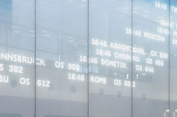
PRECISION — ORDER, RHYTHM AND GRAPHIC CLARITY.
COLLECTIBLES — EVERYDAY OBJECTS ELEVATED THROUGH CURATION.
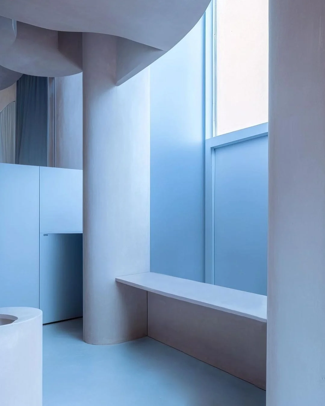
SYMBOLOGY — RECOGNISABLE OBJECTS AS VISUAL SHORTHAND FOR A BRAND.
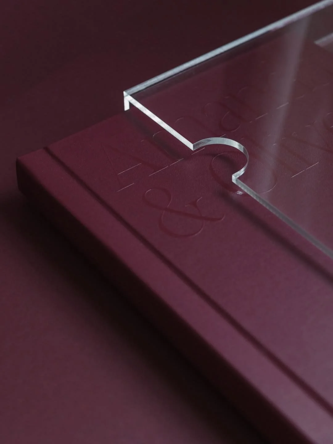
MINIMALISM — REFINED INTERIORS AND ARCHITECTURAL RESTRAINT.
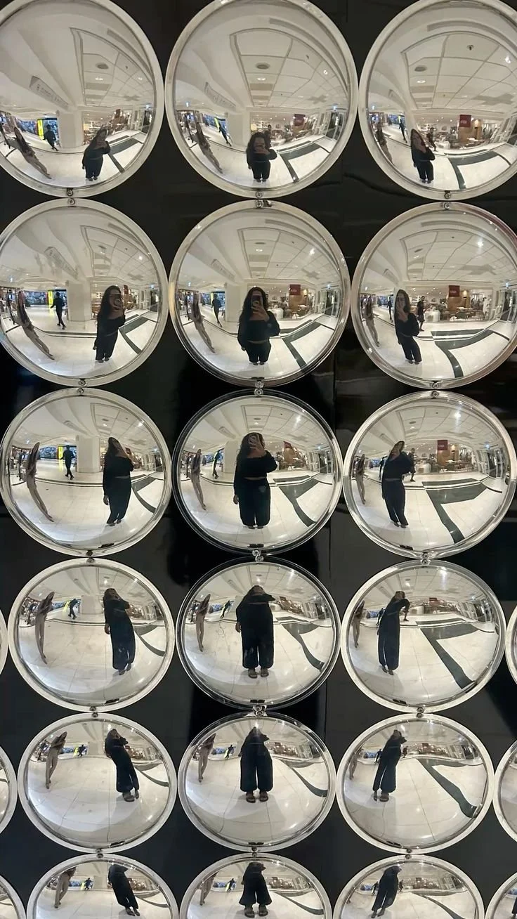
MATERIALITY — CHROME, ACRYLIC AND TACTILE FINISHES.
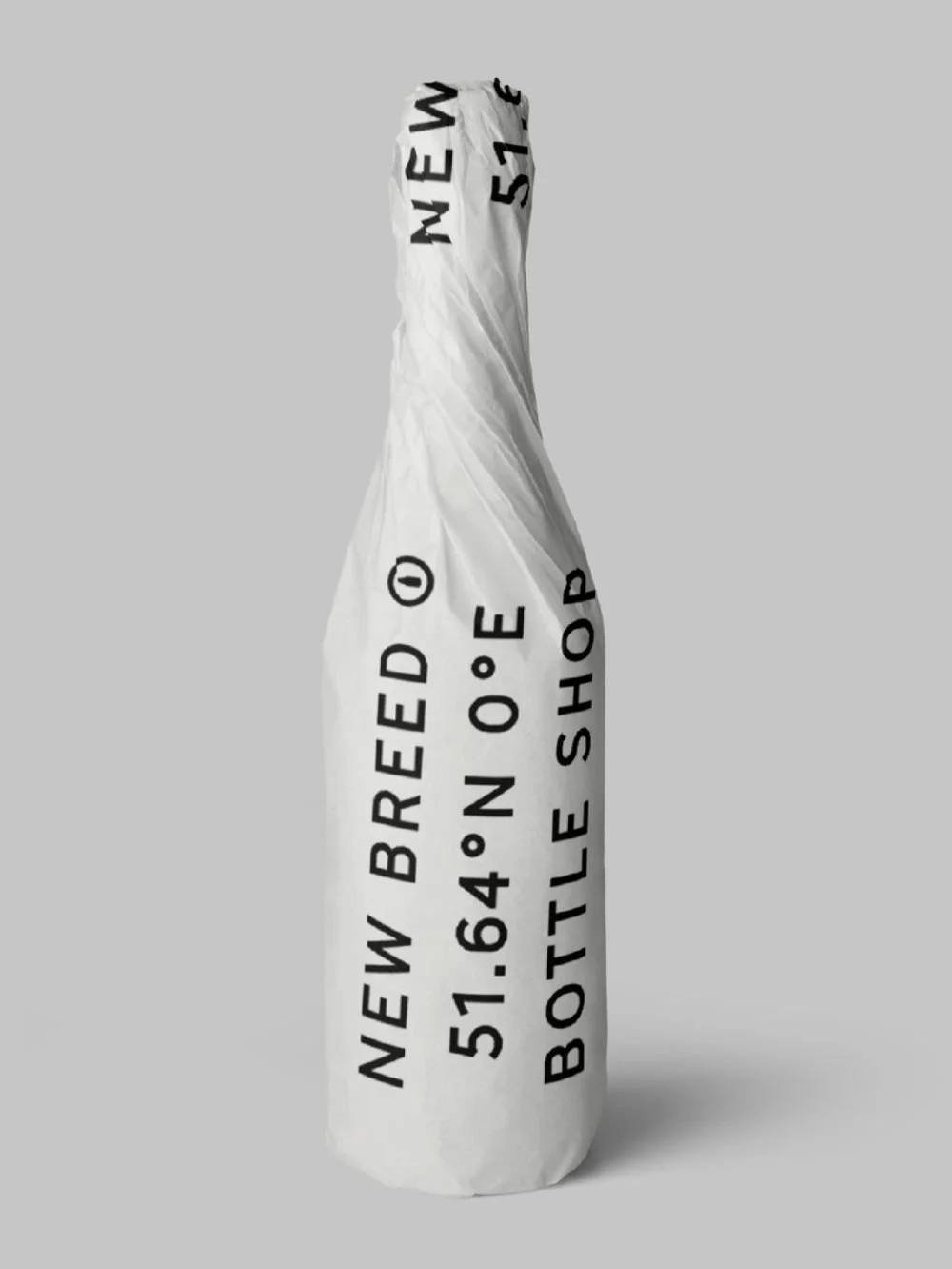
MODULARITY — REPETITION, GRID SYSTEMS AND SCULPTURAL FORM.
CELEBRATION — OBJECTS THAT MARK A MOMENT.
Visual Exploration
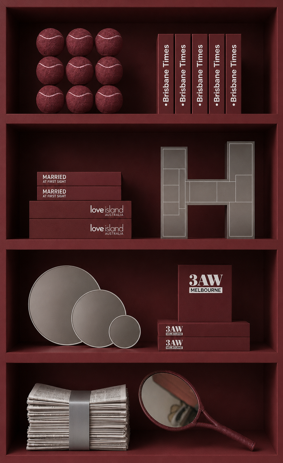
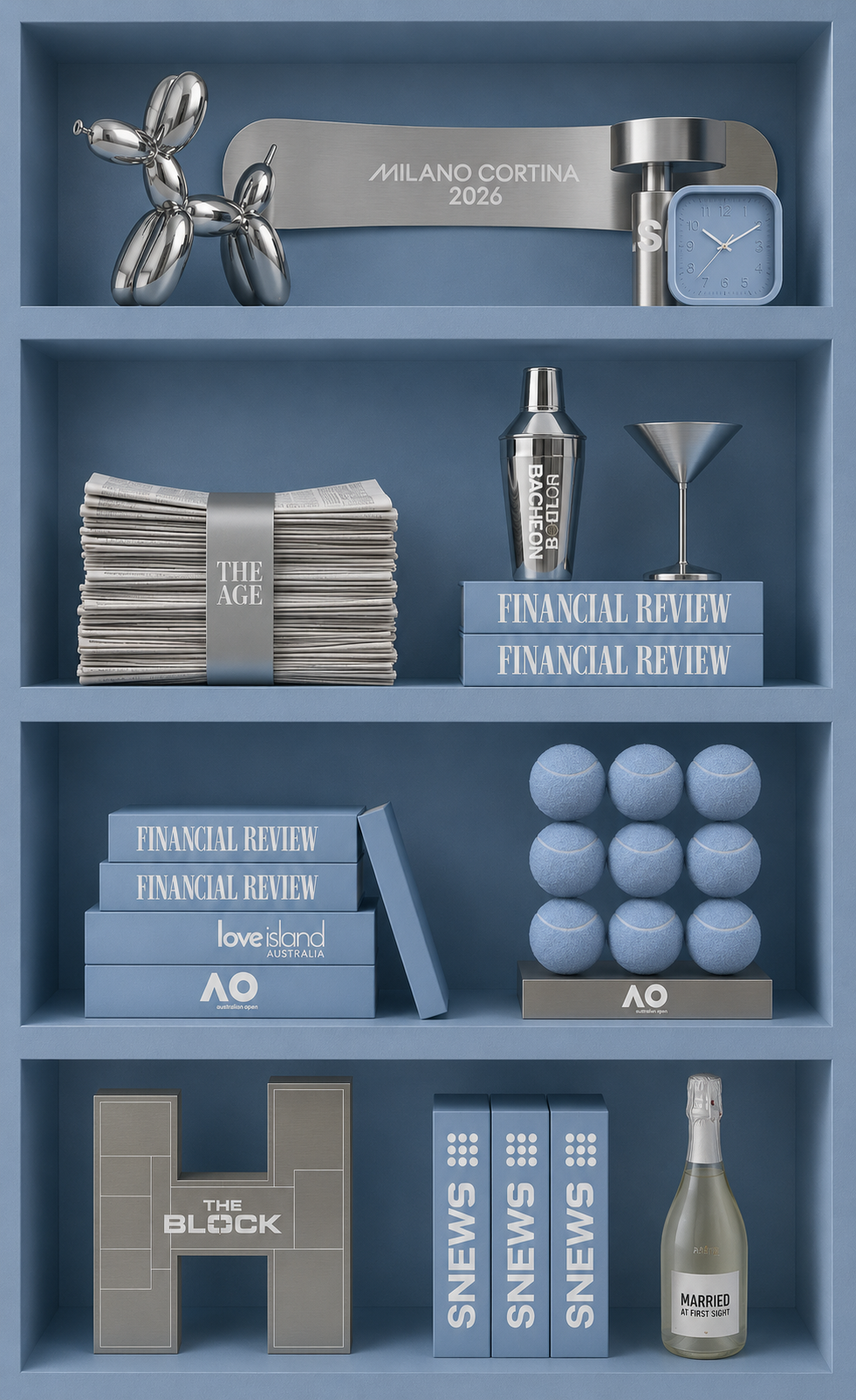
With more than 20 brands to represent, concept exploration became a critical part of the process. I tested colour palettes, object pairings, materials and compositions to understand how each brand could sit alongside the next. Through iteration, the collection evolved into a balanced system where every object felt recognisable on its own while contributing to the installation as a whole.
Bespoke Objects
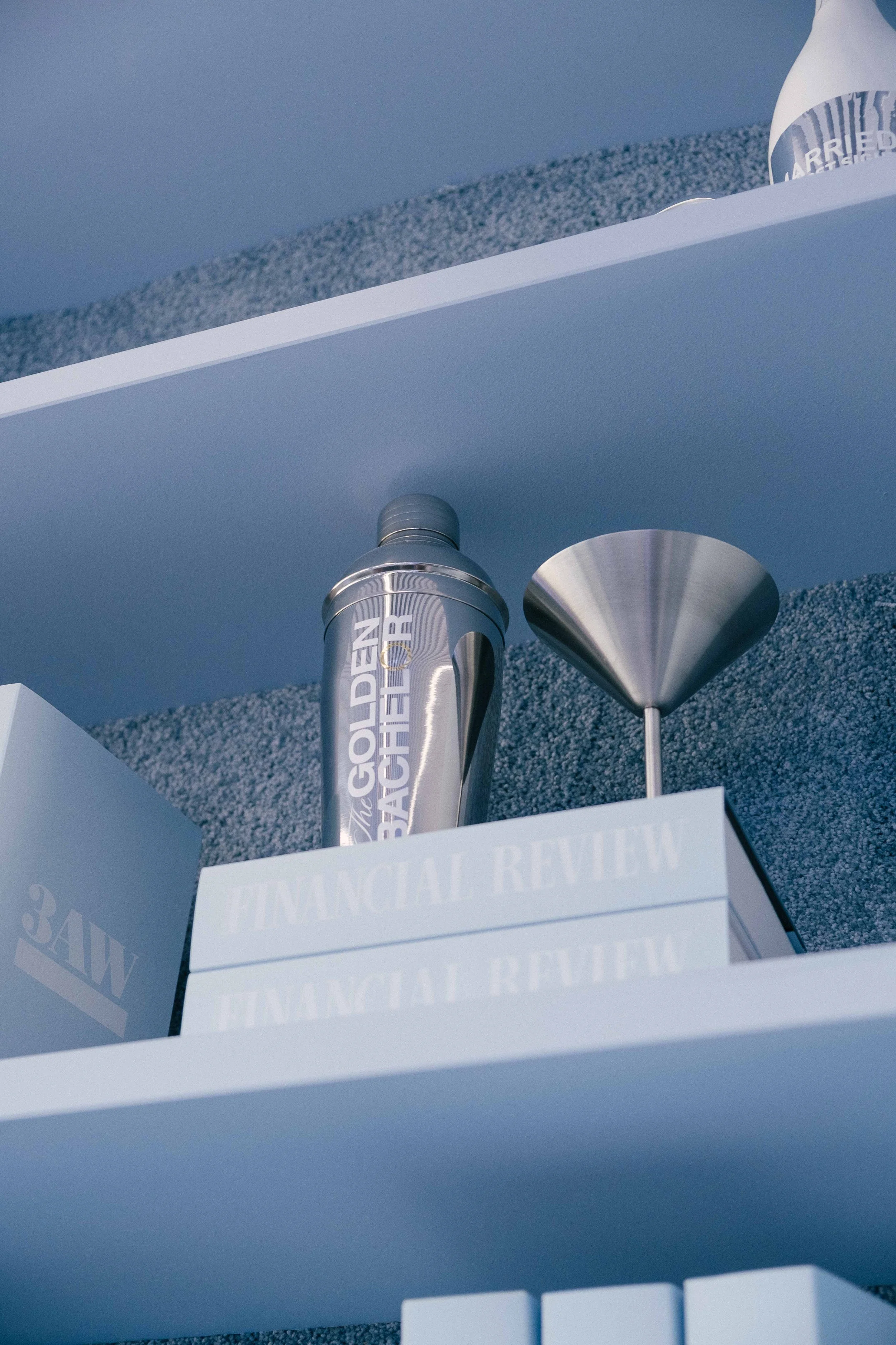
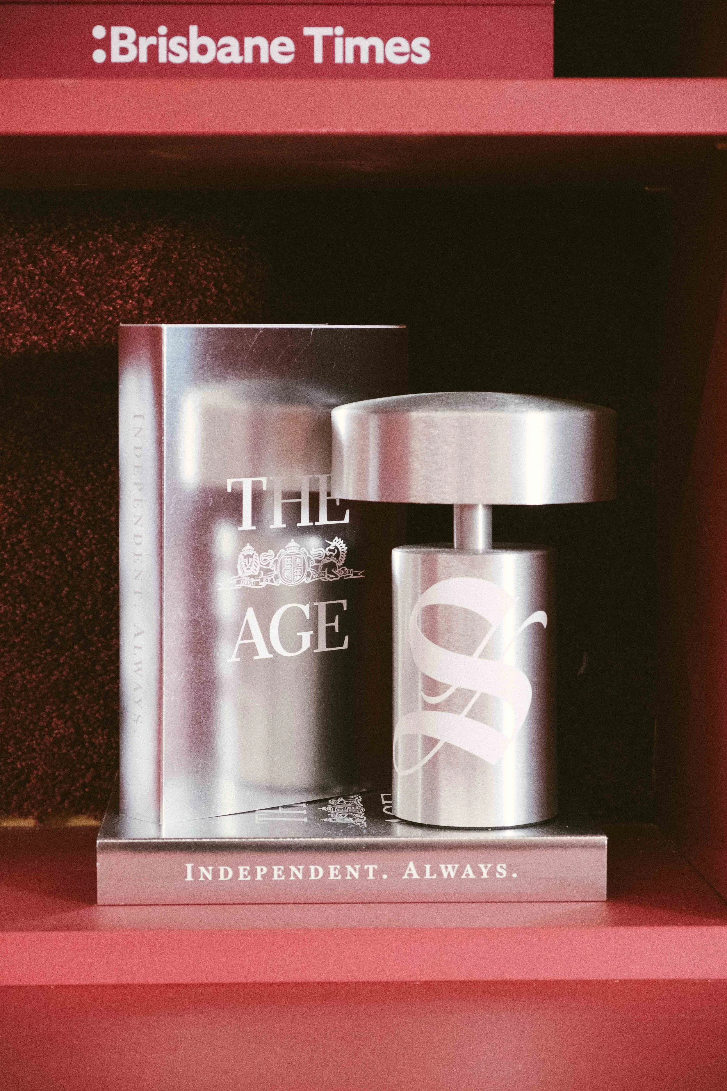
Each object was developed as a three-dimensional interpretation of a brand rather than a direct representation of its logo. By focusing on recognisable characteristics, materials and cultural references, every piece became both a standalone design object and part of a larger curated collection.
The Block
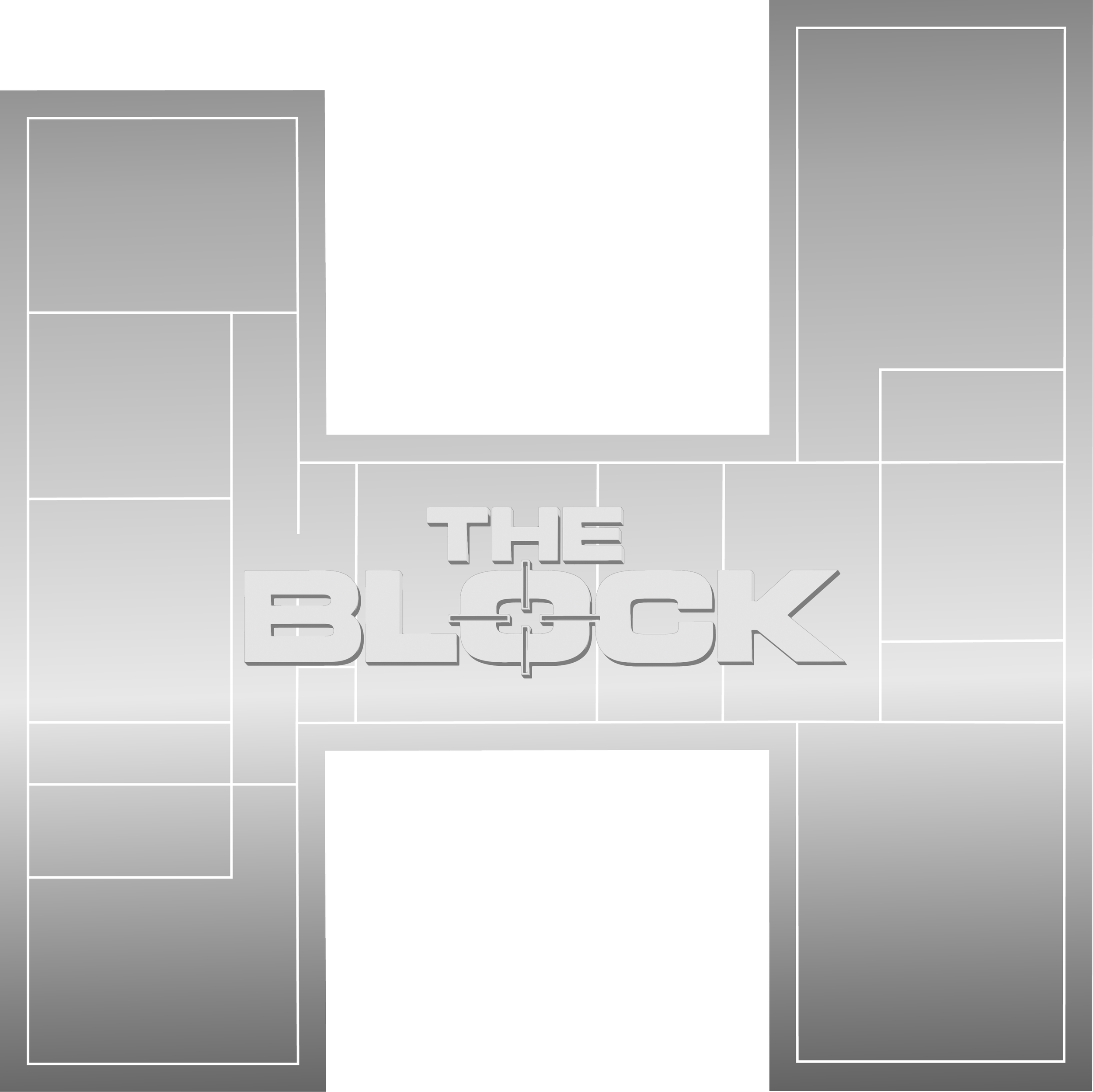
The Block was interpreted through its foundation in architecture rather than its logo. Inspired by the 2025 floor plan, the sculpture transforms a technical drawing into a refined geometric object. Dimensional lettering and a chrome finish elevate it into a collectible design piece.

Winter Olympics
A snowboard was chosen as one of the Winter Olympics' most recognisable symbols. Reduced to a monochromatic palette with subtle raised branding, the piece celebrates the craftsmanship of the sport while transforming sporting equipment into a sculptural object.
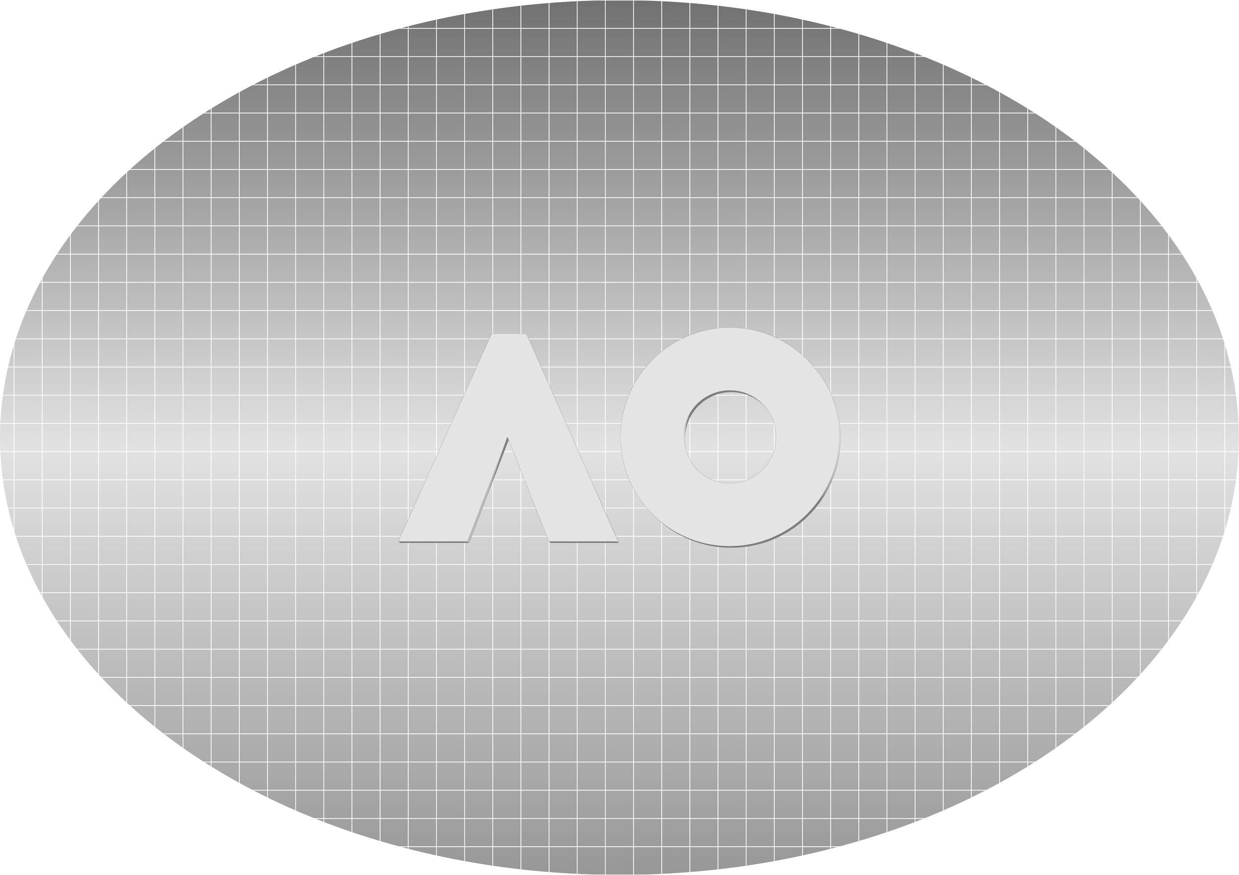
Australian Open
For the Australian Open, I wanted to move beyond a literal sporting object. The iconic silhouette of a tennis racket was distilled into a clean geometric form, with the grid pattern subtly referencing the strings. This retained instant recognition while transforming the racket into a refined sculptural object.