the Ndukwe editThe Brief
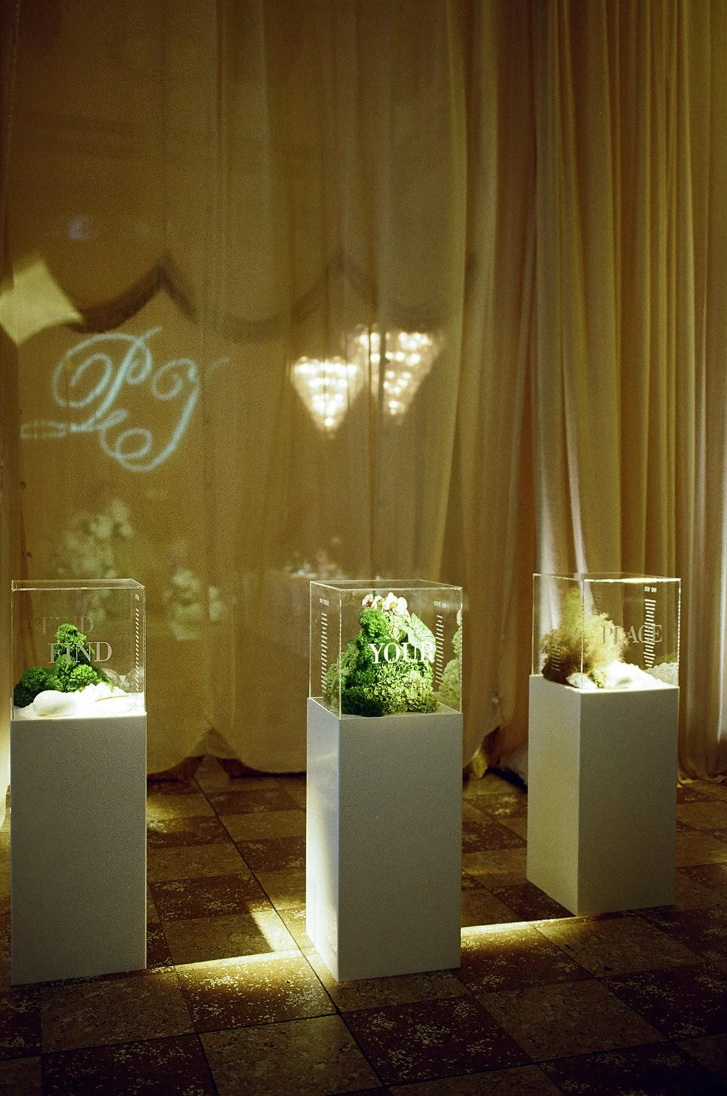
Develop a wedding identity that felt contemporary without losing its sense of occasion. The challenge was creating a visual language that moved away from traditional wedding branding while subtly celebrating the couple's heritage and carrying consistently from invitation to reception.
CLIENT
Paloma Events
Event Brand Identity • Logo Design • Illustration • Print Design • Signage Design • Production Artwork
Event Planner & Stylist: Paloma Event
Photography: Hungry Hearts Co
Logo & Identity
The couple wanted to avoid a traditional wedding logo, so I began by creating a contemporary identity system that felt abstract rather than ceremonial. An understated monogram provided a recognisable foundation, while an expressive handwritten signature introduced a more personal, editorial quality. Together, the marks created a flexible identity that could shift between refined and intimate across the wedding weekend.

A bespoke monogram designed as a contemporary symbol rather than a traditional wedding crest, creating a recognisable foundation for the identity.
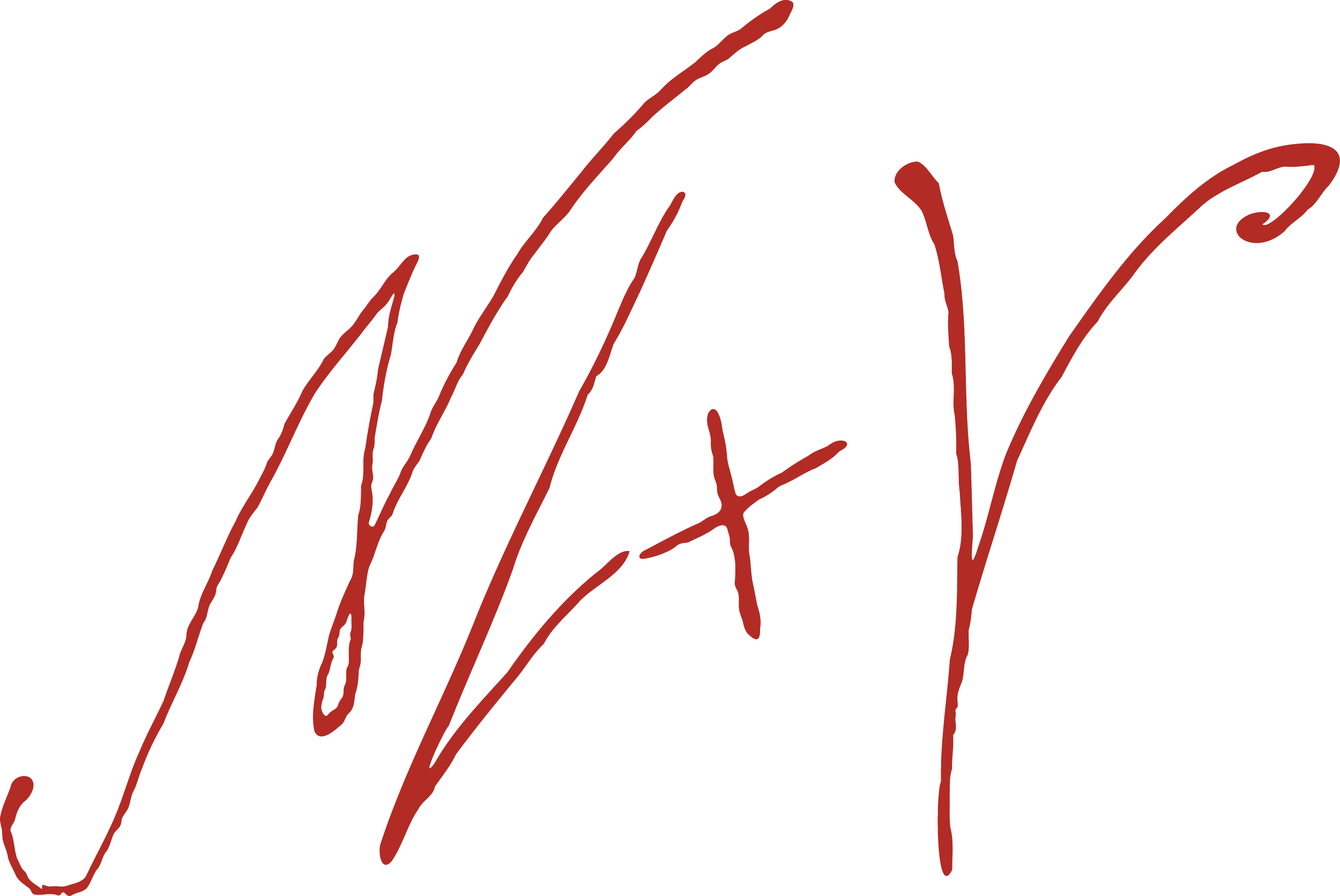
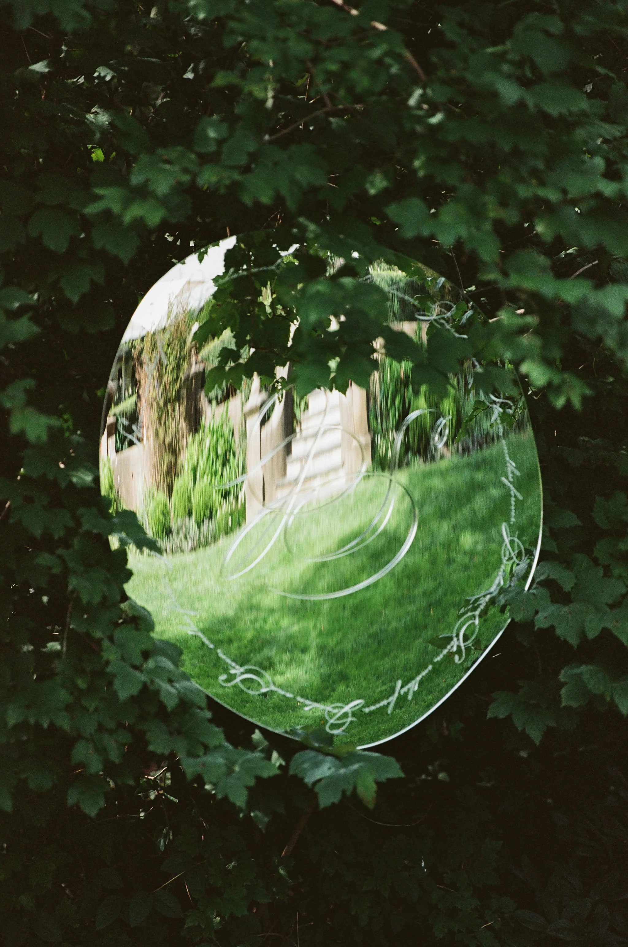
A gestural handwritten mark added warmth and spontaneity, creating a more intimate counterpoint to the refined identity system.
Editorial in Practice
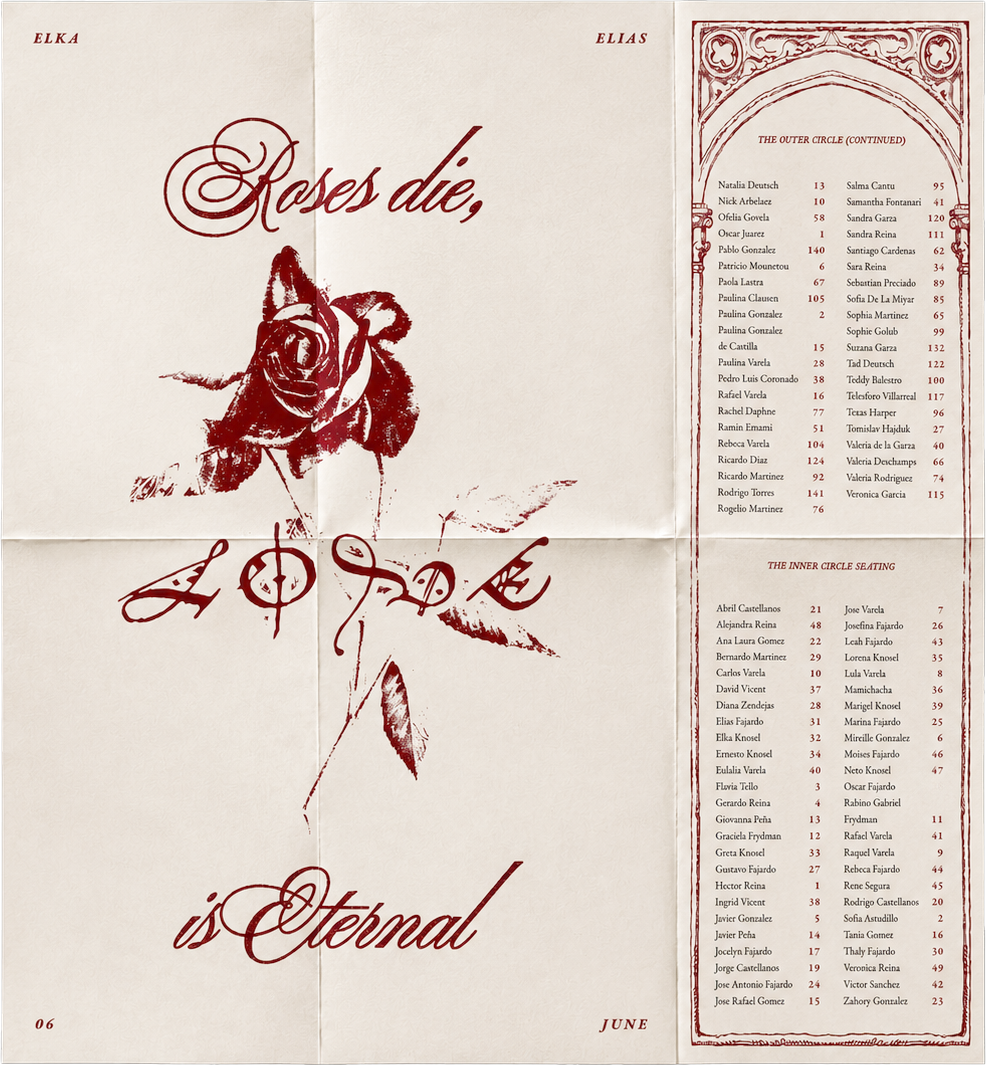
Rather than relying on decorative motifs, the identity came to life through typography, colour, composition and materiality. Applied consistently across every touchpoint, these elements created a visual language that felt refined, contemporary and unmistakably connected.
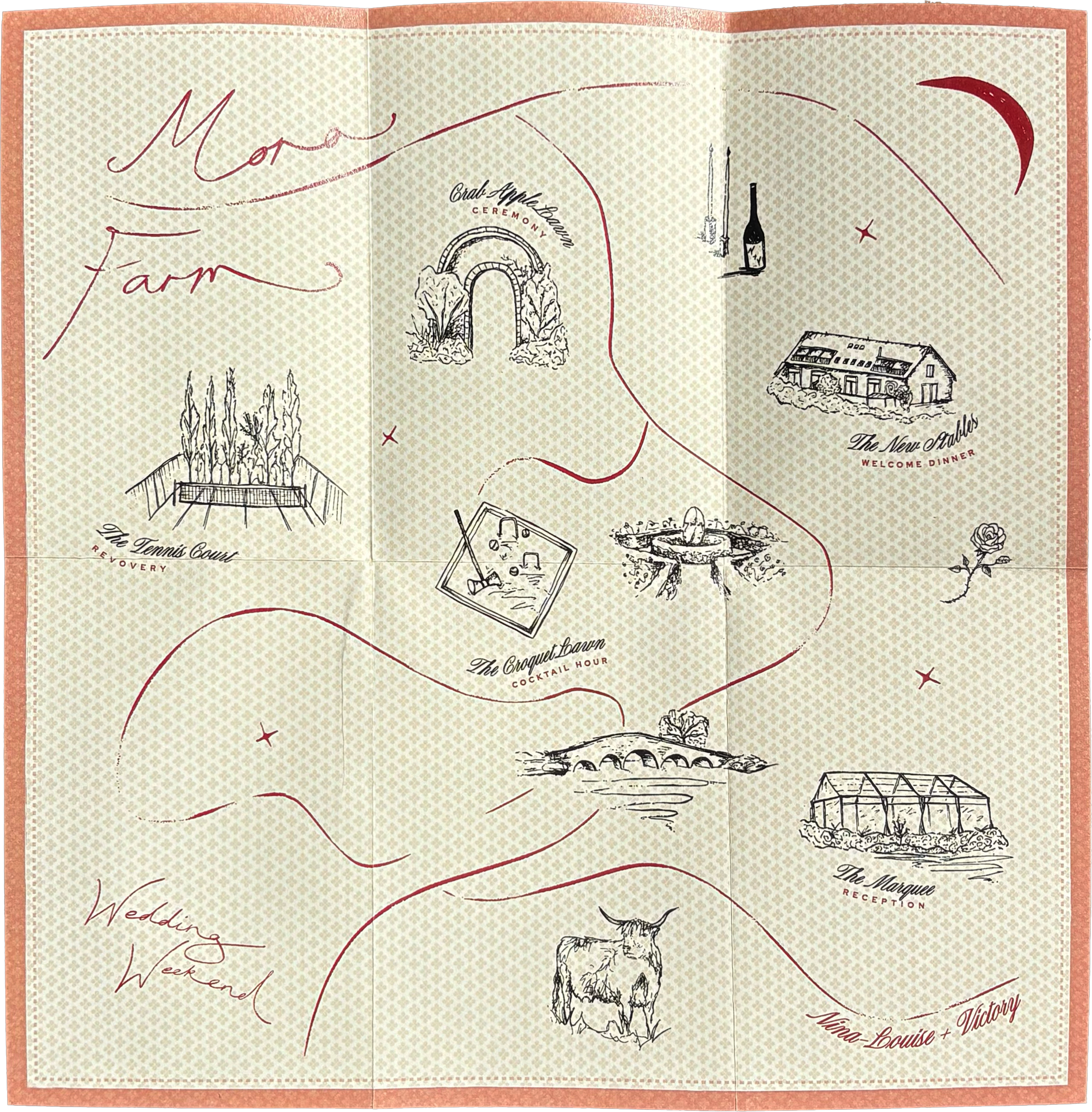
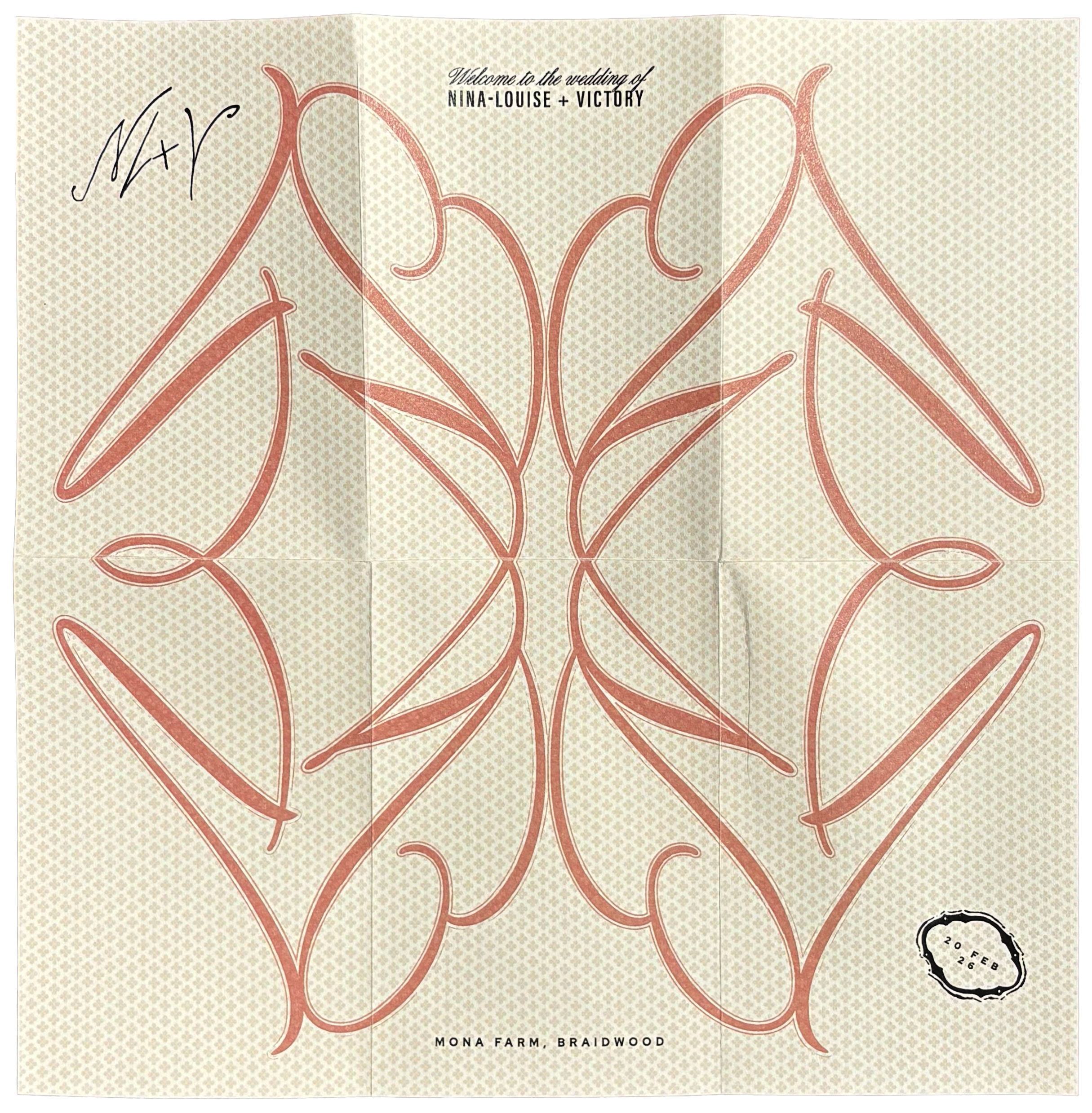
Designed as both a guide and a keepsake, the maps featured hand-drawn illustrations of each location, bringing a sense of craftsmanship and authenticity to the identity. The traditional character of the illustrations balanced the contemporary typography and restrained layouts, creating a deliberate push and pull between heritage and modernity.
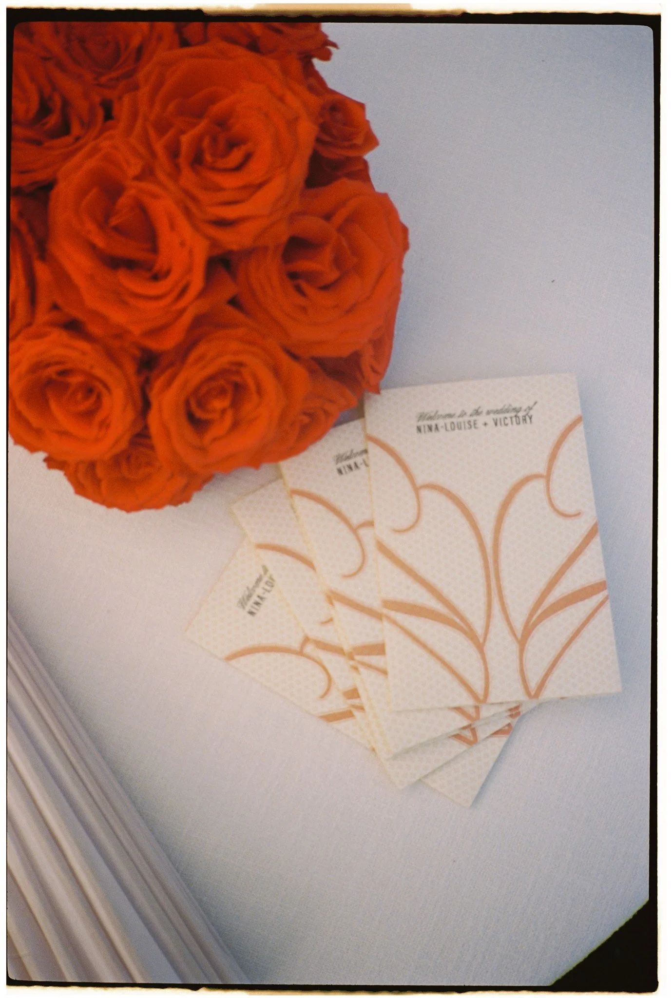
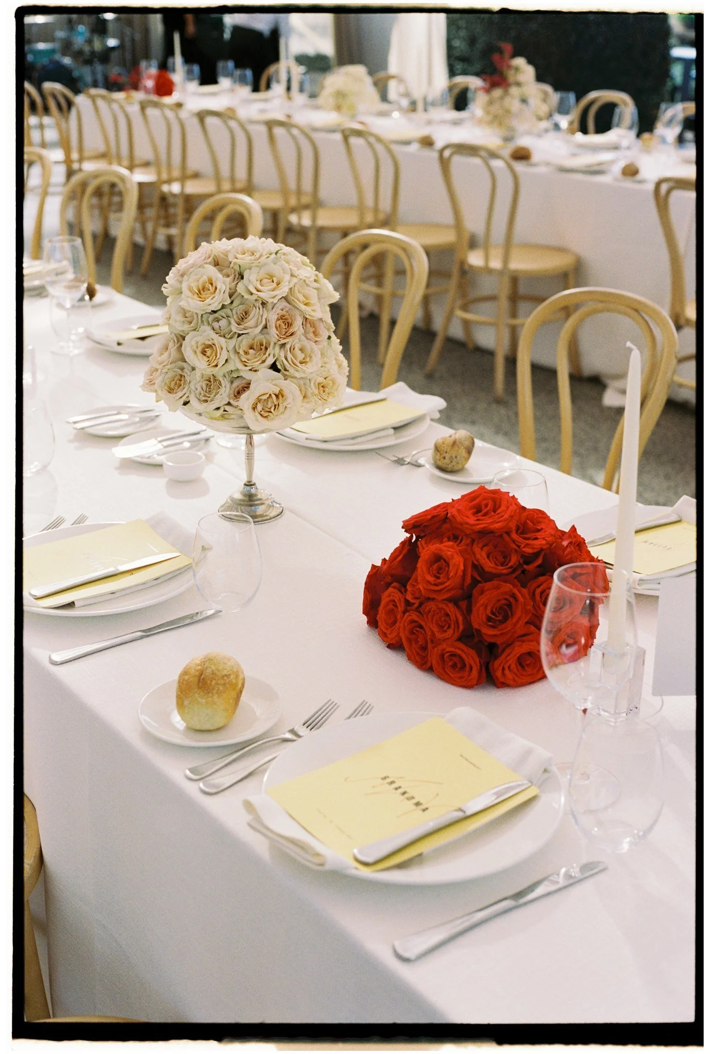
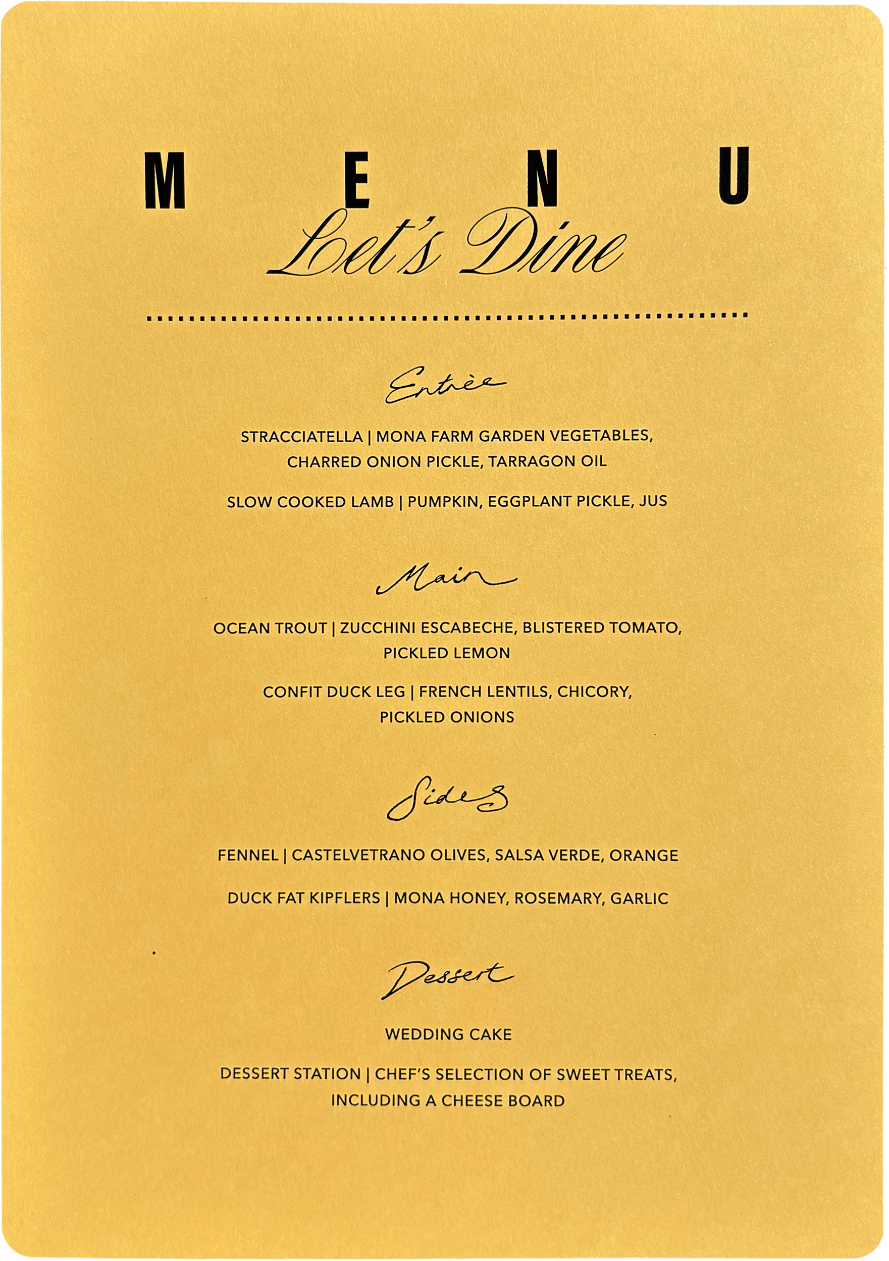
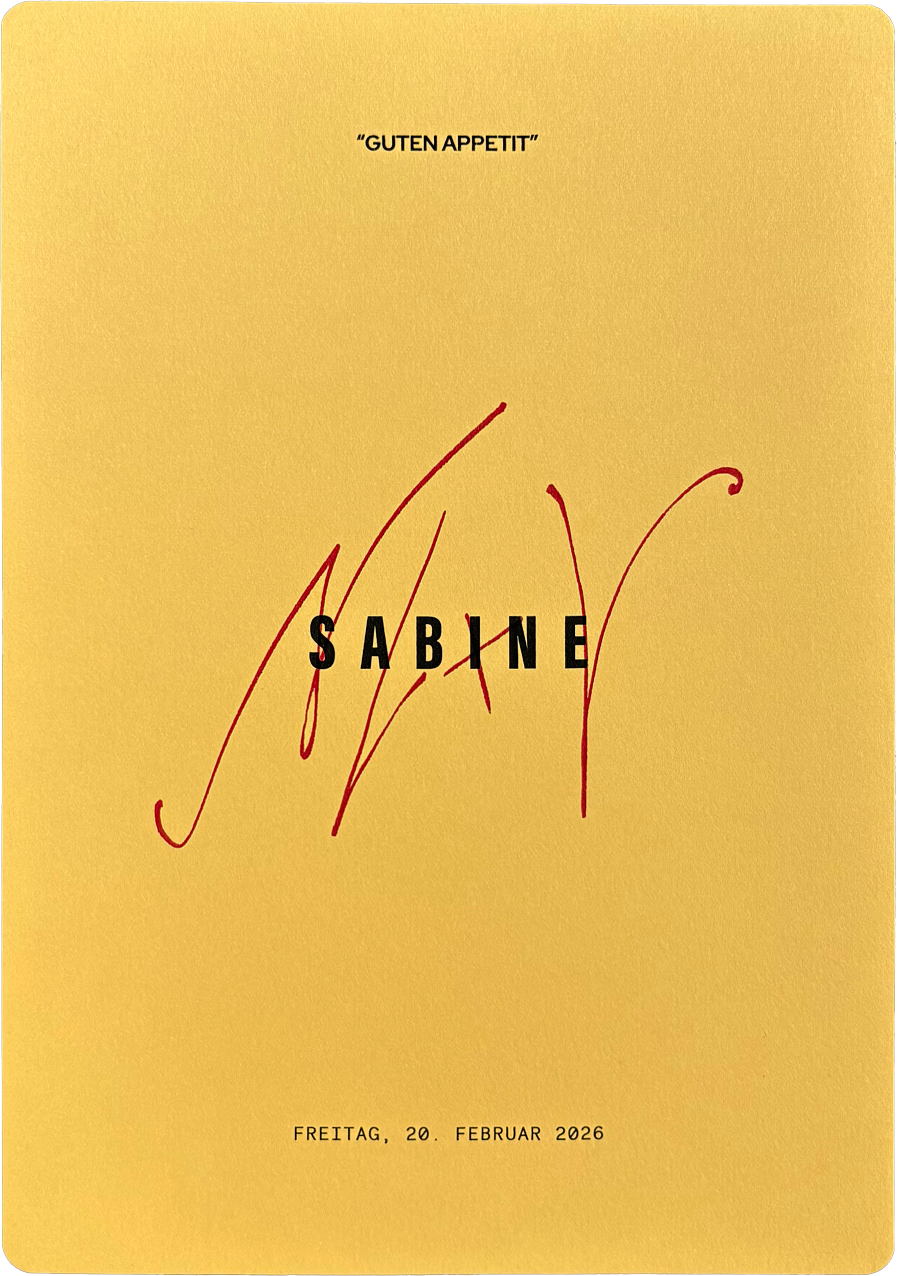
The menus united bold condensed typography, elegant script and expressive handwritten lettering into a composition that felt simultaneously contemporary, timeless and unmistakably personal. A German greeting honoured the bride's heritage, while the couple's monogram sat beneath each guest's name as a subtle extension of the identity.
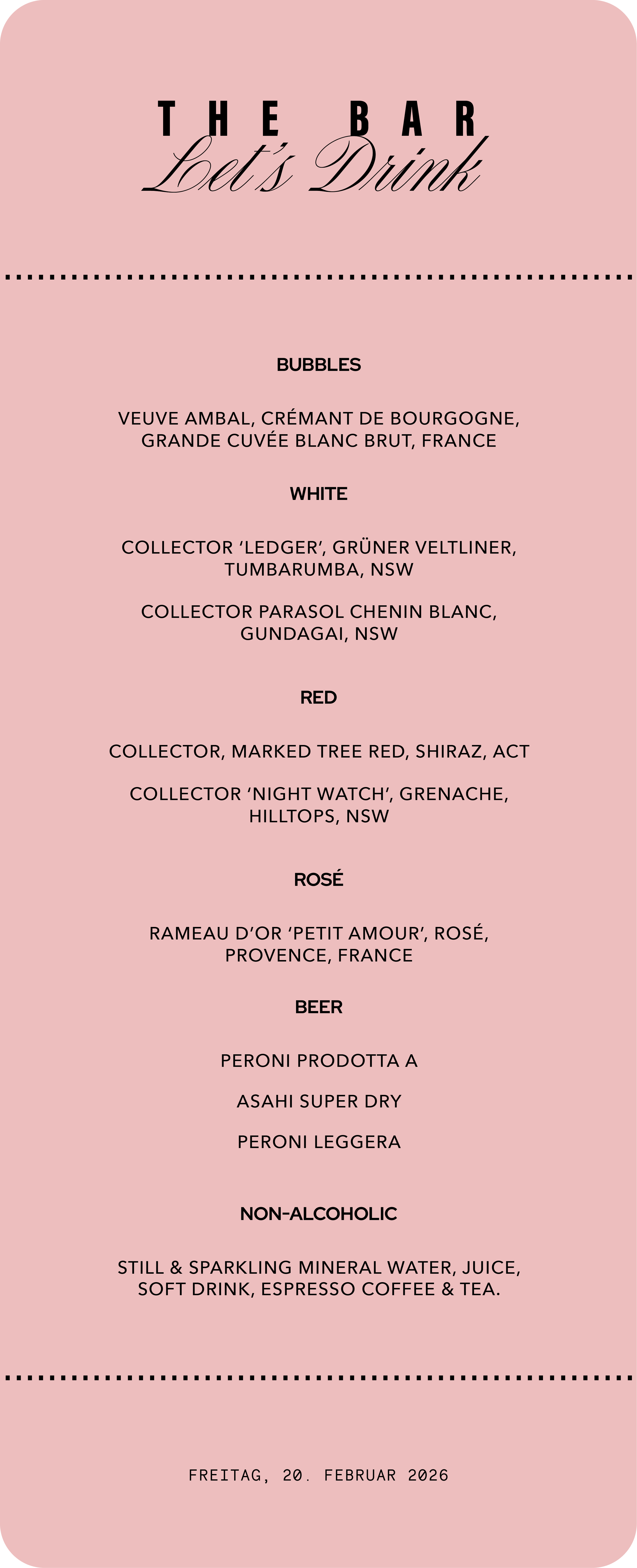
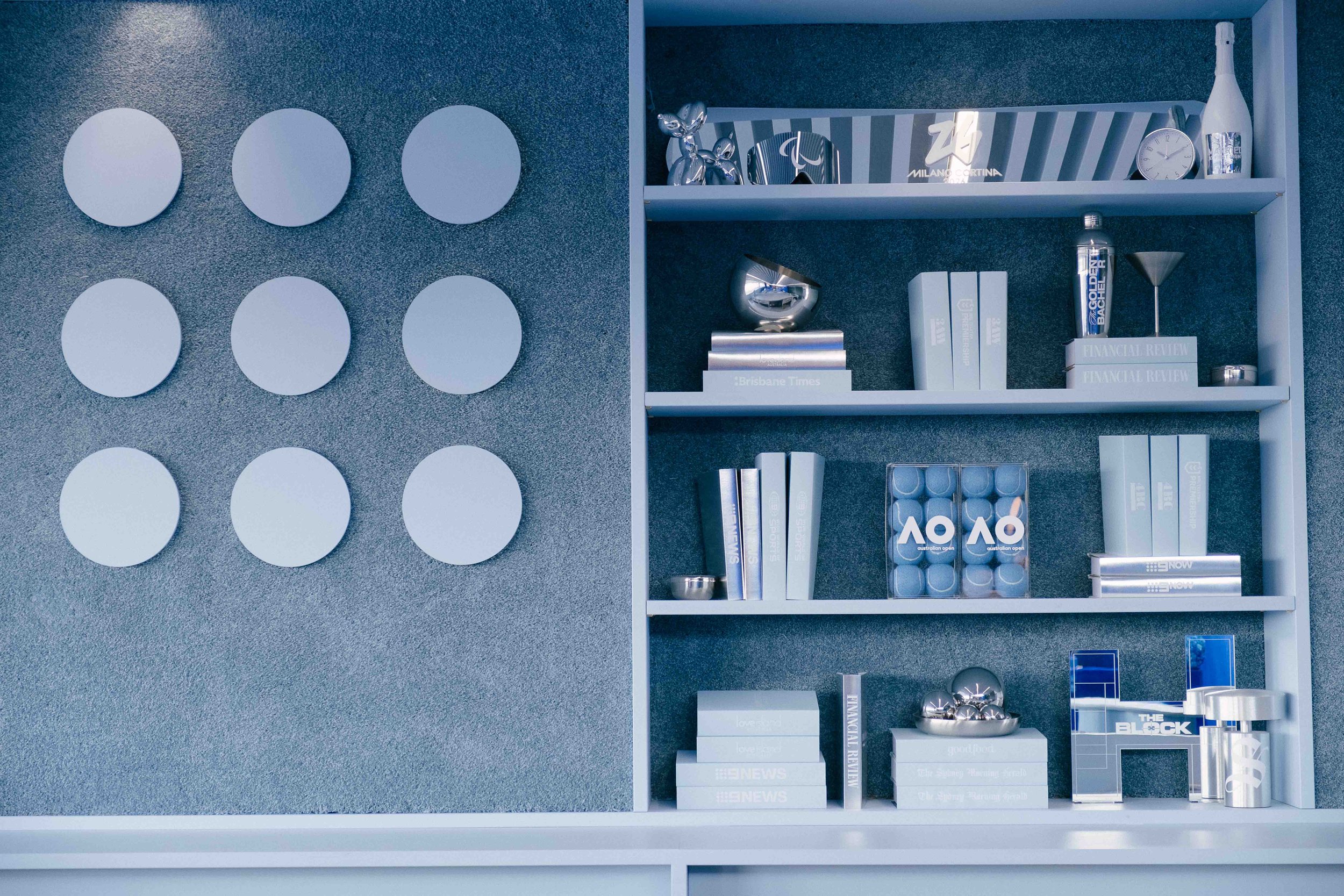
A fresh colour palette differentiated the bar experience, while the layered typographic system ensured it remained unmistakably part of the wider identity.
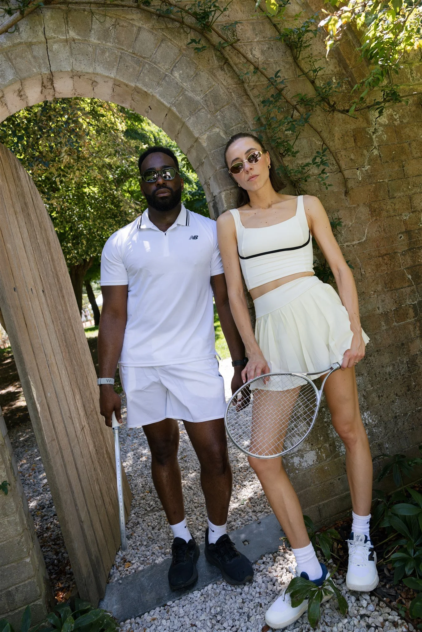
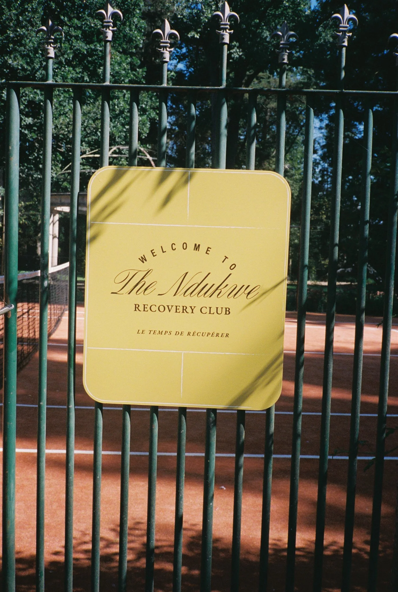
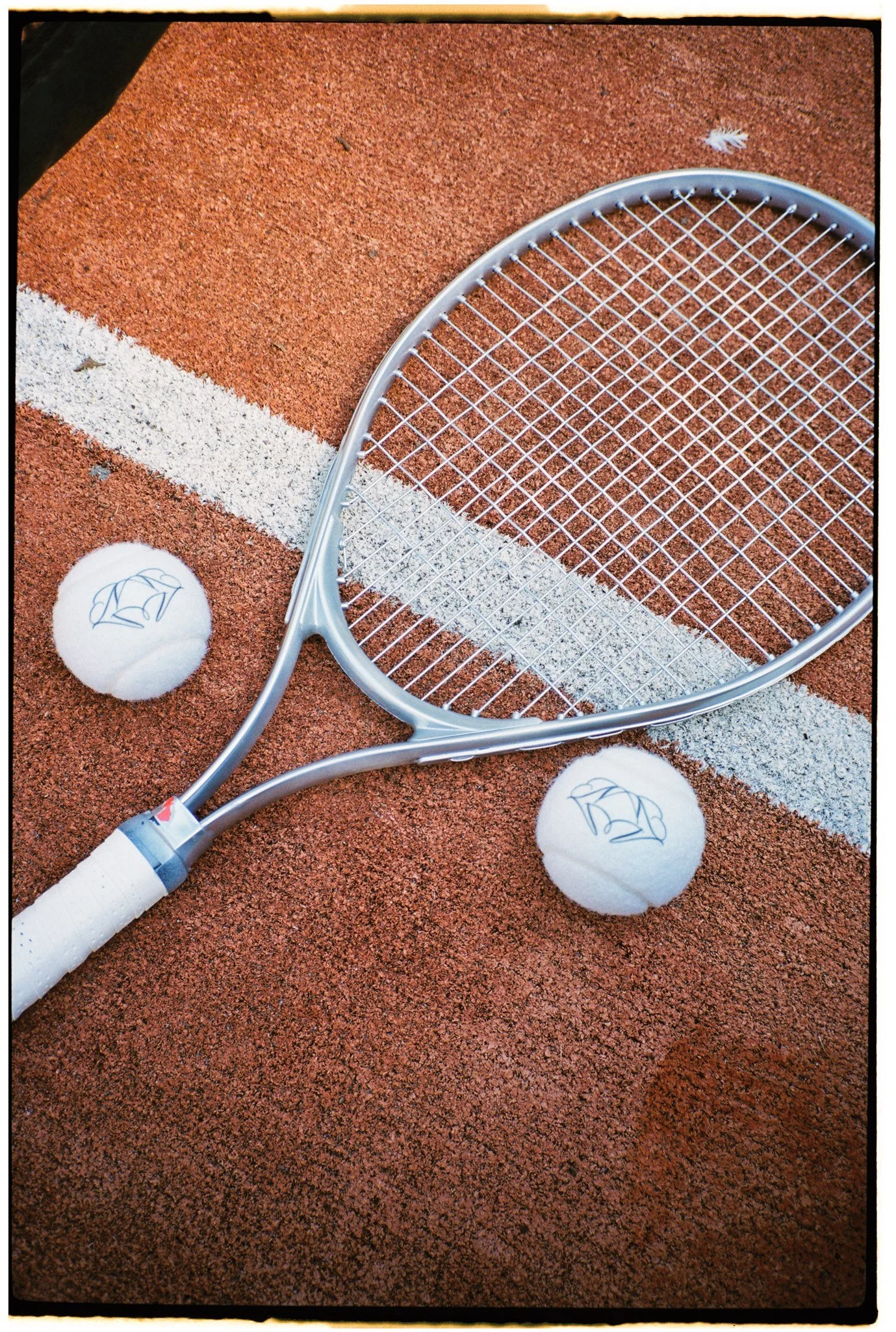
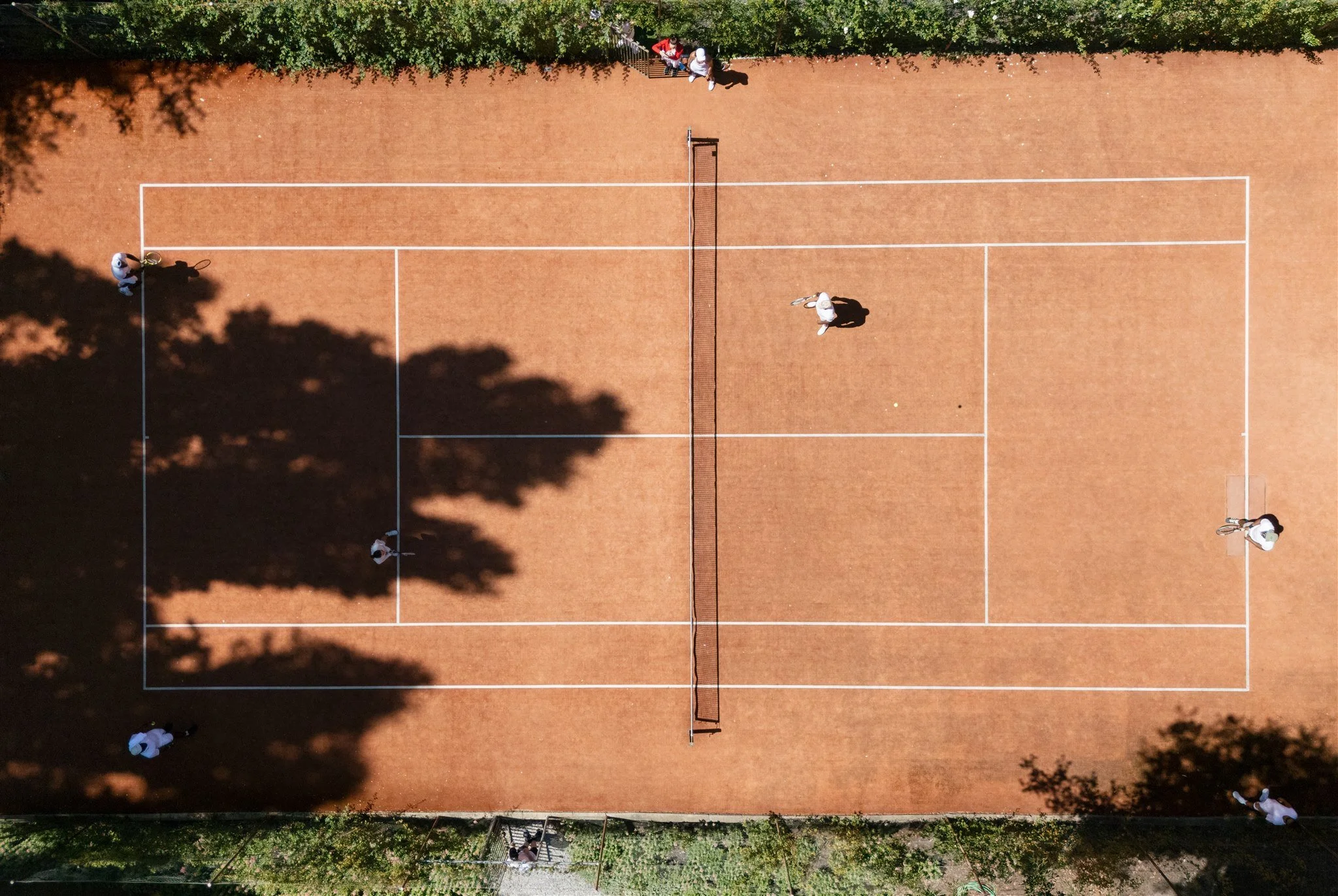
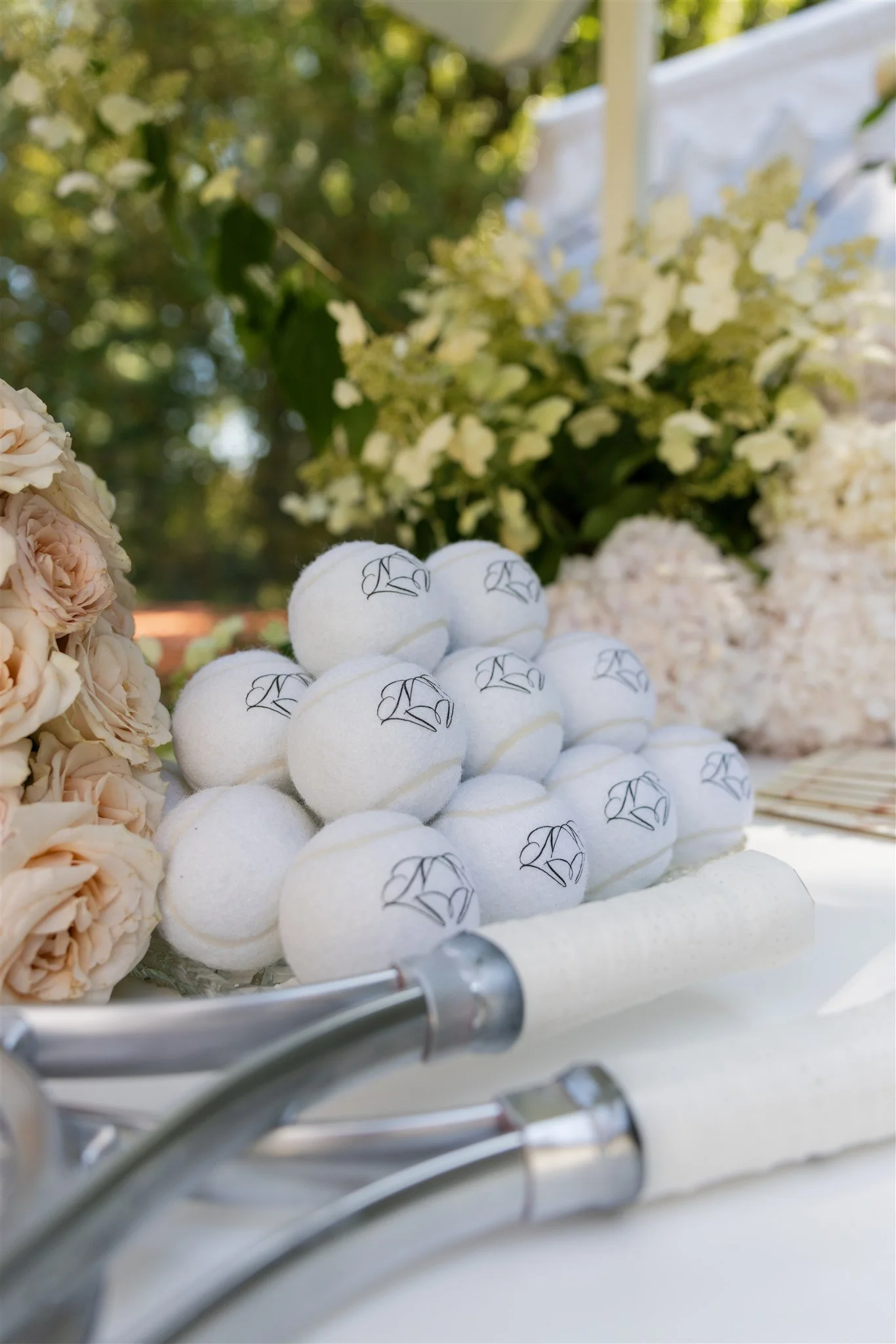
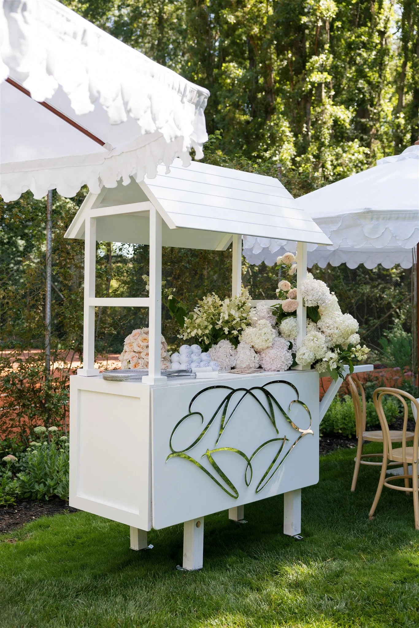
The recovery event extended the identity into a more playful setting, drawing inspiration from the couple's tennis tournament. Custom signage, branded tennis balls and a bold yellow colour palette demonstrated how the visual system could adapt while remaining cohesive.