la notte eternaThe Brief
Create a visual identity that united a rich mix of references into one cohesive world. The challenge was to weave together themes of the Garden of Eden, classical mythology, angelic light, darkness, mischief and romance, while ensuring the final experience remained elegant, immersive and deeply connected to the Tuscan landscape.
CLIENT
La Lindi
Event Brand Identity • Logo Design • Illustration • Print Design Environmental Graphics • Production Artwork
Event Planner & Stylist: La Lindi
Photography: Anna Gadalean
Content: Modern Day Romance
World Building
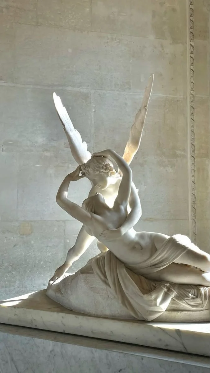
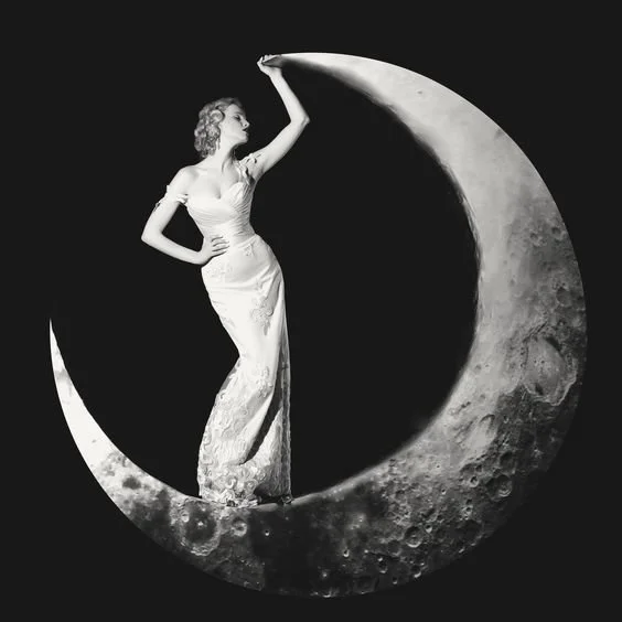
Rather than beginning with logos or typography, I first established the visual language of La Notte Eterna. Inspired by theatre, angels, fire, classical sculpture and Renaissance iconography, these references became the foundation for every design decision.
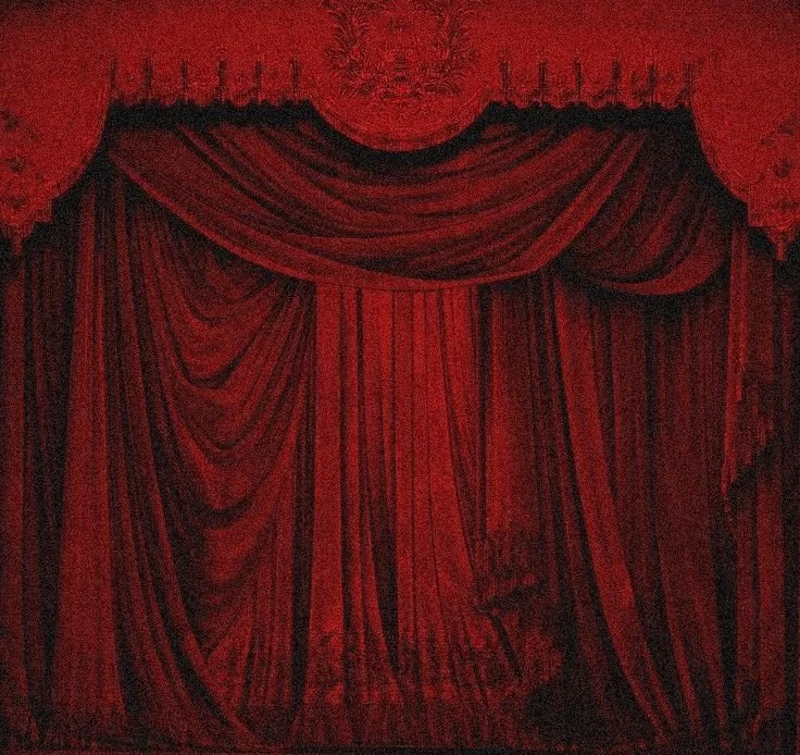
THEATRE — DRAMATIC STAGING AND LAYERED REVEALS.
SPECTACLE — BOLD VISUAL GESTURES THAT FEEL GRAND, CAMP AND CINEMATIC.
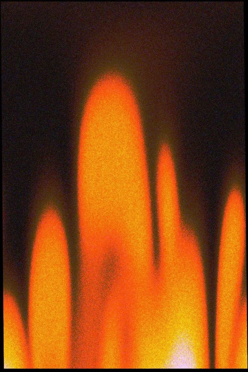
FIRE — PASSION, WARMTH AND ETERNAL DEVOTION.
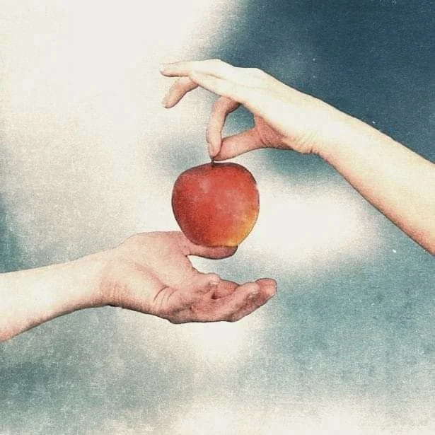
FORBIDDEN FRUIT — TEMPTATION, ADAM & EVE AND DESIRE.
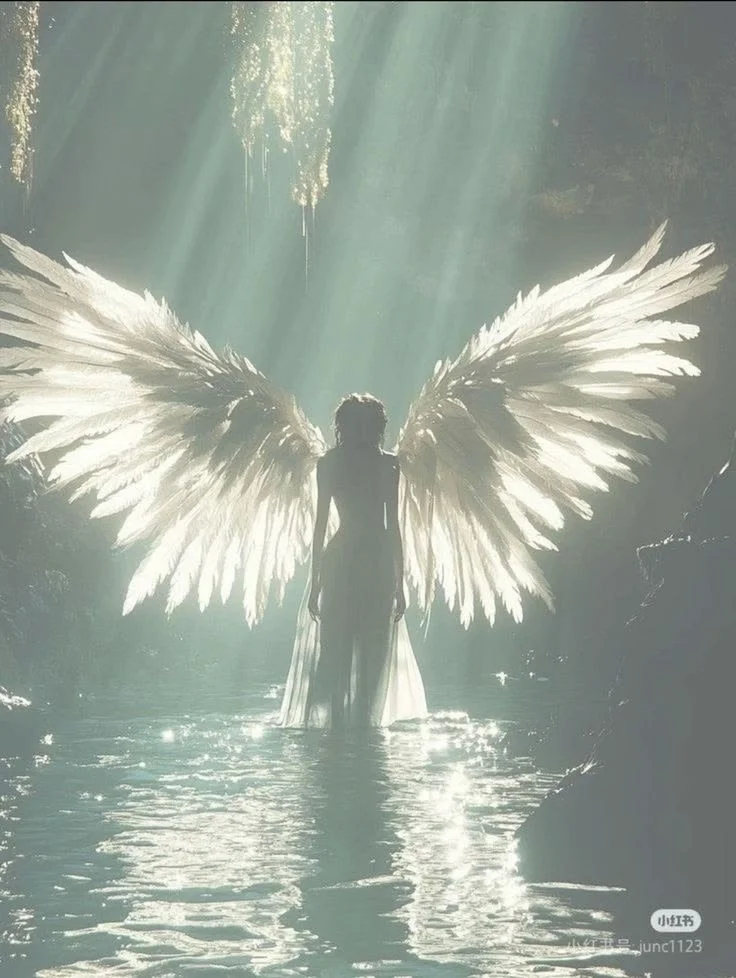
ANGELS — AIR, TRANSCENDENCE AND MEMORY.
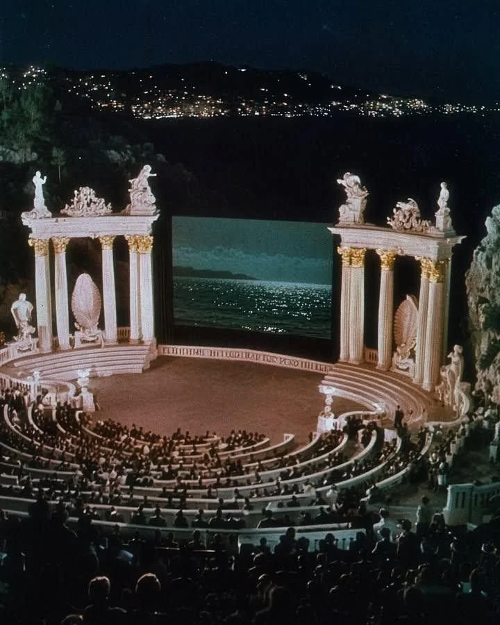
OPERA — GRANDEUR, SPECTACLE AND ITALIAN CULTURE.
Visual Language
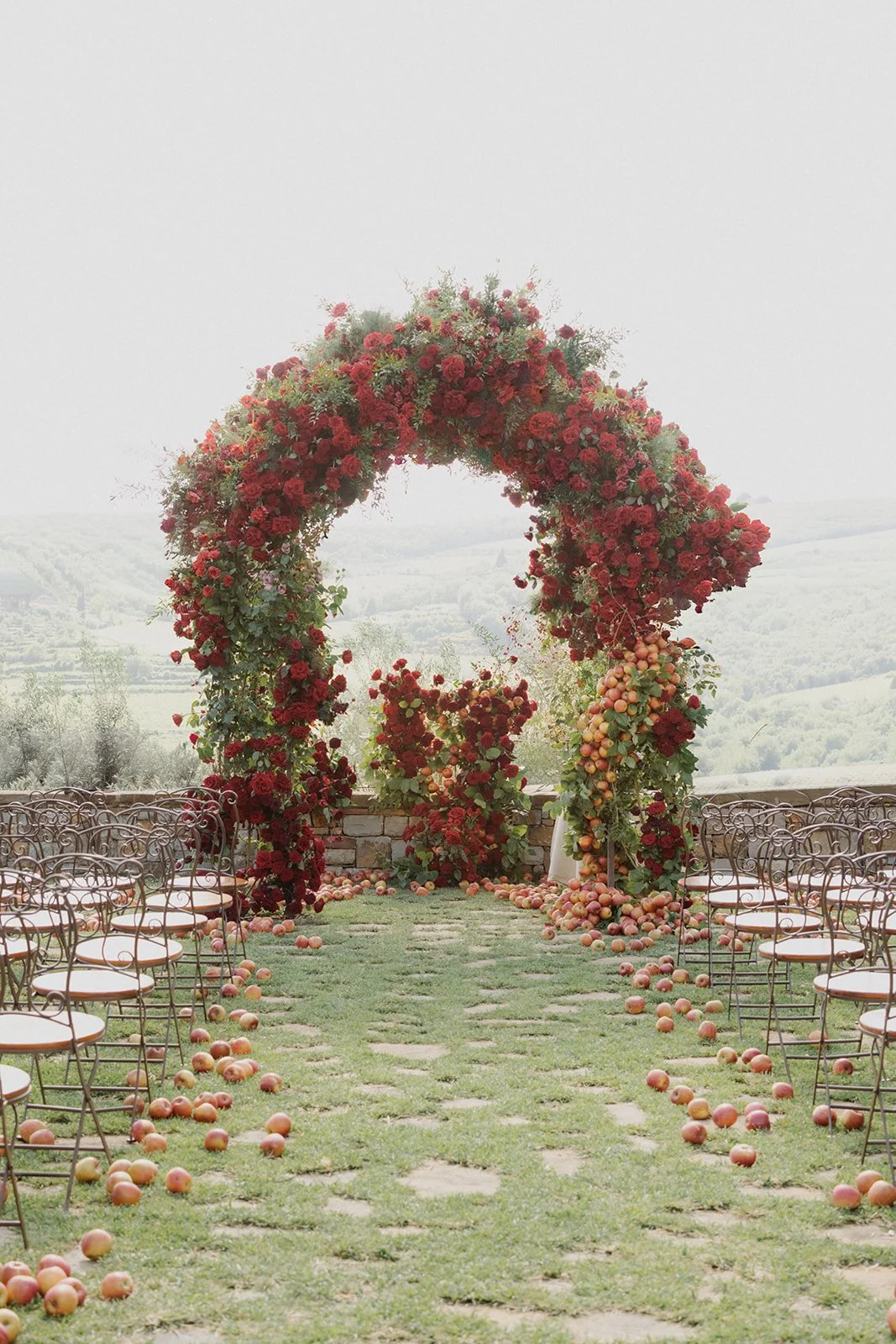
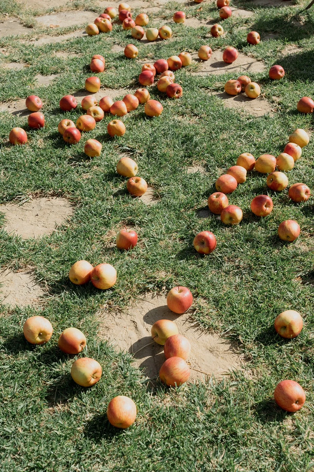
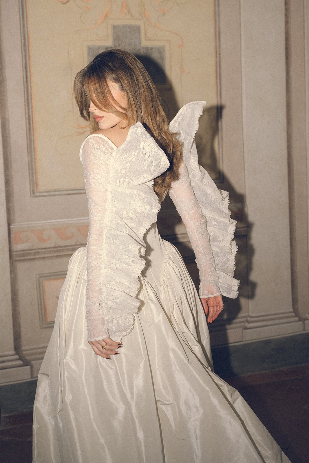
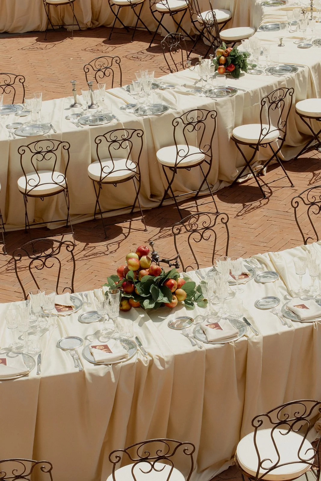
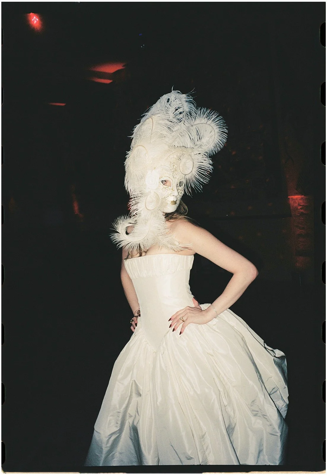
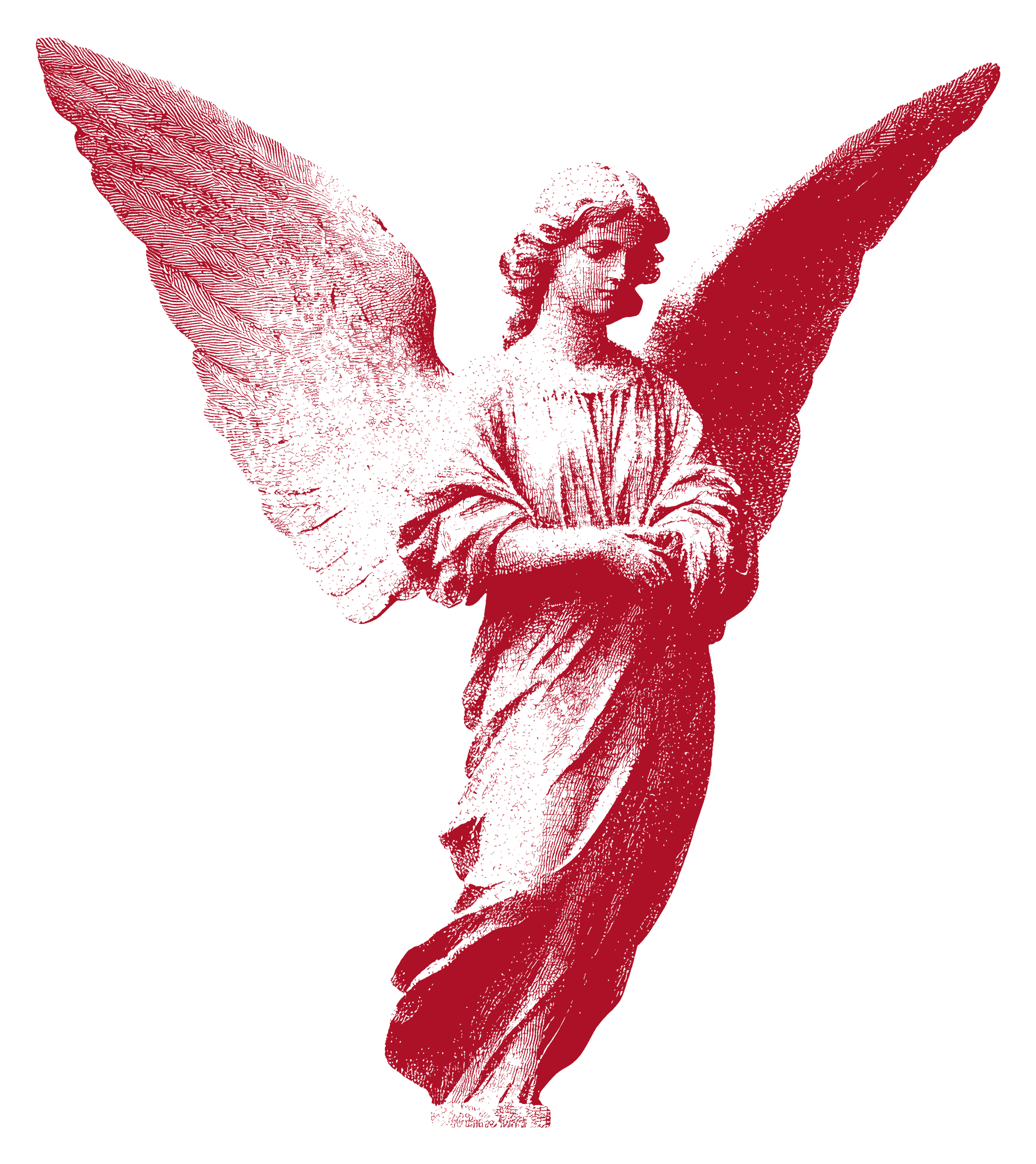
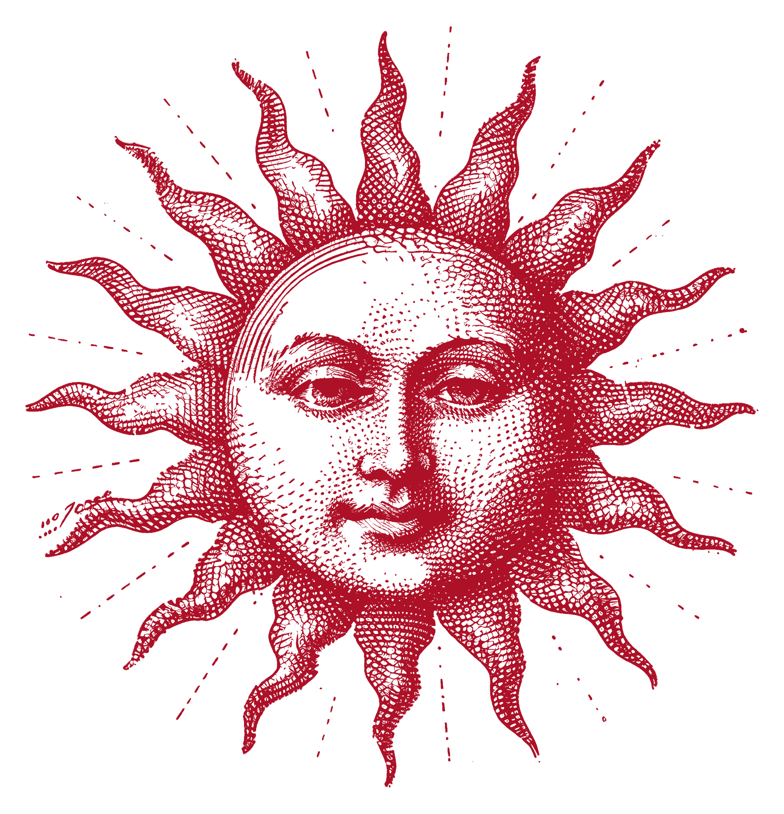
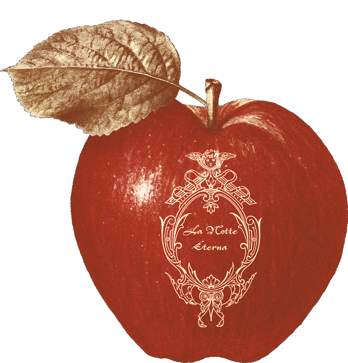
To build an immersive visual world, I developed a collection of recurring symbols inspired by Renaissance iconography, mythology and Italian theatre. Each motif carried meaning within the narrative: angels referenced both transcendence and the bride's detachable wings; the apple foreshadowed the Garden of Eden-inspired ceremony, where fallen apples became a central visual motif; celestial elements reflected the journey from day to night; and antique engravings connected the identity to the romance and craftsmanship of the Renaissance. Together, these symbols formed a flexible visual language that evolved seamlessly across invitations, digital experiences and on-the-day collateral.


Logo & Identity
The identity was designed as a family of marks rather than a single logo. An ornate crest established the ceremonial tone, the intertwined monogram offered a more intimate signature, and a bespoke koi emblem referenced the couple's personal story. This flexible system allowed the identity to adapt seamlessly across print, digital and environmental applications without losing its sense of cohesion.
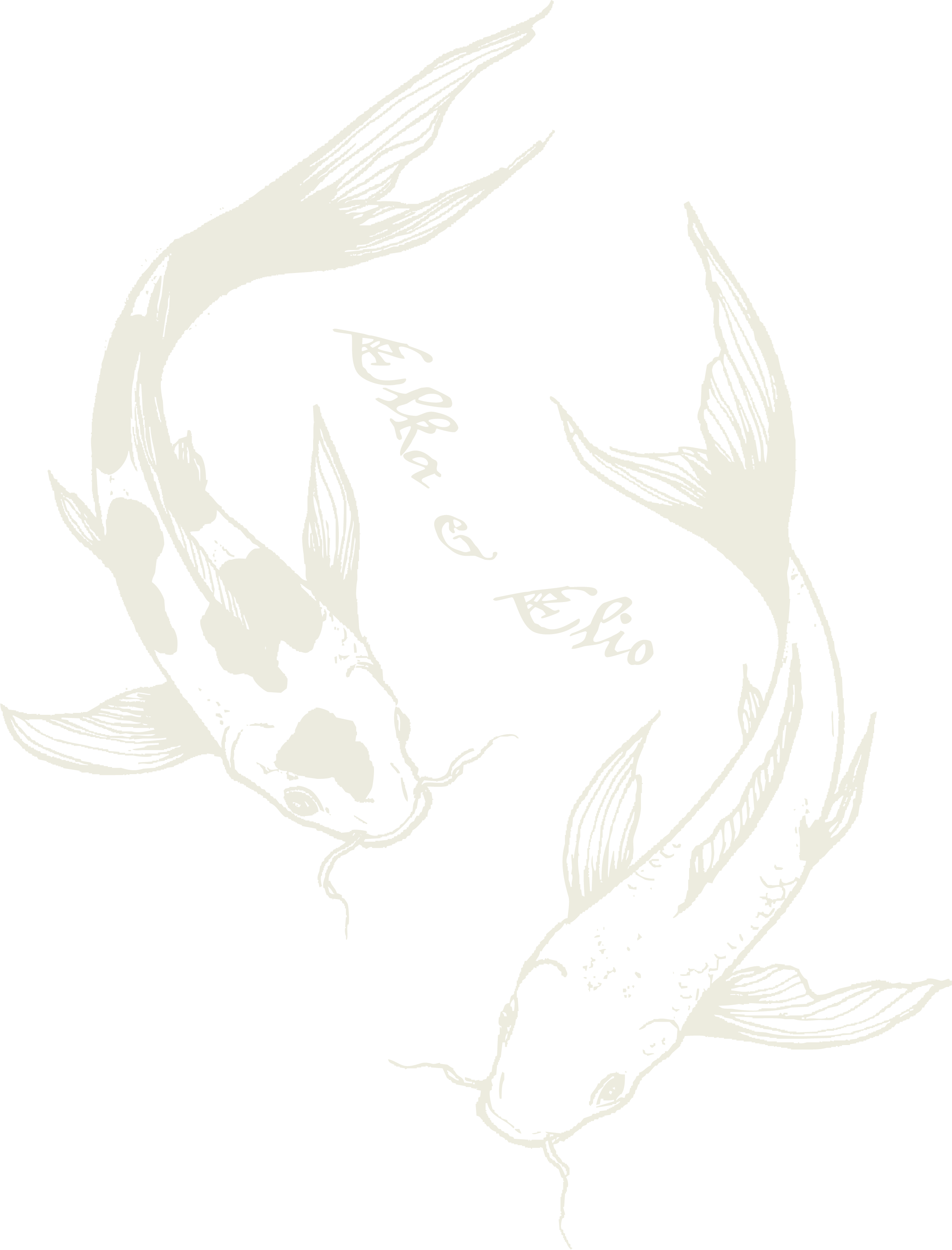
A personal emblem. Two koi fish referencing the couple's story, symbolising harmony, devotion and transformation.
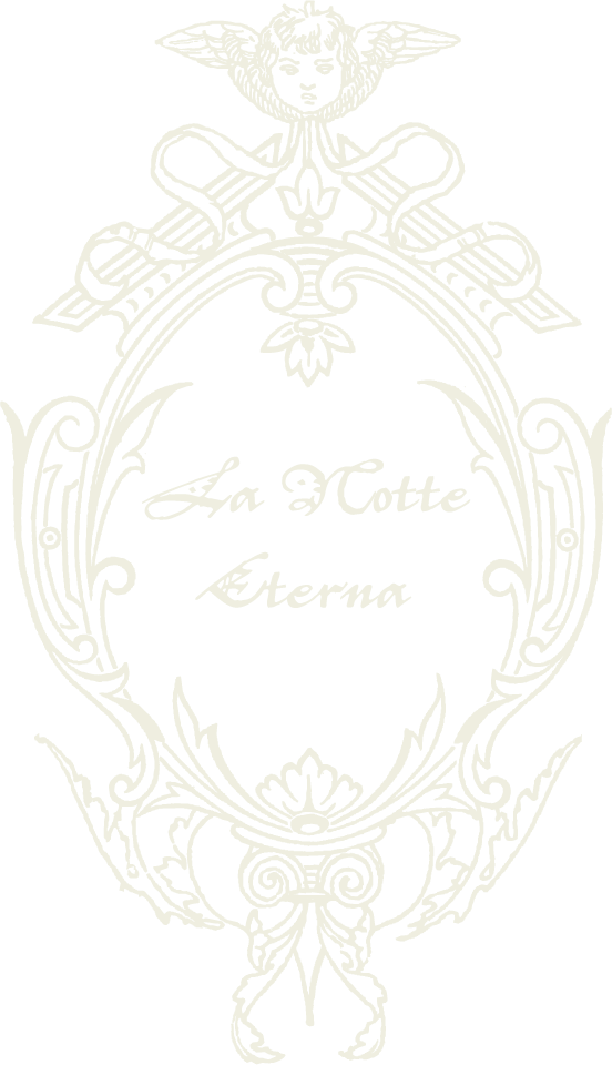
The primary mark. The ceremonial mark, inspired by Renaissance engravings and antique heraldry.
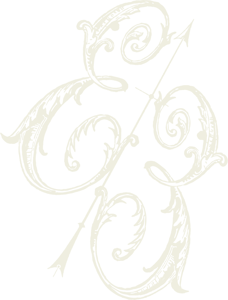
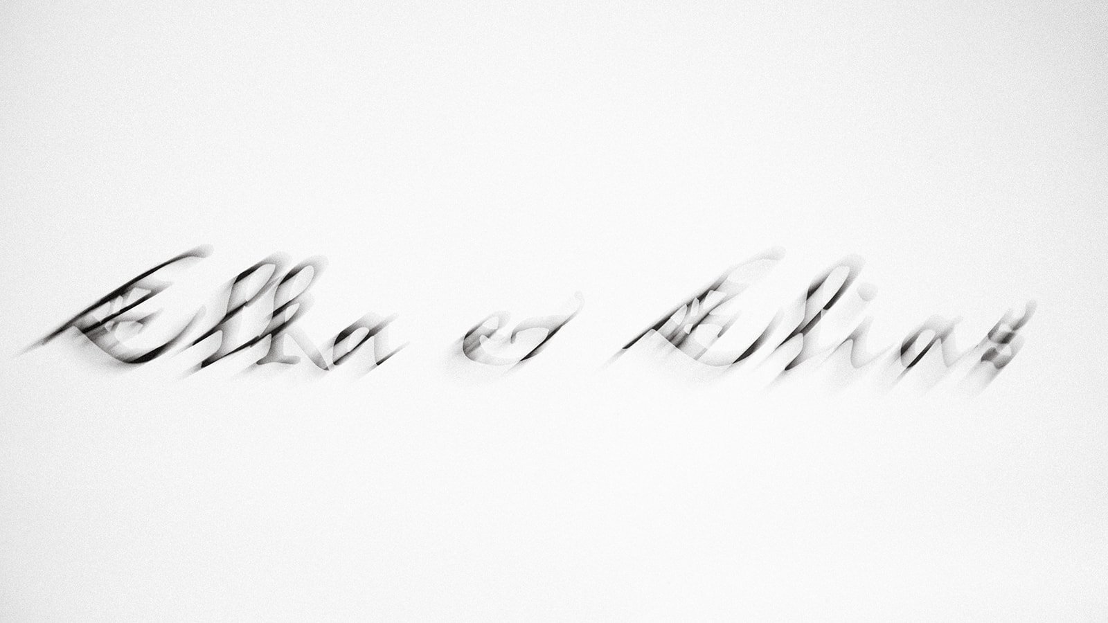
The couple's monogram. An intertwined signature used across more intimate applications.
The First Impression
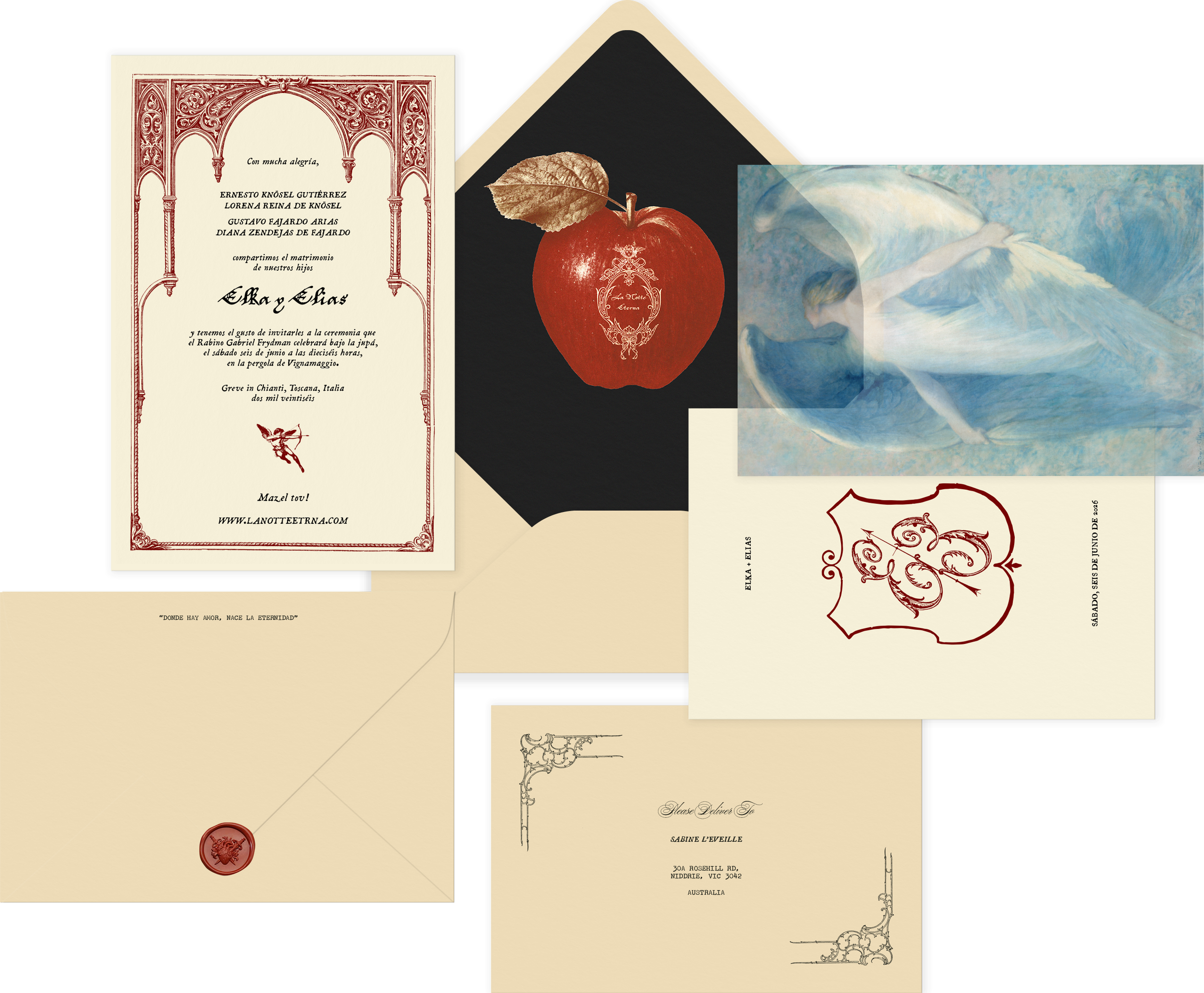
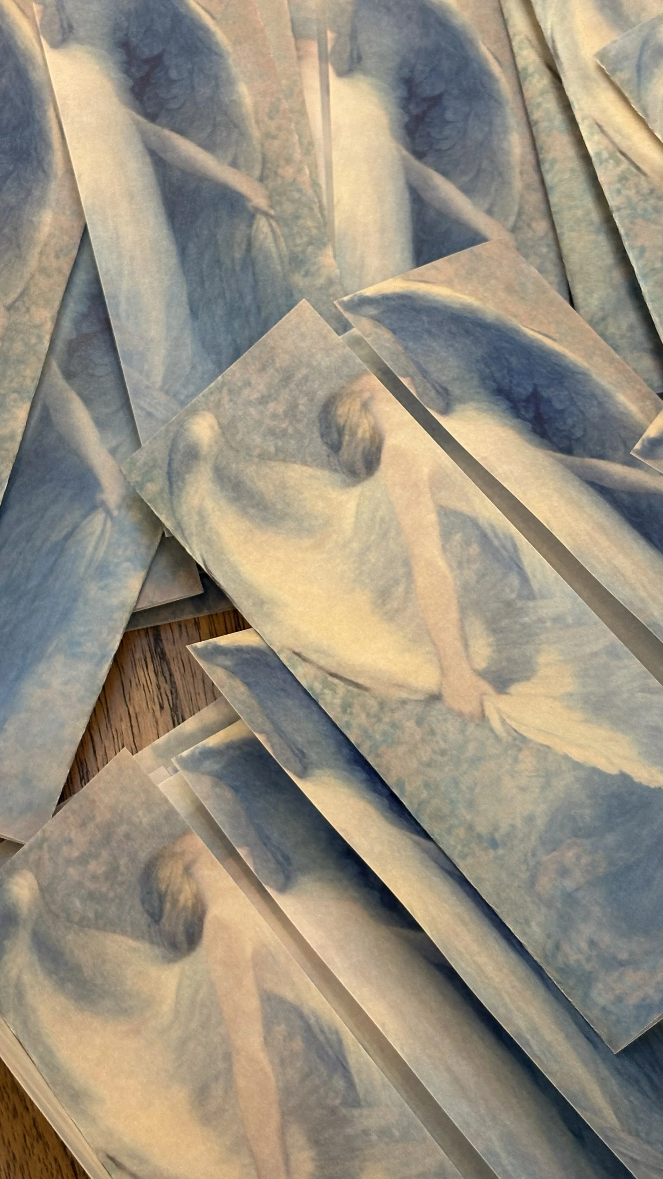
The invitation became the opening chapter of La Notte Eterna. Layers of translucent vellum, ornate Renaissance detailing and a sacred heart wax seal transformed the unboxing into a ceremonial reveal, inviting guests into the world before they ever arrived in Tuscany.
Digital Experience
The website became the second chapter of the story. Building on the invitation suite, I designed a fully bespoke digital experience that blended motion, typography and illustration to create a feeling of mystery, allure and anticipation. Every interaction was designed to immerse guests in the world of La Notte Eterna, where practical information unfolded through an atmosphere of dark romance and cinematic storytelling.
Objects of Experience
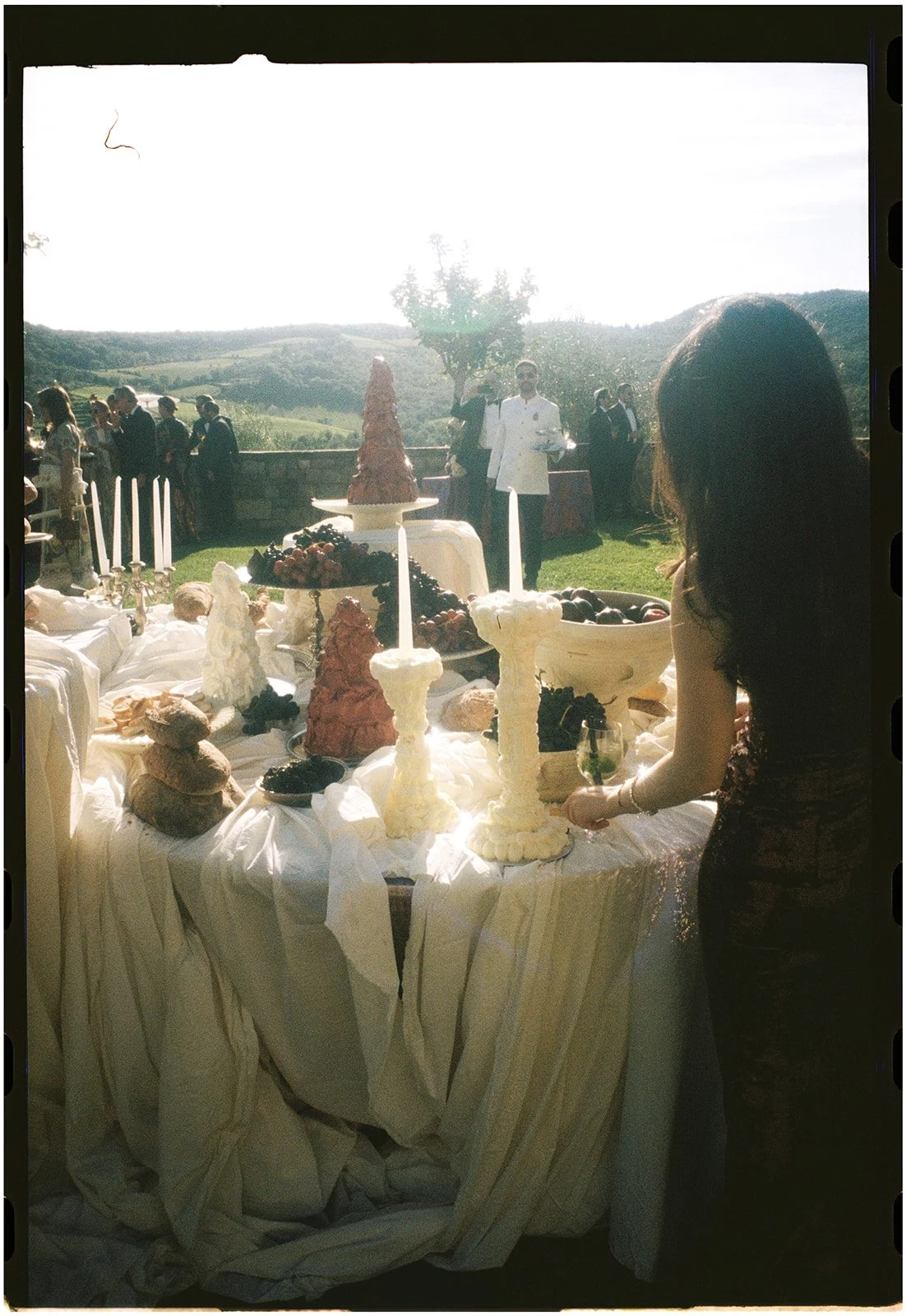
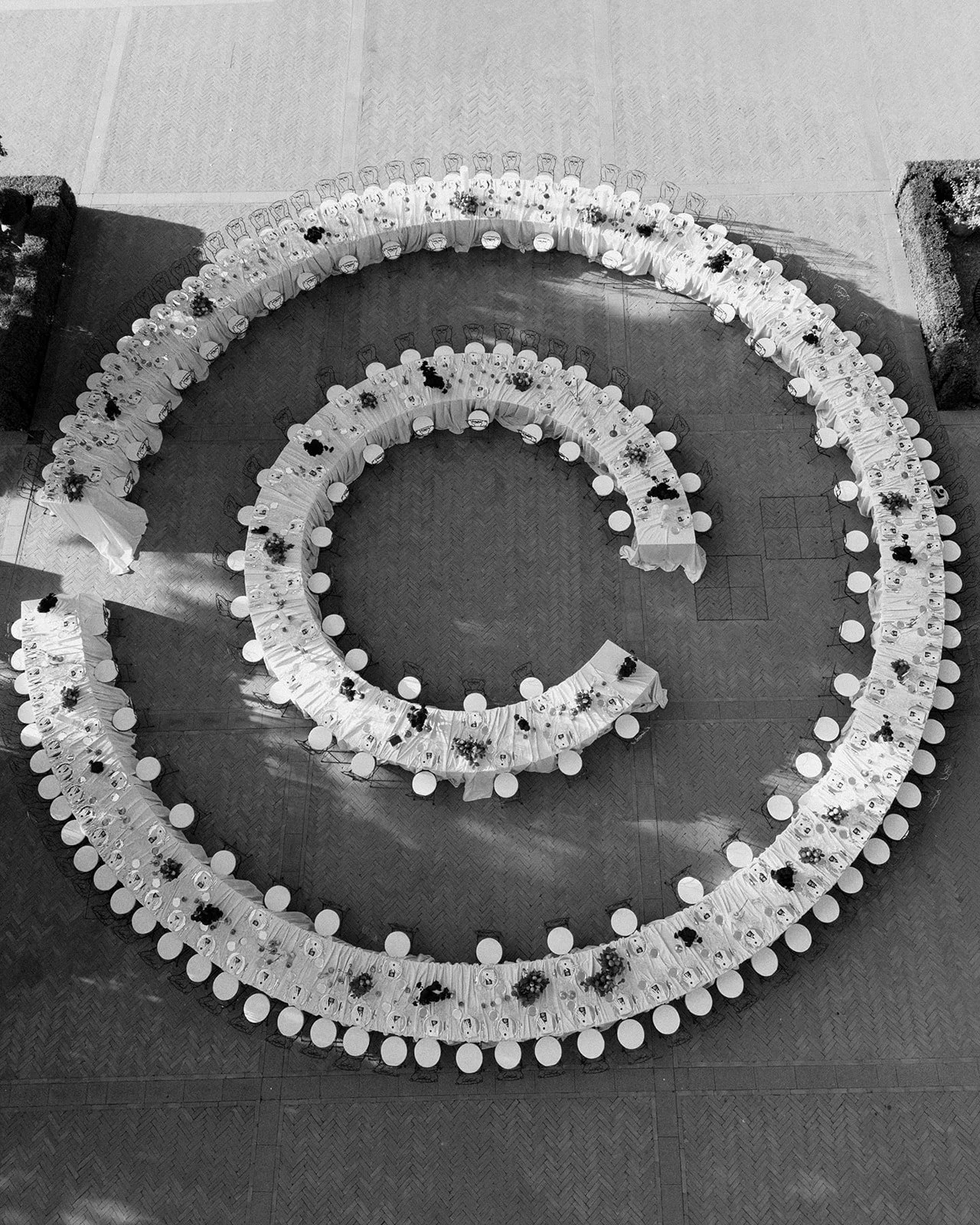
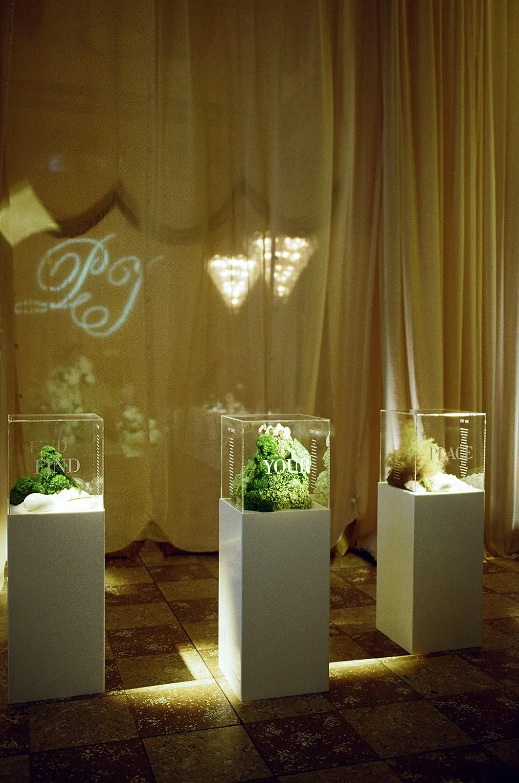
The identity reached its fullest expression on the day itself. Every object, from seating charts and menus to signage and guest stationery, was designed as part of a single immersive narrative, blurring the line between branding, storytelling and experience.
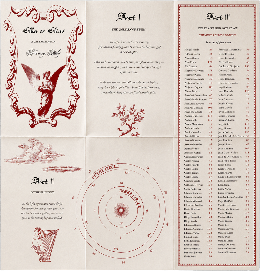
Playbill seating chart
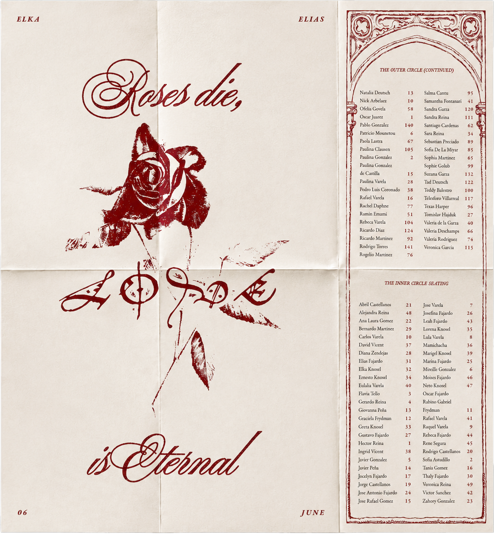
Inspired by vintage theatre programmes, the seating chart transformed wayfinding into part of the narrative. Structured in acts and punctuated with editorial typography, it encouraged guests to discover the evening like a performance rather than simply finding their table.
Eleven-metre poem
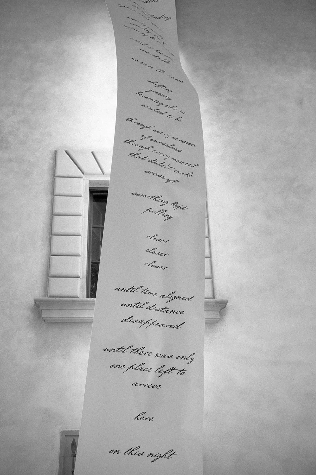
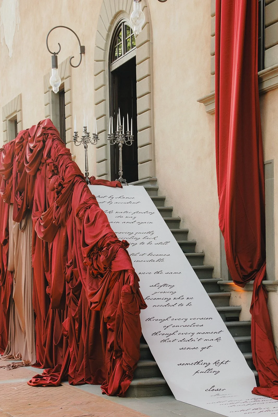
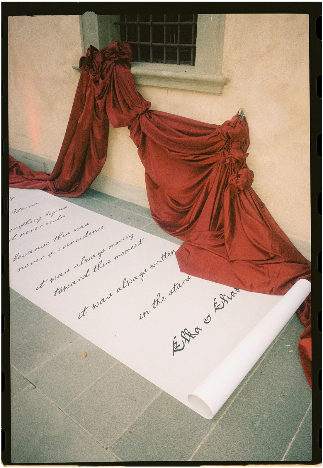
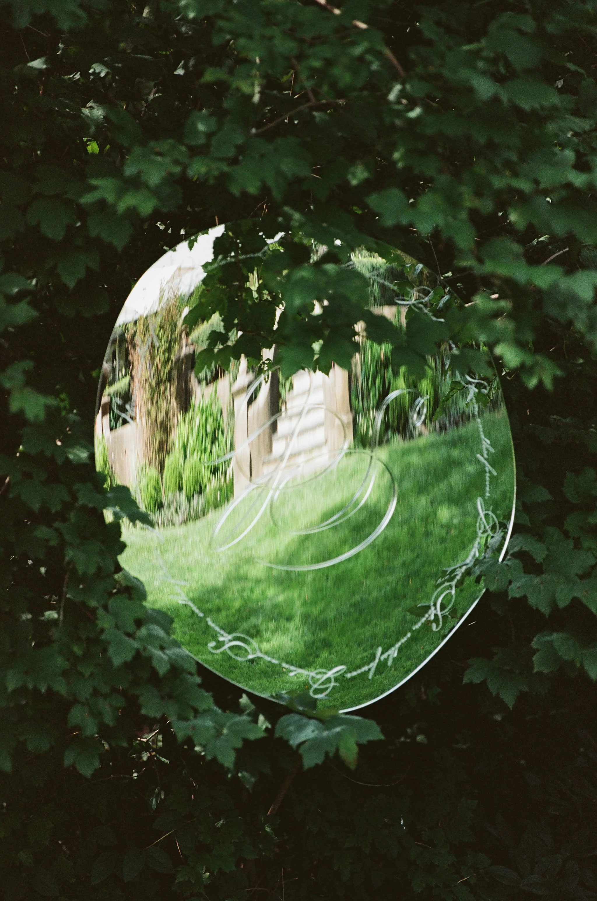
Designed as an architectural installation, an eleven-metre poem suspended through the courtyard became the event's most personal gesture. Rather than relying on bold names or branding, handwritten verses created a quieter, more intimate expression of love that contrasted beautifully with the scale of the venue.
Ceremonial Objects
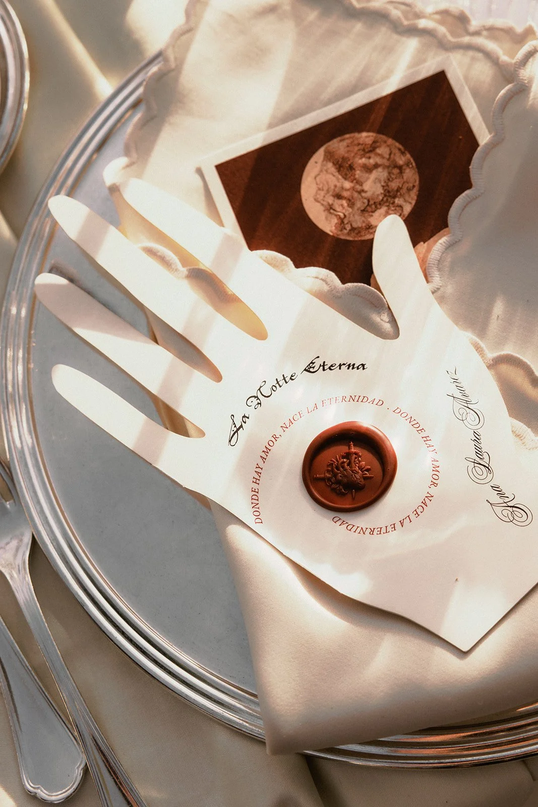
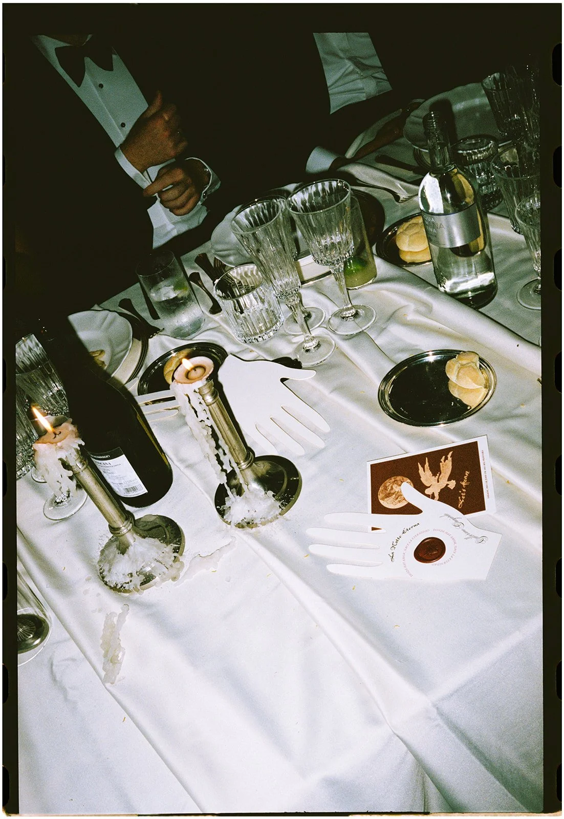
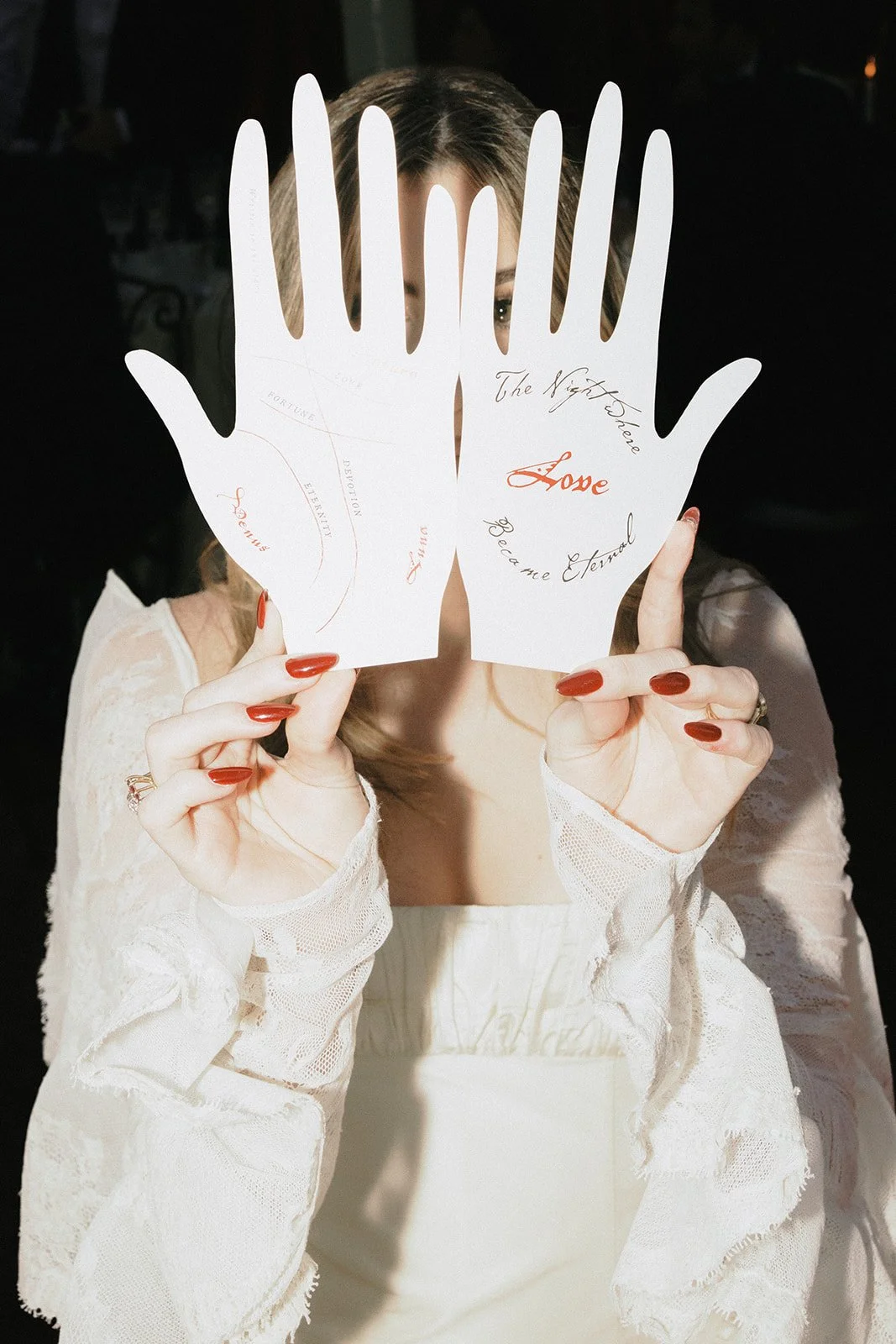
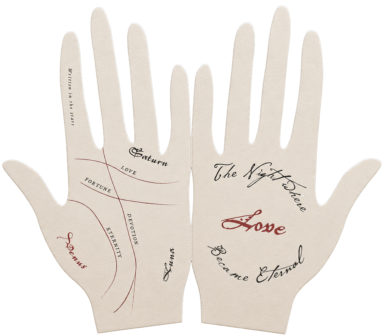
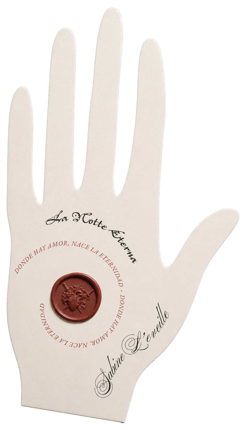
Designed to feel more like ceremonial props than stationery, the laser-cut hands served as each guest's place card, while holding the evening's menu within. A sculptural wax seal introduced texture and craftsmanship, creating a visual link back to the invitation suite. Each hand also featured a bespoke palm reading inspired by the mythology and symbolism woven throughout the celebration, transforming a functional place setting into part of the narrative.
Il Bar Segreto
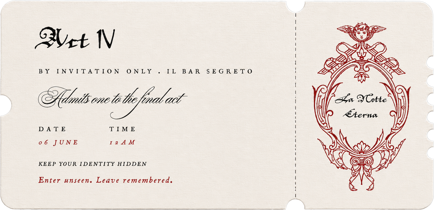
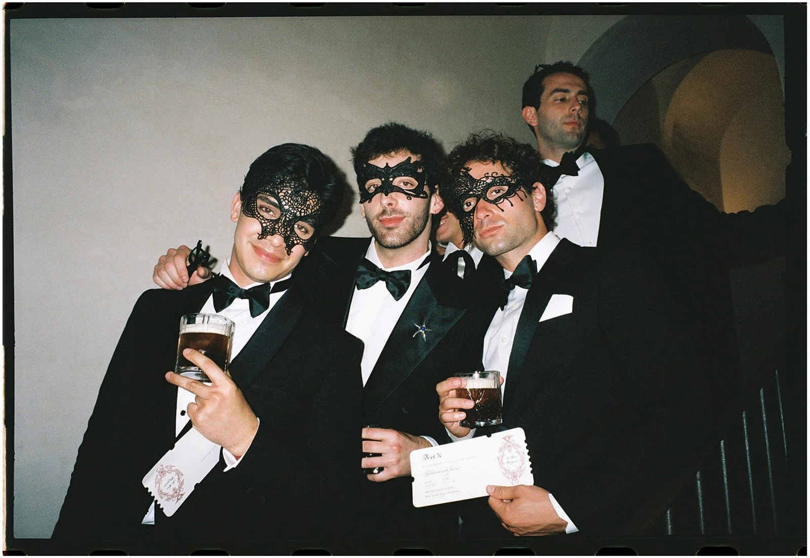
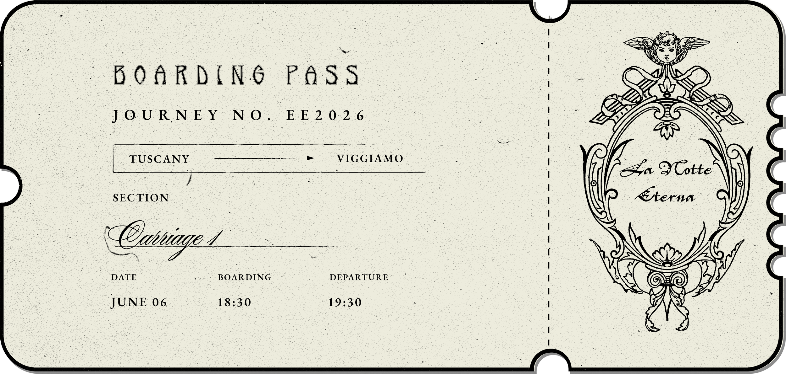
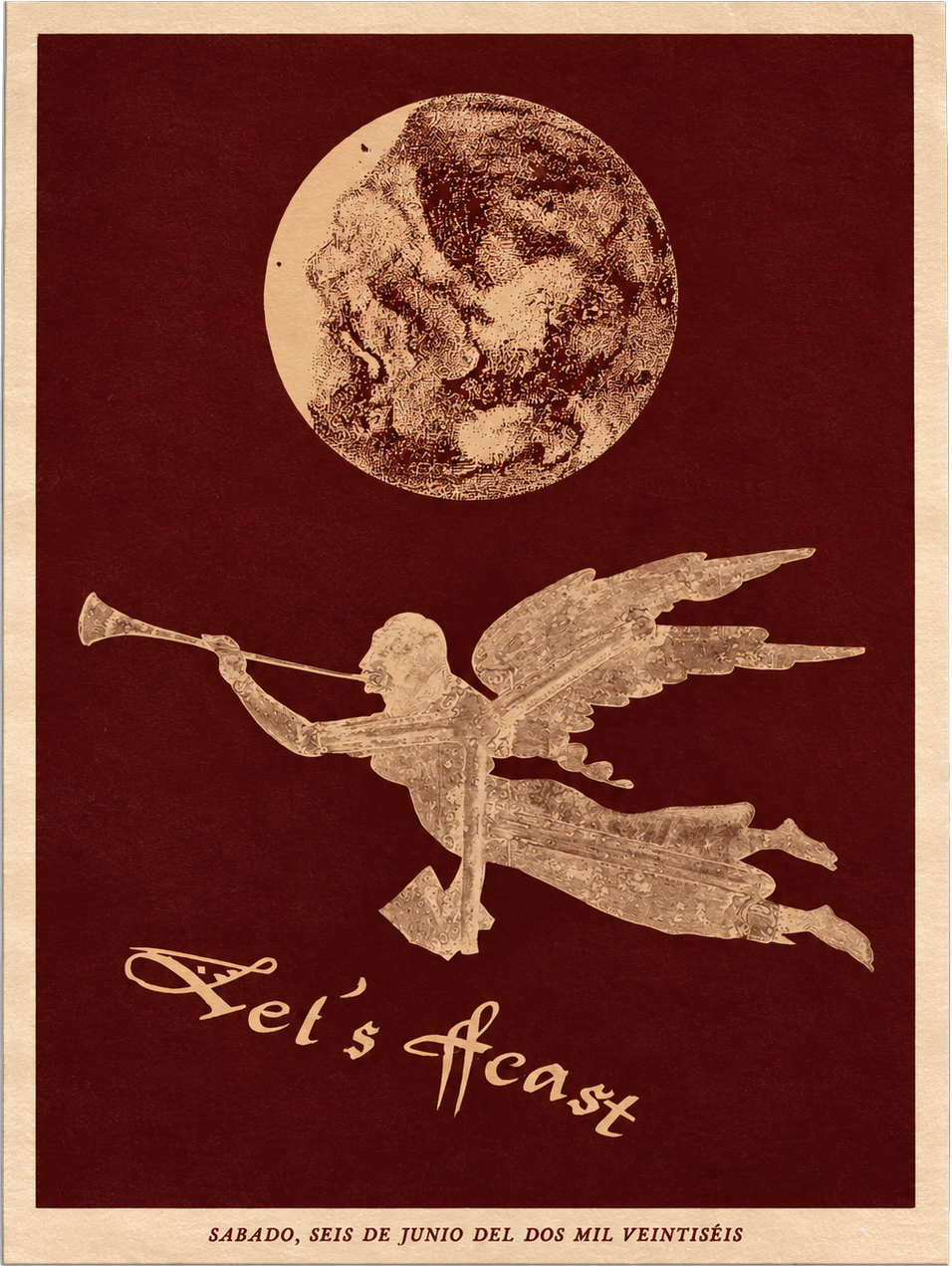
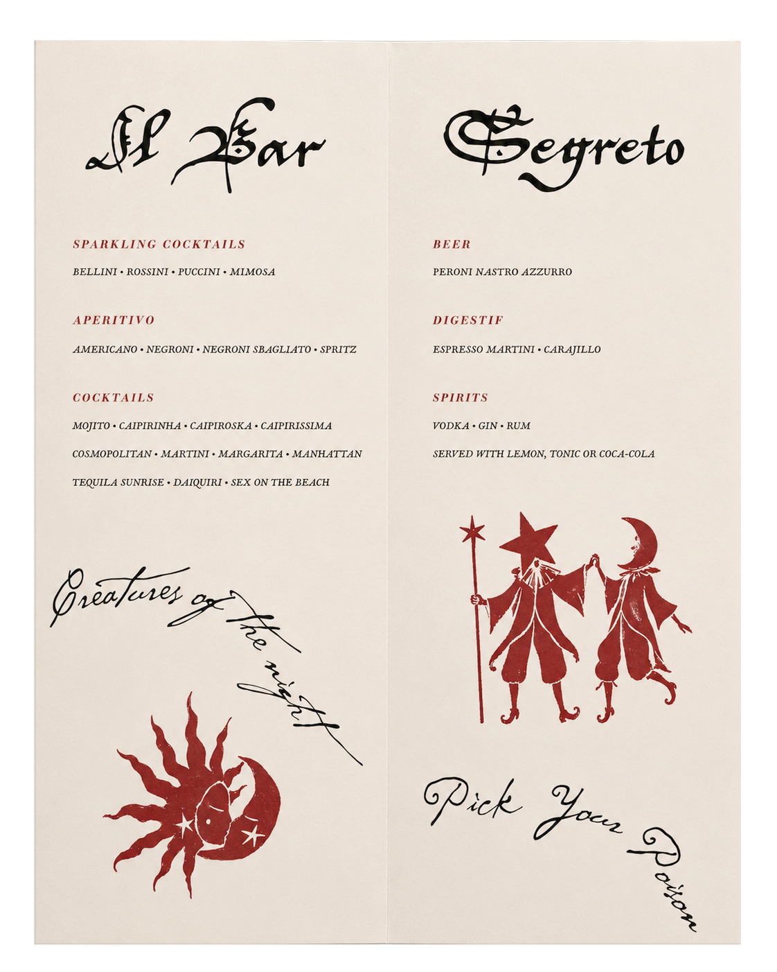
The evening concluded with Il Bar Segreto, a hidden bar revealed through a bespoke ticket inspired by vintage theatre ephemera. More than an entry pass, it became another storytelling device, inviting guests into the final act of the celebration. Inside, bespoke menus, expressive lettering and folkloric illustrations extended the bar's own visual language, ensuring the experience felt like a natural continuation of the world rather than a separate space.
The Experience